
UX/UI for
Helsingin Sanomat
Type
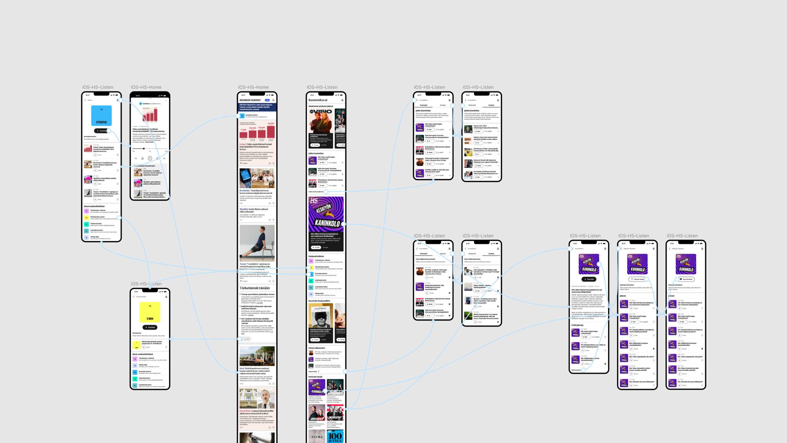
Client Work
Client
Sanoma Media Finland
Tags
User Experience Design
User Interface Design
Year
2025
In 2025, I applied for a UX/UI internship at Finland’s largest media company, Sanoma. I did so because I wanted to get a deeper understanding of customer-centric design, accessibility, and prototyping in Figma. For five months, I worked in their Audiovideo team, which was in charge of developing audio and video features for all of Sanoma’s news apps. At that stage, their live product was still close to the MVP released at the start of the year.
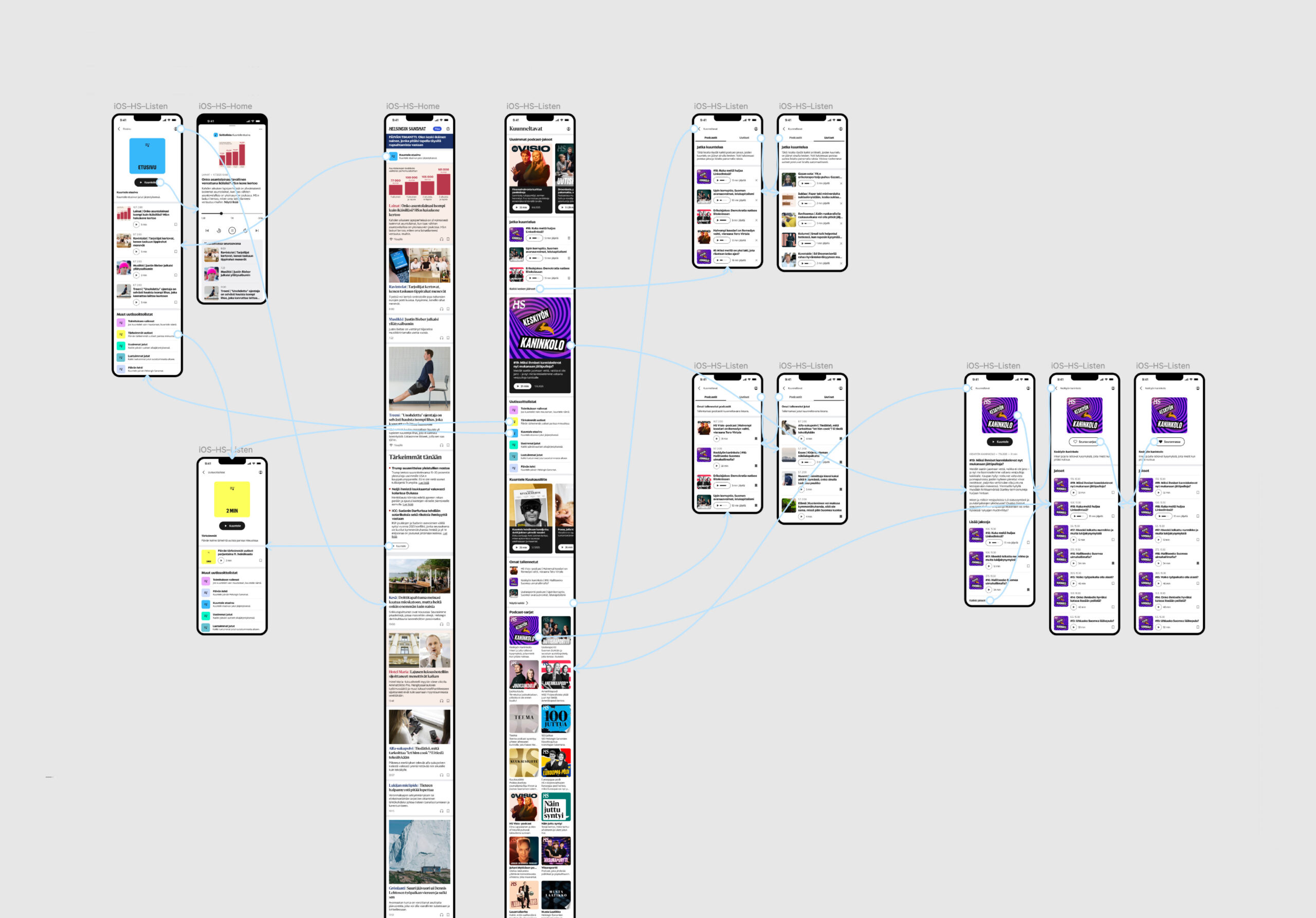
When I joined, the team’s focus was on the company’s leading newspaper, Helsingin Sanomat. Together with the Lead Designer, I was tasked with researching how we could increase the reach and retention of HS’ audio features. We started by interviewing users to figure out how they used news apps’ audio content and app-based audio in general. Based on these findings, I developed prototypes for new features. We user-tested and refined these prototypes. Finally, I was asked to take a comprehensive look at HS’ audio section and deliver concrete suggestions on how to make users’ audio experience even better. I have detailed much of this process below.
As is usually the case, not all of the suggested new features have gone into production. Many are still in the development backlog and some will remain so for good. Out of those that have seen the light of day, some have been modified visually from my original proposals. My internship ended before I could see the true impact of these changes, but when I left, the trend was clearly pointing towards users finding HS’ audio content more often.
This was a comprehensive project, during which I was able to hone my skills in all aspects of the UX/UI pipeline: customer interviews, prototyping, user testing, UI design, and so on. As a result, I’m much better at designing customer-centrically and with software developers in mind.
UX/UI for Helsingin Sanomat
Type
Client Work
Client
Sanoma Media Finland
Tags
User Experience Design
User Interface Design
Year
2025
In 2025, I applied for a UX/UI internship at Finland’s largest media company, Sanoma. I did so because I wanted to get a deeper understanding of customer-centric design, accessibility, and prototyping in Figma. For five months, I worked in their Audiovideo team, which was in charge of developing audio and video features for all of Sanoma’s news apps. At that stage, their live product was still close to the MVP released at the start of the year.
When I joined, the team’s focus was on the company’s leading newspaper, Helsingin Sanomat. Together with the Lead Designer, I was tasked with researching how we could increase the reach and retention of HS’ audio features. We started by interviewing users to figure out how they used news apps’ audio content and app-based audio in general. Based on these findings, I developed prototypes for new features. We user-tested and refined these prototypes. Finally, I was asked to take a comprehensive look at HS’ audio section and deliver concrete suggestions on how to make users’ audio experience even better. I have detailed much of this process below.
As is usually the case, not all of the suggested new features have gone into production. Many are still in the development backlog and some will remain so for good. Out of those that have seen the light of day, some have been modified visually from my original proposals. My internship ended before I could see the true impact of these changes, but when I left, the trend was clearly pointing towards users finding HS’ audio content more often.
This was a comprehensive project, during which I was able to hone my skills in all aspects of the UX/UI pipeline: customer interviews, prototyping, user testing, UI design, and so on. As a result, I’m much better at designing customer-centrically and with software developers in mind.
UX/UI for Helsingin Sanomat
Type
Client Work
Client
Sanoma Media Finland
Tags
User Experience Design
User Interface Design
Year
2025
In 2025, I applied for a UX/UI internship at Finland’s largest media company, Sanoma. I did so because I wanted to get a deeper understanding of customer-centric design, accessibility, and prototyping in Figma. For five months, I worked in their Audiovideo team, which was in charge of developing audio and video features for all of Sanoma’s news apps. At that stage, their live product was still close to the MVP released at the start of the year.
When I joined, the team’s focus was on the company’s leading newspaper, Helsingin Sanomat. Together with the Lead Designer, I was tasked with researching how we could increase the reach and retention of HS’ audio features. We started by interviewing users to figure out how they used news apps’ audio content and app-based audio in general. Based on these findings, I developed prototypes for new features. We user-tested and refined these prototypes. Finally, I was asked to take a comprehensive look at HS’ audio section and deliver concrete suggestions on how to make users’ audio experience even better. I have detailed much of this process below.
As is usually the case, not all of the suggested new features have gone into production. Many are still in the development backlog and some will remain so for good. Out of those that have seen the light of day, some have been modified visually from my original proposals. My internship ended before I could see the true impact of these changes, but when I left, the trend was clearly pointing towards users finding HS’ audio content more often.
This was a comprehensive project, during which I was able to hone my skills in all aspects of the UX/UI pipeline: customer interviews, prototyping, user testing, UI design, and so on. As a result, I’m much better at designing customer-centrically and with software developers in mind.
UX/UI for Helsingin Sanomat
Type Client Work
Client Sanoma Media Finland
Tags User Experience Design, User Interface Design
Year 2025
In 2025, I applied for a UX/UI internship at Finland’s largest media company, Sanoma. I did so because I wanted to get a deeper understanding of customer-centric design, accessibility, and prototyping in Figma. For five months, I worked in their Audiovideo team, which was in charge of developing audio and video features for all of Sanoma’s news apps. At that stage, their live product was still close to the MVP released at the start of the year.
When I joined, the team’s focus was on the company’s leading newspaper, Helsingin Sanomat. Together with the Lead Designer, I was tasked with researching how we could increase the reach and retention of HS’ audio features. We started by interviewing users to figure out how they used news apps’ audio content and app-based audio in general. Based on these findings, I developed prototypes for new features. We user-tested and refined these prototypes. Finally, I was asked to take a comprehensive look at HS’ audio section and deliver concrete suggestions on how to make users’ audio experience even better. I have detailed much of this process below.
As is usually the case, not all of the suggested new features have gone into production. Many are still in the development backlog and some will remain so for good. Out of those that have seen the light of day, some have been modified visually from my original proposals. My internship ended before I could see the true impact of these changes, but when I left, the trend was clearly pointing towards users finding HS’ audio content more often.
This was a comprehensive project, during which I was able to hone my skills in all aspects of the UX/UI pipeline: customer interviews, prototyping, user testing, UI design, and so on. As a result, I’m much better at designing customer-centrically and with software developers in mind.
01
The Starting Point
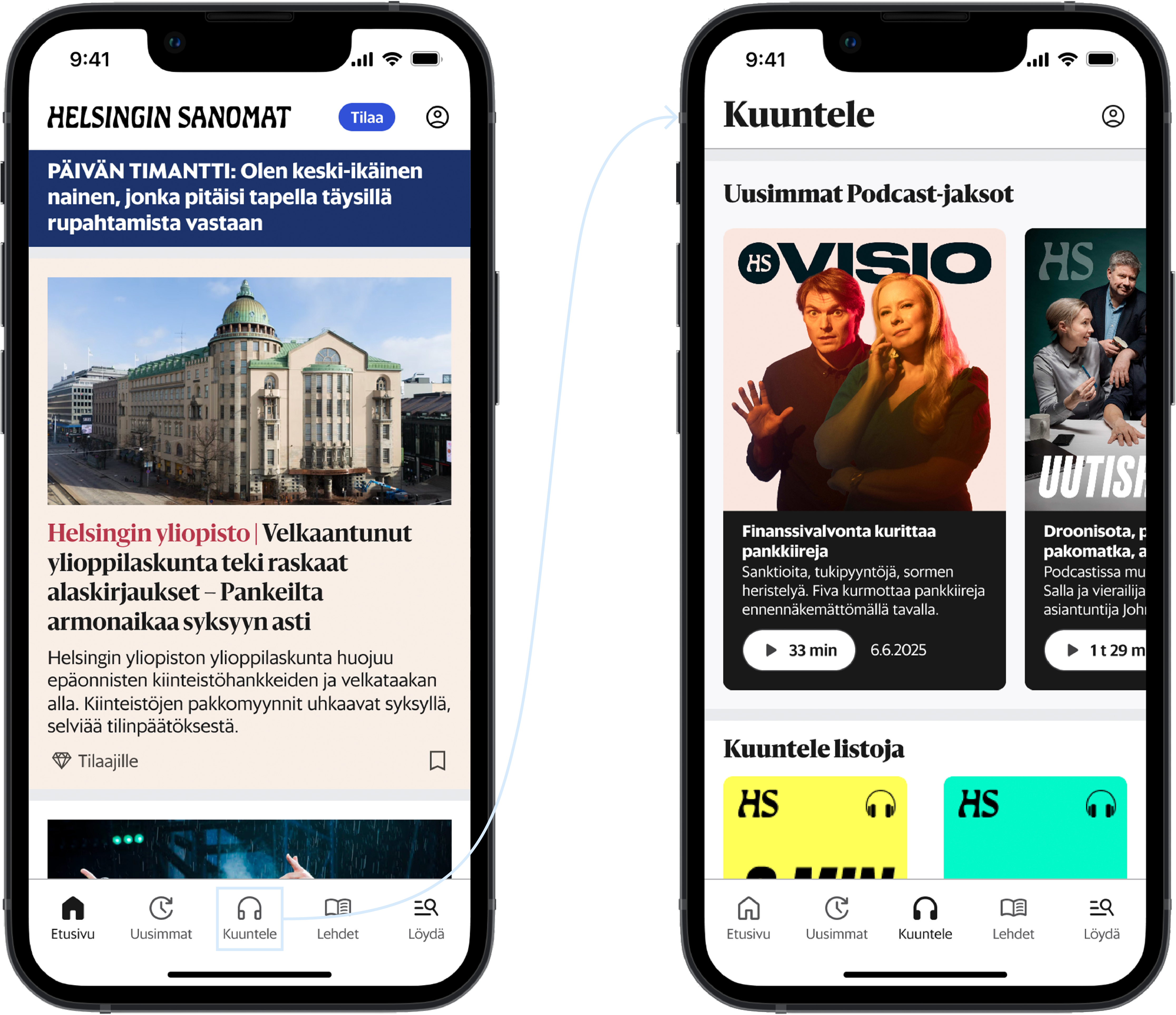
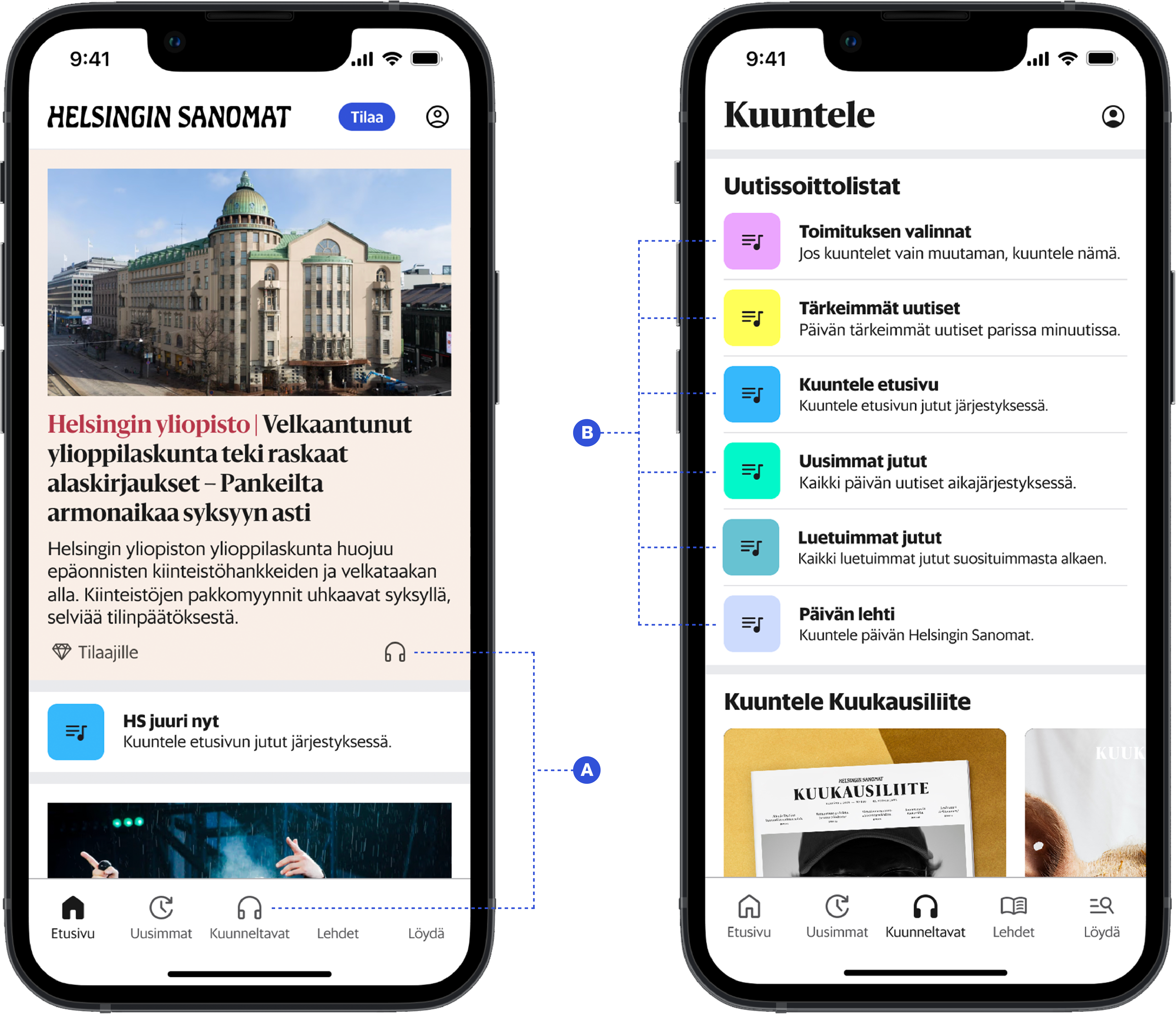
When I joined the team, the audiovideo content in the Helsingin Sanomat app was very close to the MVP released a couple of months earlier. The primary destination for audio content was the Kuuntele (“Listen”) section, which was devoted to podcasts, audio articles, and text-to-speech playlists of the day’s main stories (right).
The front page (left) had no permanent audio-related calls to action outside of the bottom menu. The primary problem quickly became clear: in order for listening to increase, users needed to be made aware of the existence of proprietary audio content in the HS app. The app needed to become an audio destination.
In order for that to happen, several old features had to be refined and new ones added.
My collaborative roles in this project:
I prepared user interviews and tests together with the Team Lead and the Lead Designer, co-conducted the interviews, discussed the findings with my colleagues, and helped compile and prioritize a list of concrete future audio improvements.
My independent roles in this project:
I carried out a comprehensive visual and functional overview of the entire Kuuntele (“Listen”) section of the HS app and came with suggestions for new components and UX improvements, many of which have since undergone user testing.
02
The Front Page
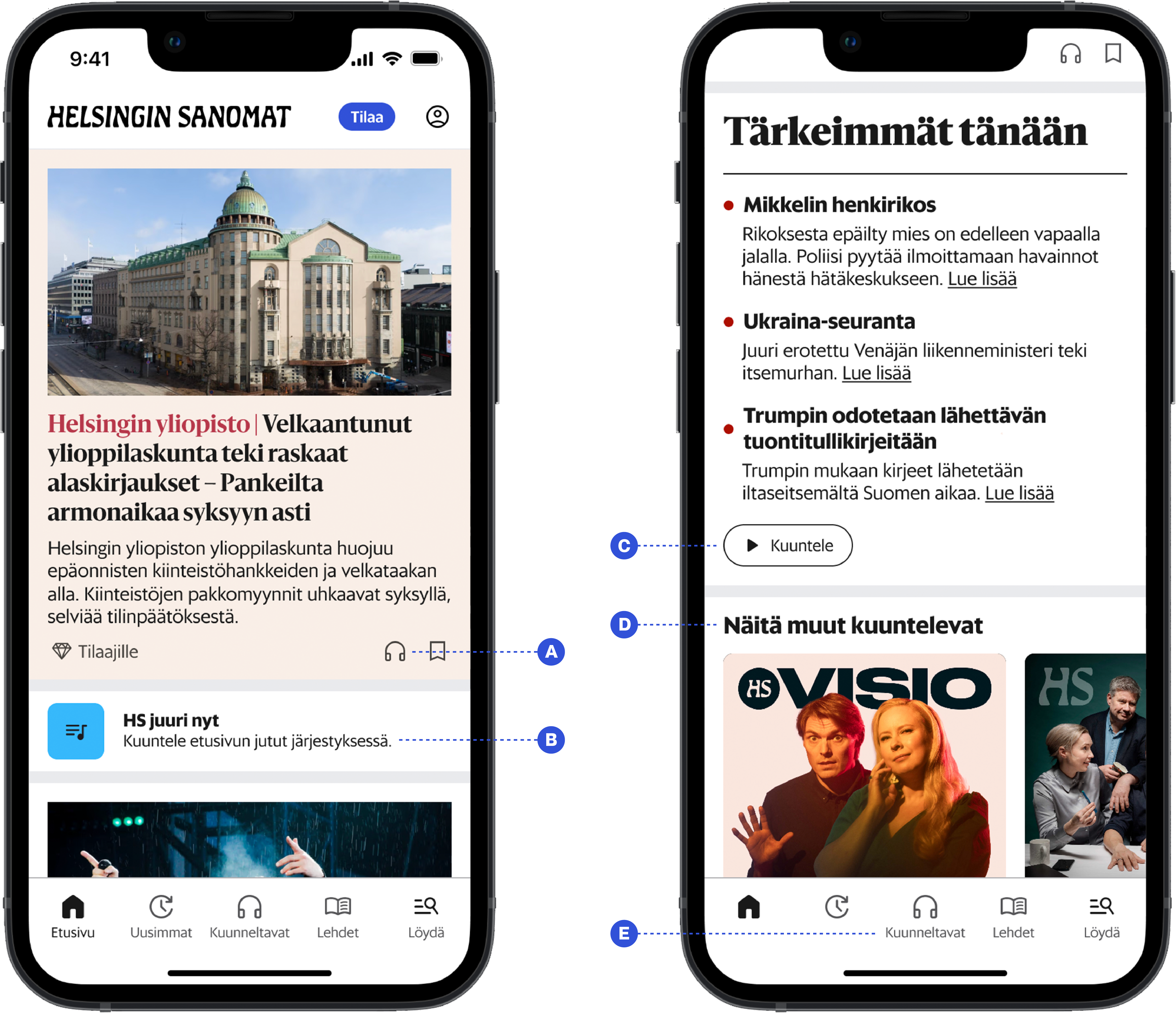
Several changes to the front page were suggested after user interviews and testing:
A. The headphone icon should be added to every story on the front page, reinforcing the connection between the icon and the ability to listen to HS’ content, and providing users a quick and easy way to access audio.
B. Many users were interested in listening to text-to-speech articles, particularly the front page news, but didn’t know how to or found it too difficult. This could be facilitated by showing the front page playlist on the front page.
C. The text-to-speech playlists could also be promoted by adding a CTA button (“Listen”) under the front page news summaries. Clicking would lead to the summary playlist, and provide yet another access point to audio content.
D. Audio content would benefit from a versatile presence on the front page. For example, a carousel of popular podcast episodes could be shown with a curiosity-triggering headline such as “This is what others are listening to”.
E. The current name of the section, “Kuuntele” (“Listen”), should be A/B tested against “Kuunneltavat” (“Audio”), to see if that makes it clearer to users that the headphone icon in the menu leads to a separate audio section.
I conducted this primary research together with the Team Lead and Lead Designer.
03
The Audio Section
For the “Kuuntele” (“Listen”) section, I designed new components and reworked old ones based on needs uncovered by the previous research. I also proposed visual solutions for certain basic functionalities that were known to be missing.
Some of this work is presented below.
Note that while the examples I’m about to give pertain to the Helsingin Sanomat app in particular, I designed everything as Design-System-compatible white-label components using semantic tokens. They can therefore be seamlessly used by all of Sanoma’s brands.
Based on the previous research, I carried out this part of the project independently.
3.1 An “Unfinished” Screen
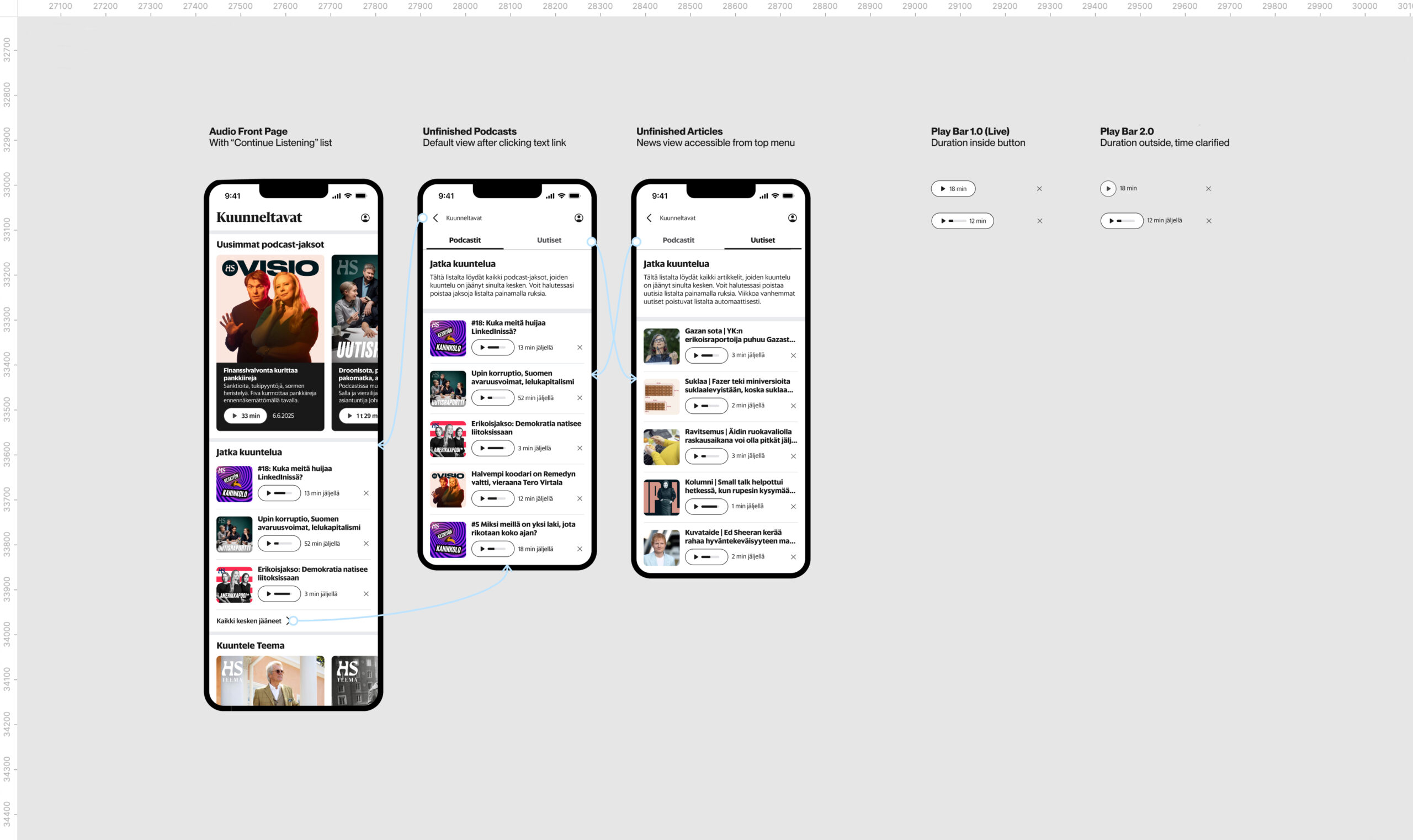
There was no easy way for users to find episodes/articles they hadn’t finished listening to. An “Unfinished” screen was needed. This should include separate tabs for podcasts and news articles, clear information on the listening time remaining, and an easy way to delete episodes or articles one doesn’t want to finish.
There should also be an “Unfinished” list in the audio section’s main view, so that users can effortlessly pick up any content they might want to keep listening to.
The play buttons currently include not only the play icon but also the episode duration. They become particularly crammed for unfinished content, since that’s marked by a progress bar between the other two elements. I argued the button should only include the icon (and the potential progress bar) and that the duration should be moved next to it.
Also, the durations for unfinished episodes are ambiguous. Does “12 min” on the button indicate time listened or time remaining? This matters; our research found many users listen to audio in the background and choose their ‘soundtrack’ based on duration. Tagging the word “jäljellä” (“left”) onto the minutes makes it clear.
3.2 Distinct News Playlists
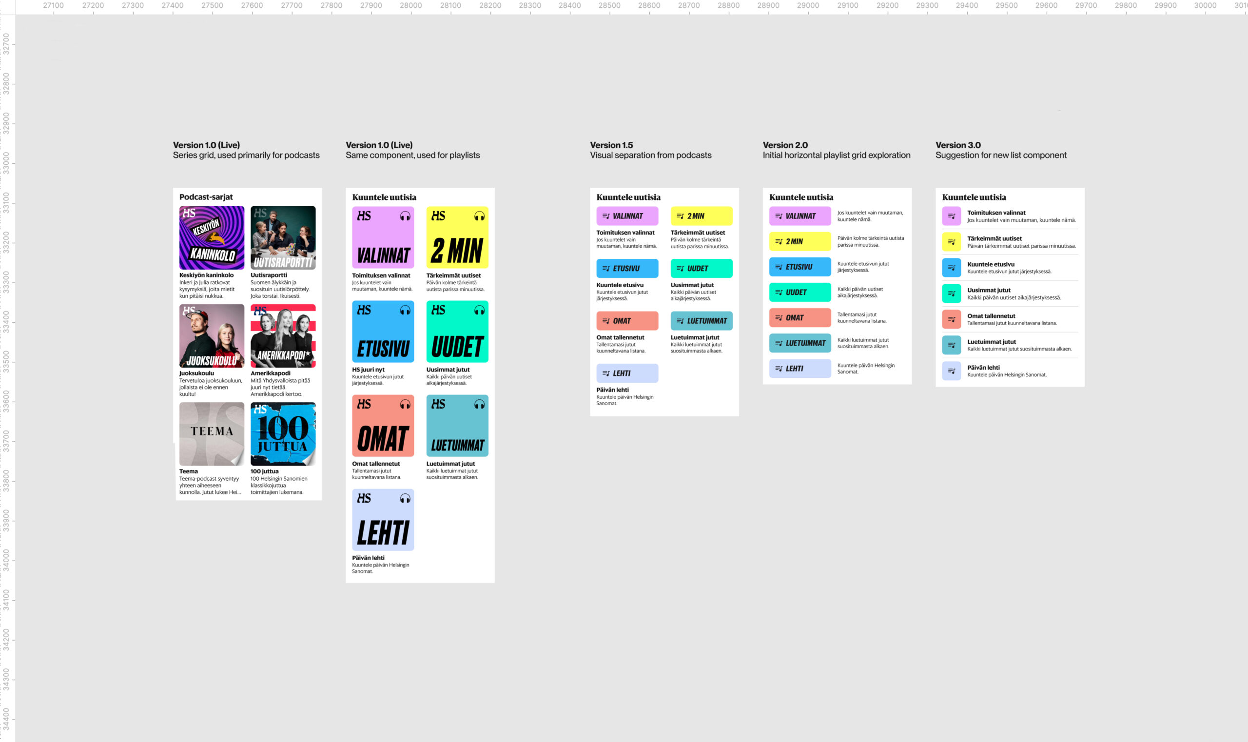
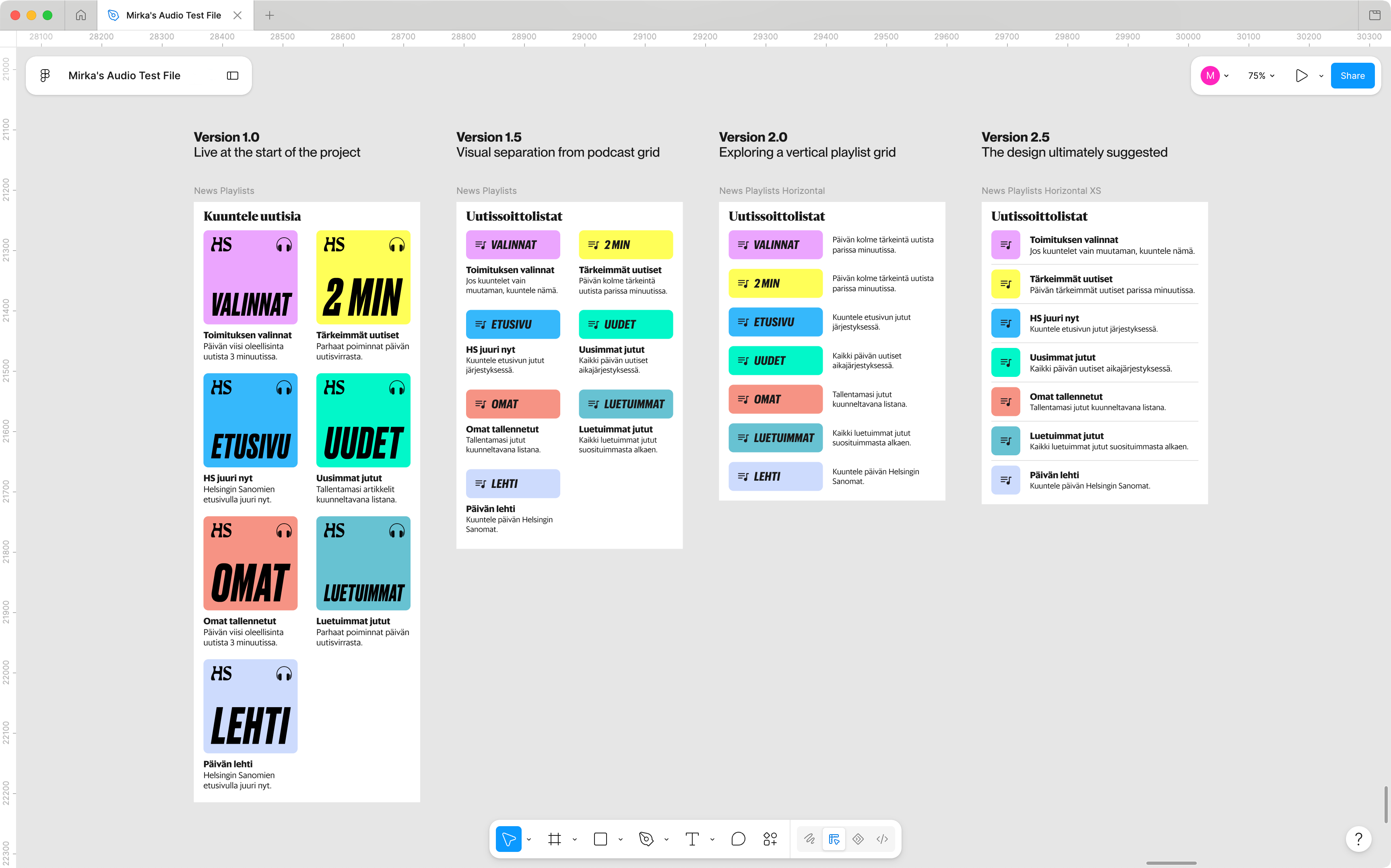
The text-to-speech news playlists were found to be confusing for users: they neither knew how to use them nor what kinds of articles each of them included (i.e., how the playlists differed).
They needed to be visually separated from the existing podcast grid, which relies on visually striking main images to signal original audio journalism, and to be smaller in size so that they can more easily be added to the competitive front page news feed and direct flow to the audio content from there.
I designed a small horizontal grid component which reduces the required space by almost 50% and visually separates the news playlists from the podcasts. I also redesigned the main images for the news playlists, since the old ones were cluttered and used a different headphone icon for an unknown reason.
I also recommended that the playlists’ colors and names be revisited. In particular, the front page playlist should simply be called “Etusivu” (“Front Page”) or “Kuuntele etusivu” (“Listen to the Front Page”) instead of “HS juuri nyt” (“HS Right Now”), to maximize clarity.
3.3 Easy Access to Saved Content
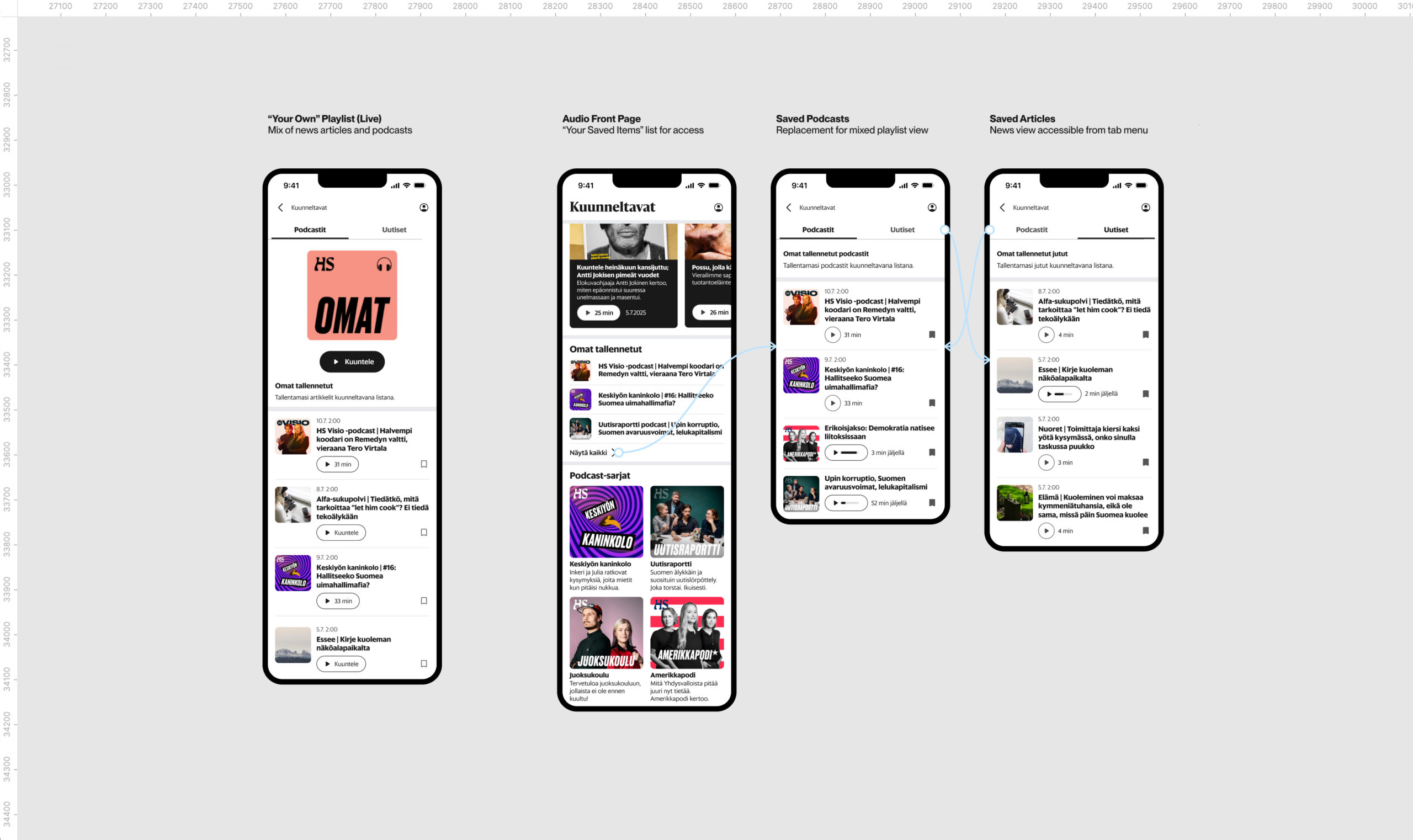
Another major challenge was the lack of hassle-free access to items that users have saved for later. This is likely to severely deter listeners from returning to HS audio content.
Setting this up in a clear way is no easy feat, particularly because all of the saved items, regardless of type, are currently structured as a part of a playlist titled “Omat” (lit. “Your Own”). How can audio-first content (e.g. podcast episodes) and text-first content (e.g. news articles) coexist without causing confusion? What’s the best way to access them outside of the (unintuitive) news playlist grid?
Fixing this would require a complete overhaul of the navigational system in the app, which meant that it was far from being implemented or even user-tested during my time in the team, but I felt it was an important issue to highlight still.
Note also the discrepancies between the news and podcast play buttons (leftmost screen). The podcast play button currently also includes the episode duration, whereas the news button has the generic “Kuuntele” (“Listen”). My suggestion was to harmonize the two but move the duration to the right side of the button to eliminate any possible ambiguity about the button’s function.
3.4 Revamped Episode View
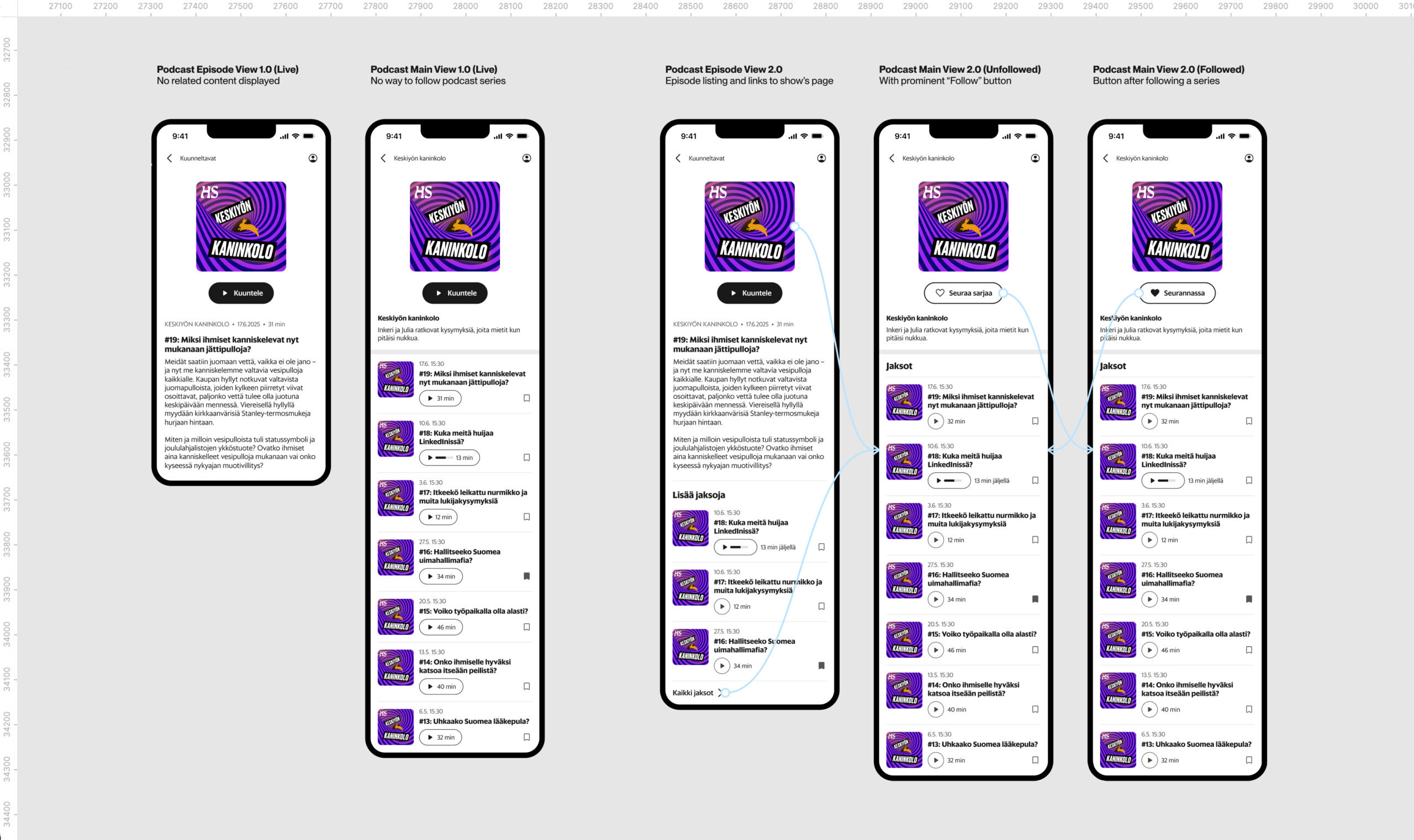
The podcast episode screens were very bare, only including the podcast image, a play button, and the episode description. Critical navigation to further audio content was lacking. In fact, access from a singular podcast episode to its main show was hidden under the profile picture menu in the top bar. Due to this, users can easily be directed to an episode from the front page and never find their way to further audio content.
I sketched an improved episode screen, where the main image links to the podcast series, the episode description is followed by a list of more episodes, and those in turn are trailed by a straightforward text button that takes the user to the series’ main screen.
There should also be a simple way to follow a podcast series and get push notifications about when a new episode is released. My suggested fix was changing the primary button on the series view from the generic “Kuuntele” (“Listen”) – which starts the newest episode, but doesn’t make that clear – to a secondary button which lets the user follow or unfollow a series.
3.5 Revamped Playlist View
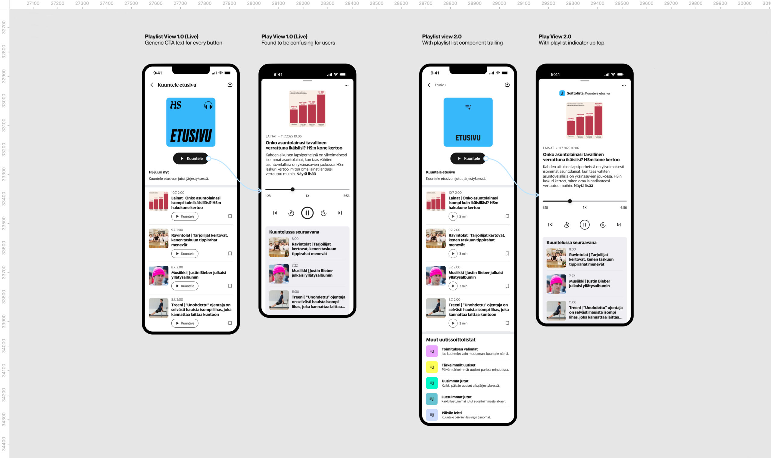
I suggested some improvements for the text-to-speech news playlist screens, as well. These were primarily that the articles’ play buttons should be edited from the generic “Kuuntele” (“Listen”) text to show the durations next to the buttons, and that the other news playlists should be displayed at the bottom of the screen.
I also argued that an opened playlist should have a title that includes a small version of the new playlist icons to make it more clear to users what they’re looking at. Finding, understanding, navigating, and differentiating between the news playlists was one of the most difficult things for users according to the interviews conducted before this design process began.
Note also the polished control panel of the playing view (rightmost screen), featuring the new Back15 and Skip15 icons I created. Check out the project Sanoma Design System Work to see more of my icon and pictogram designs.
3.6 Other Improvements
I also made several more minor suggestions for better user experience and visual cohesion.
For example, I recommended reviewing the entire headline system used in the app. Instead of showing the screen a user would get back to by clicking the back button, the headers included the headline of the current screen. This was redundant, because in a news application, each screen already has its title prominently displayed. It also hindered effective navigation by making the the back button less clear.
I edited the podcast grid component to be more unified with the rest of the app, which is built on 16 px gaps between different elements, by reducing its vertical gap from 31 px to 16 px.
I wrote tickets for several small discrepancies between the Android and iOS versions, such as iOS showing the podcast runtimes as “1 h 1 min” whereas Android displayed “1h1m”.
Overall, my detail-oriented nature really shone in this project. I find great pleasure in ensuring visual and behavioral clarity and consistency within design, and bettering the overall user experience through that.
04
Unsolved Problems
As is always the case, many issues without an elegant solution remained, and were still in the research pipeline when I moved from the Audiovideo Team to the Design System Team.
Examples:
A. On the front page, the same headphone icon is now used in both the article teasers and the bottom menu, but clicking the former starts a text-to-speech read-through of the article, whereas the latter takes the user to the audio section. Do these actions need to be better differentiated, to ensure the user always knows what will happen when they click somewhere?
B. The new, smaller, news playlist component uses the same icon for each of the playlists, so the only ways to differentiate between them are the colors and the titles. That’s suboptimal from a user’s perspective, in particular because I noticed the colors haven’t been verified for accessibility. How could the playlists be further separated? Could a set of different but visually related playlist icons be created?
I marked these issues as needing further consideration when I handed off the project to the Audiovideo team’s Lead Designer.
01
The Starting Point
When I joined the team, the audiovideo content in the Helsingin Sanomat app was very close to the MVP released a couple of months earlier. The primary destination for audio content was the Kuuntele (“Listen”) section, which was devoted to podcasts, audio articles, and text-to-speech playlists of the day’s main stories (right).
The front page (left) had no permanent audio-related calls to action outside of the bottom menu. The primary problem quickly became clear: in order for listening to increase, users needed to be made aware of the existence of proprietary audio content in the HS app. The app needed to become an audio destination.
In order for that to happen, several old features had to be refined and new ones added.
.
.
My independent roles in this project:
I carried out a comprehensive visual and functional overview of the entire Kuuntele (“Listen”) section of the HS app and came with suggestions for new components and UX improvements, many of which have since undergone user testing.
My collaborative roles in this project:
I prepared user interviews and tests together with the Team Lead and the Lead Designer, co-conducted the interviews, discussed the findings with my colleagues, and helped compile and prioritize a list of concrete future audio improvements.
02
The Front Page
Several changes to the front page were suggested after user interviews and testing:
A. The headphone icon should be added to every story on the front page, reinforcing the connection between the icon and the ability to listen to HS’ content, and providing users a quick and easy way to access audio.
B. Many users were interested in listening to text-to-speech articles, particularly the front page news, but didn’t know how to or found it too difficult. This could be facilitated by showing the front page playlist on the front page.
C. The text-to-speech playlists could also be promoted by adding a CTA button (“Listen”) under the front page news summaries. Clicking would lead to the summary playlist, and provide yet another access point to audio content.
D. Audio content would benefit from a versatile presence on the front page. For example, a carousel of popular podcast episodes could be shown with a curiosity-triggering headline such as “This is what others are listening to”.
E. The current name of the section, “Kuuntele” (“Listen”), should be A/B tested against “Kuunneltavat” (“Audio”), to see if that makes it clearer to users that the headphone icon in the menu leads to a separate audio section.
I conducted this primary research together with the Team Lead and Lead Designer.
.
03
The Audio Section
For the “Kuuntele” (“Listen”) section, I designed new components and reworked old ones based on needs uncovered by the previous research. I also proposed visual solutions for certain basic functionalities that were known to be missing.
Some of this work is presented below.
Note that while the examples I’m about to give pertain to the Helsingin Sanomat app in particular, I designed everything as Design-System-compatible white-label components using semantic tokens. They can therefore be seamlessly used by all of Sanoma’s brands.
Based on the previous research, I carried out this part of the project independently.
.
3.1 An “Unfinished” Screen
There was no easy way for users to find episodes/articles they hadn’t finished listening to. An “Unfinished” screen was needed. This should include separate tabs for podcasts and news articles, clear information on the listening time remaining, and an easy way to delete episodes or articles one doesn’t want to finish.
There should also be an “Unfinished” list in the audio section’s main view, so that users can effortlessly pick up any content they might want to keep listening to.
The play buttons currently include not only the play icon but also the episode duration. They become particularly crammed for unfinished content, since that’s marked by a progress bar between the other two elements. I argued the button should only include the icon (and the potential progress bar) and that the duration should be moved next to it.
Also, the durations for unfinished episodes are ambiguous. Does “12 min” on the button indicate time listened or time remaining? This matters; our research found many users listen to audio in the background and choose their ‘soundtrack’ based on duration. Tagging the word “jäljellä” (“left”) onto the minutes makes it clear.
3.2 Distinct News Playlists
The text-to-speech news playlists were found to be confusing for users: they neither knew how to use them nor what kinds of articles each of them included (i.e., how the playlists differed).
They needed to be visually separated from the existing podcast grid, which relies on visually striking main images to signal original audio journalism, and to be smaller in size so that they can more easily be added to the competitive front page news feed and direct flow to the audio content from there.
I designed a small horizontal grid component which reduces the required space by almost 50% and visually separates the news playlists from the podcasts. I also redesigned the main images for the news playlists, since the old ones were cluttered and used a different headphone icon for an unknown reason.
I also recommended that the playlists’ colors and names be revisited. In particular, the front page playlist should simply be called “Etusivu” (“Front Page”) or “Kuuntele etusivu” (“Listen to the Front Page”) instead of “HS juuri nyt” (“HS Right Now”), to maximize clarity.
3.3 Easy Access to Saved Content
Another major challenge was the lack of hassle-free access to items that users have saved for later. This is likely to severely deter listeners from returning to HS audio content.
Setting this up in a clear way is no easy feat, particularly because all of the saved items, regardless of type, are currently structured as a part of a playlist titled “Omat” (lit. “Your Own”). How can audio-first content (e.g. podcast episodes) and text-first content (e.g. news articles) coexist without causing confusion? What’s the best way to access them outside of the (unintuitive) news playlist grid?
Fixing this would require a complete overhaul of the navigational system in the app, which meant that it was far from being implemented or even user-tested during my time in the team, but I felt it was an important issue to highlight still.
Note also the discrepancies between the news and podcast play buttons (leftmost screen). The podcast play button currently also includes the episode duration, whereas the news button has the generic “Kuuntele” (“Listen”). My suggestion was to harmonize the two but move the duration to the right side of the button to eliminate any possible ambiguity about the button’s function.
3.4 Revamped Episode View
The podcast episode screens were very bare, only including the podcast image, a play button, and the episode description. Critical navigation to further audio content was lacking. In fact, access from a singular podcast episode to its main show was hidden under the profile picture menu in the top bar. Due to this, users can easily be directed to an episode from the front page and never find their way to further audio content.
I sketched an improved episode screen, where the main image links to the podcast series, the episode description is followed by a list of more episodes, and those in turn are trailed by a straightforward text button that takes the user to the series’ main screen.
There should also be a simple way to follow a podcast series and get push notifications about when a new episode is released. My suggested fix was changing the primary button on the series view from the generic “Kuuntele” (“Listen”) – which starts the newest episode, but doesn’t make that clear – to a secondary button which lets the user follow or unfollow a series.
3.5 Revamped Playlist View
I suggested some improvements for the text-to-speech news playlist screens, as well. These were primarily that the articles’ play buttons should be edited from the generic “Kuuntele” (“Listen”) text to show the durations next to the buttons, and that the other news playlists should be displayed at the bottom of the screen.
I also argued that an opened playlist should have a title that includes a small version of the new playlist icons to make it more clear to users what they’re looking at. Finding, understanding, navigating, and differentiating between the news playlists was one of the most difficult things for users according to the interviews conducted before this design process began.
Note also the polished control panel of the playing view (rightmost screen), featuring the new Back15 and Skip15 icons I created. Check out the project Sanoma Design System Work to see more of my icon and pictogram designs.
04
Unsolved Problems
As is always the case, many issues without an elegant solution remained, and were still in the research pipeline when I moved from the Audiovideo Team to the Design System Team.
Examples:
A. On the front page, the same headphone icon is now used in both the article teasers and the bottom menu, but clicking the former starts a text-to-speech read-through of the article, whereas the latter takes the user to the audio section. Do these actions need to be better differentiated, to ensure the user always knows what will happen when they click somewhere?
B. The new, smaller, news playlist component uses the same icon for each of the playlists, so the only ways to differentiate between them are the colors and the titles. That’s suboptimal from a user’s perspective, in particular because I noticed the colors haven’t been verified for accessibility. How could the playlists be further separated? Could a set of different but visually related playlist icons be created?
I marked these issues as needing further consideration when I handed off the project to the Audiovideo team’s Lead Designer.
.
01
The Starting Point
When I joined the team, the audiovideo content in the Helsingin Sanomat app was very close to the MVP released a couple of months earlier. The primary destination for audio content was the Kuuntele (“Listen”) section, which was devoted to podcasts, audio articles, and text-to-speech playlists of the day’s main stories (right).
The front page (left) had no permanent audio-related calls to action outside of the bottom menu. The primary problem quickly became clear: in order for listening to increase, users needed to be made aware of the existence of proprietary audio content in the HS app. The app needed to become an audio destination.
In order for that to happen, several old features had to be refined and new ones added.
.
My independent roles in this project:
I carried out a comprehensive visual and functional overview of the entire Kuuntele (“Listen”) section of the HS app and came with suggestions for new components and UX improvements, many of which have since undergone user testing.
.
My collaborative roles in this project:
I prepared user interviews and tests together with the Team Lead and the Lead Designer, co-conducted the interviews, discussed the findings with my colleagues, and helped compile and prioritize a list of concrete future audio improvements.
02
The Front Page
Several changes to the front page were suggested after user interviews and testing:
A. The headphone icon should be added to every story on the front page, reinforcing the connection between the icon and the ability to listen to HS’ content, and providing users a quick and easy way to access audio.
B. Many users were interested in listening to text-to-speech articles, particularly the front page news, but didn’t know how to or found it too difficult. This could be facilitated by showing the front page playlist on the front page.
C. The text-to-speech playlists could also be promoted by adding a CTA button (“Listen”) under the front page news summaries. Clicking would lead to the summary playlist, and provide yet another access point to audio content.
D. Audio content would benefit from a versatile presence on the front page. For example, a carousel of popular podcast episodes could be shown with a curiosity-triggering headline such as “This is what others are listening to”.
E. The current name of the section, “Kuuntele” (“Listen”), should be A/B tested against “Kuunneltavat” (“Audio”), to see if that makes it clearer to users that the headphone icon in the menu leads to a separate audio section.
I conducted this primary research together with the Team Lead and Lead Designer.
03
The Audio Section
For the “Kuuntele” (“Listen”) section, I designed new components and reworked old ones based on needs uncovered by the previous research. I also proposed visual solutions for certain basic functionalities that were known to be missing.
Some of this work is presented below.
Note that while the examples I’m about to give pertain to the Helsingin Sanomat app in particular, I designed everything as Design-System-compatible white-label components using semantic tokens. They can therefore be seamlessly used by all of Sanoma’s brands.
Based on the previous research, I carried out this part of the project independently.
3.1 An “Unfinished” Screen
There was no easy way for users to find episodes/articles they hadn’t finished listening to. An “Unfinished” screen was needed. This should include separate tabs for podcasts and news articles, clear information on the listening time remaining, and an easy way to delete episodes or articles one doesn’t want to finish.
There should also be an “Unfinished” list in the audio section’s main view, so that users can effortlessly pick up any content they might want to keep listening to.
The play buttons currently include not only the play icon but also the episode duration. They become particularly crammed for unfinished content, since that’s marked by a progress bar between the other two elements. I argued the button should only include the icon (and the potential progress bar) and that the duration should be moved next to it.
Also, the durations for unfinished episodes are ambiguous. Does “12 min” on the button indicate time listened or time remaining? This matters; our research found many users listen to audio in the background and choose their ‘soundtrack’ based on duration. Tagging the word “jäljellä” (“left”) onto the minutes makes it clear.
3.2 Distinct News Playlists
The text-to-speech news playlists were found to be confusing for users: they neither knew how to use them nor what kinds of articles each of them included (i.e., how the playlists differed).
They needed to be visually separated from the existing podcast grid, which relies on visually striking main images to signal original audio journalism, and to be smaller in size so that they can more easily be added to the competitive front page news feed and direct flow to the audio content from there.
I designed a small horizontal grid component which reduces the required space by almost 50% and visually separates the news playlists from the podcasts. I also redesigned the main images for the news playlists, since the old ones were cluttered and used a different headphone icon for an unknown reason.
I also recommended that the playlists’ colors and names be revisited. In particular, the front page playlist should simply be called “Etusivu” (“Front Page”) or “Kuuntele etusivu” (“Listen to the Front Page”) instead of “HS juuri nyt” (“HS Right Now”), to maximize clarity.
3.3 Easy Access to Saved Content
Another major challenge was the lack of hassle-free access to items that users have saved for later. This is likely to severely deter listeners from returning to HS audio content.
Setting this up in a clear way is no easy feat, particularly because all of the saved items, regardless of type, are currently structured as a part of a playlist titled “Omat” (lit. “Your Own”). How can audio-first content (e.g. podcast episodes) and text-first content (e.g. news articles) coexist without causing confusion? What’s the best way to access them outside of the (unintuitive) news playlist grid?
Fixing this would require a complete overhaul of the navigational system in the app, which meant that it was far from being implemented or even user-tested during my time in the team, but I felt it was an important issue to highlight still.
Note also the discrepancies between the news and podcast play buttons (leftmost screen). The podcast play button currently also includes the episode duration, whereas the news button has the generic “Kuuntele” (“Listen”). My suggestion was to harmonize the two but move the duration to the right side of the button to eliminate any possible ambiguity about the button’s function.
3.4 Revamped Episode View
The podcast episode screens were very bare, only including the podcast image, a play button, and the episode description. Critical navigation to further audio content was lacking. In fact, access from a singular podcast episode to its main show was hidden under the profile picture menu in the top bar. Due to this, users can easily be directed to an episode from the front page and never find their way to further audio content.
I sketched an improved episode screen, where the main image links to the podcast series, the episode description is followed by a list of more episodes, and those in turn are trailed by a straightforward text button that takes the user to the series’ main screen.
There should also be a simple way to follow a podcast series and get push notifications about when a new episode is released. My suggested fix was changing the primary button on the series view from the generic “Kuuntele” (“Listen”) – which starts the newest episode, but doesn’t make that clear – to a secondary button which lets the user follow or unfollow a series.
3.5 Revamped Playlist View
I suggested some improvements for the text-to-speech news playlist screens, as well. These were primarily that the articles’ play buttons should be edited from the generic “Kuuntele” (“Listen”) text to show the durations next to the buttons, and that the other news playlists should be displayed at the bottom of the screen.
I also argued that an opened playlist should have a title that includes a small version of the new playlist icons to make it more clear to users what they’re looking at. Finding, understanding, navigating, and differentiating between the news playlists was one of the most difficult things for users according to the interviews conducted before this design process began.
Note also the polished control panel of the playing view (rightmost screen), featuring the new Back15 and Skip15 icons I created. Check out the project Sanoma Design System Work to see more of my icon and pictogram designs.
04
Unsolved Problems
As is always the case, many issues without an elegant solution remained, and were still in the research pipeline when I moved from the Audiovideo Team to the Design System Team.
Examples:
A. On the front page, the same headphone icon is now used in both the article teasers and the bottom menu, but clicking the former starts a text-to-speech read-through of the article, whereas the latter takes the user to the audio section. Do these actions need to be better differentiated, to ensure the user always knows what will happen when they click somewhere?
B. The new, smaller, news playlist component uses the same icon for each of the playlists, so the only ways to differentiate between them are the colors and the titles. That’s suboptimal from a user’s perspective, in particular because I noticed the colors haven’t been verified for accessibility. How could the playlists be further separated? Could a set of different but visually related playlist icons be created?
I marked these issues as needing further consideration when I handed off the project to the Audiovideo team’s Lead Designer.