Alchemist’s Elixir
Type
Self-Initiated Work
Tags
Illustration
Packaging Design
Branding
Year
2018
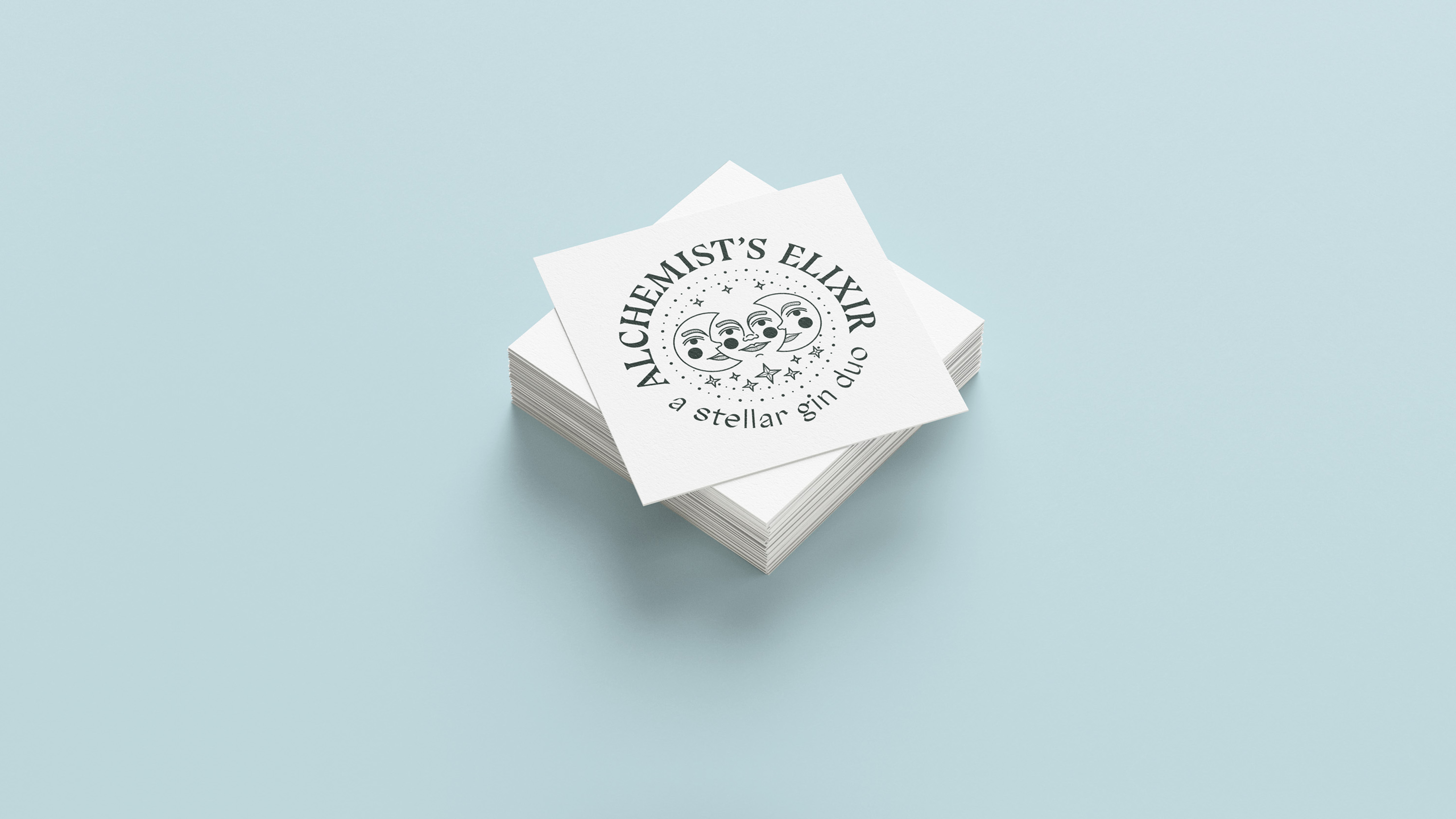
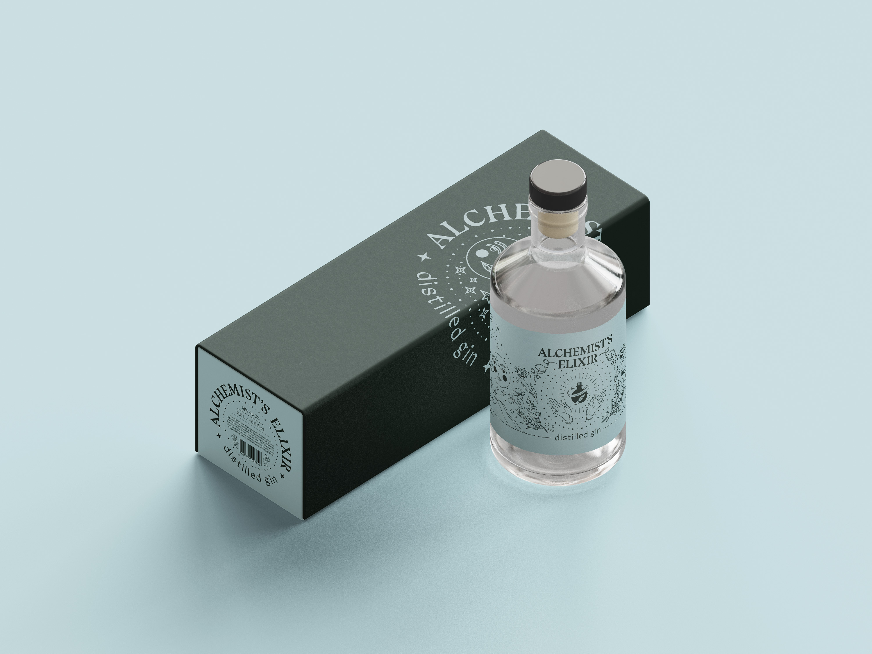
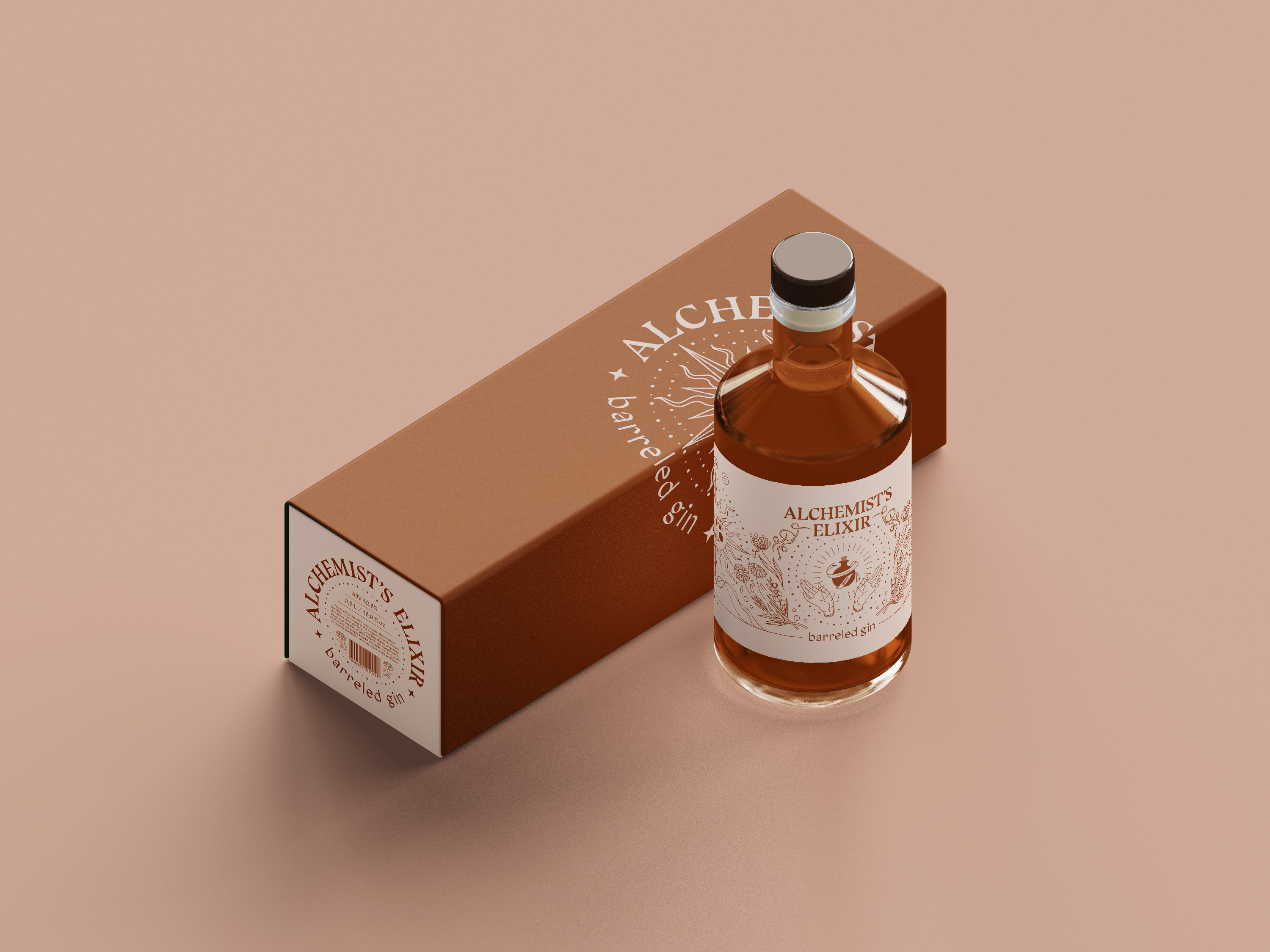
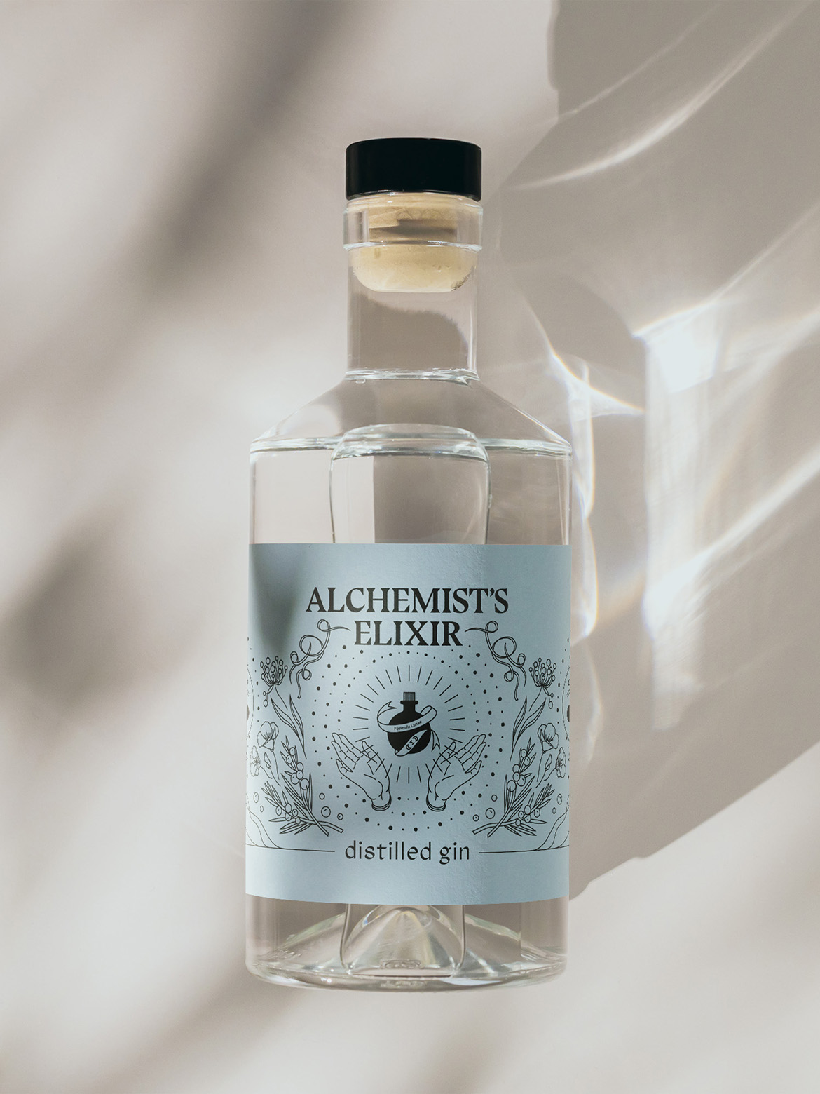
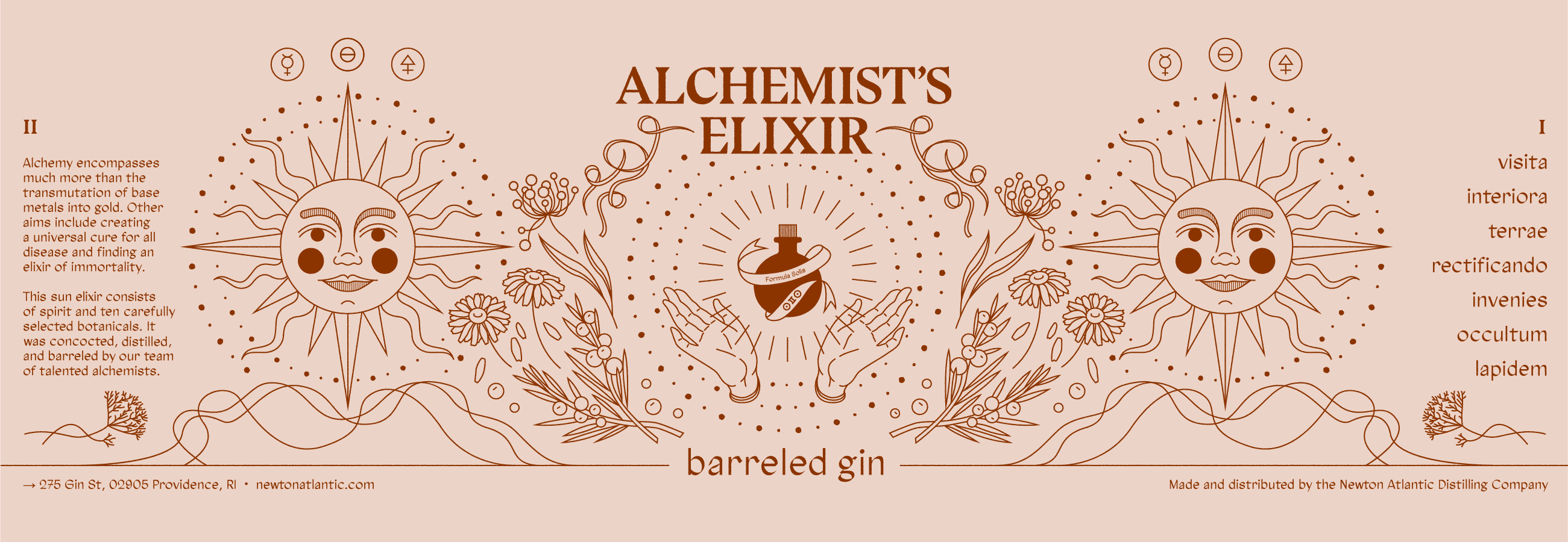
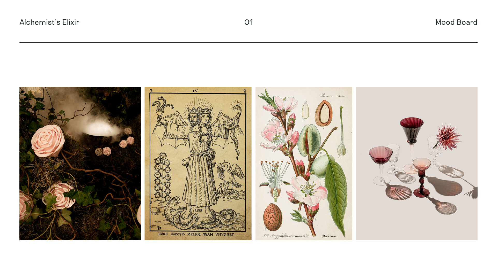
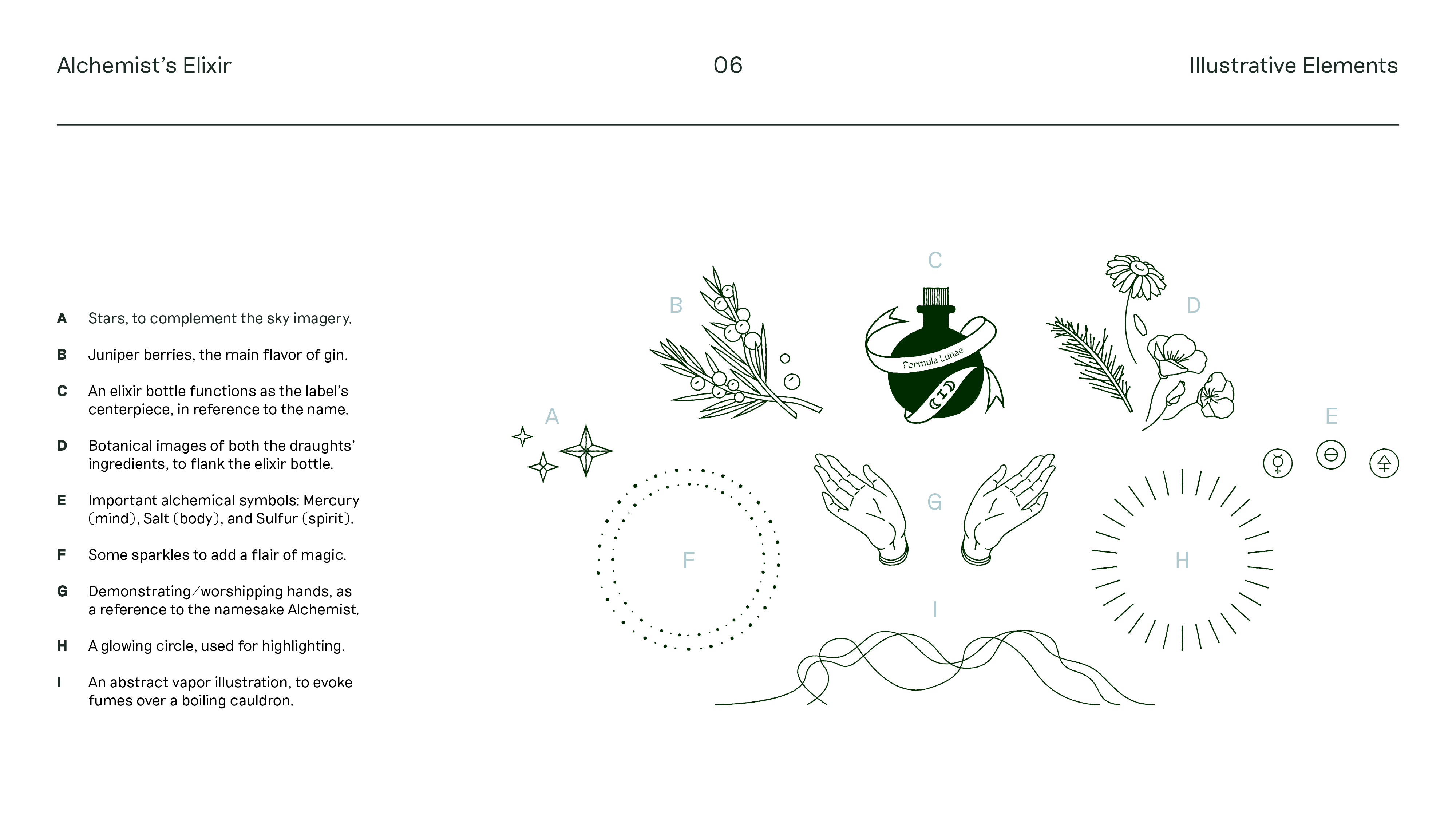
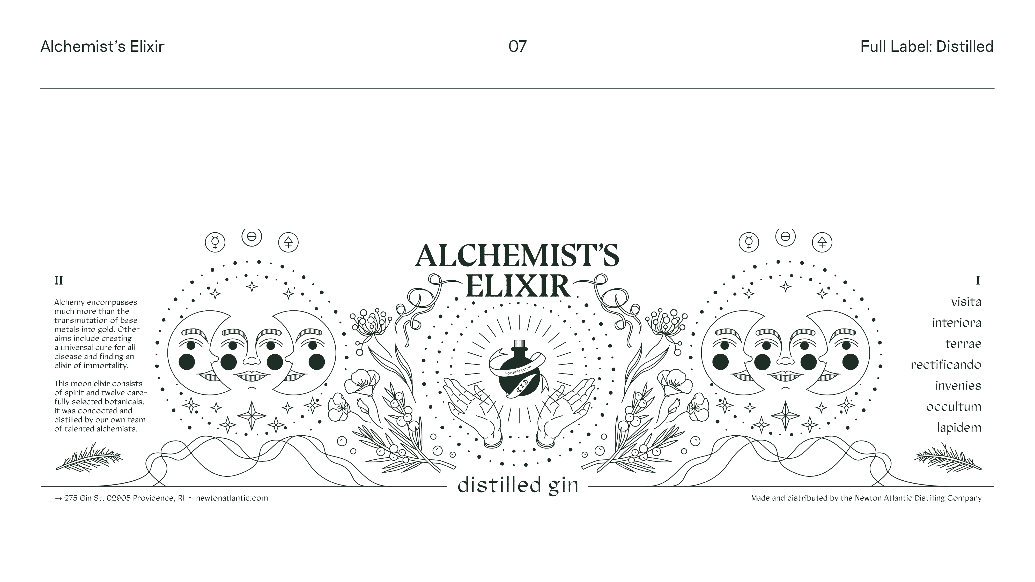
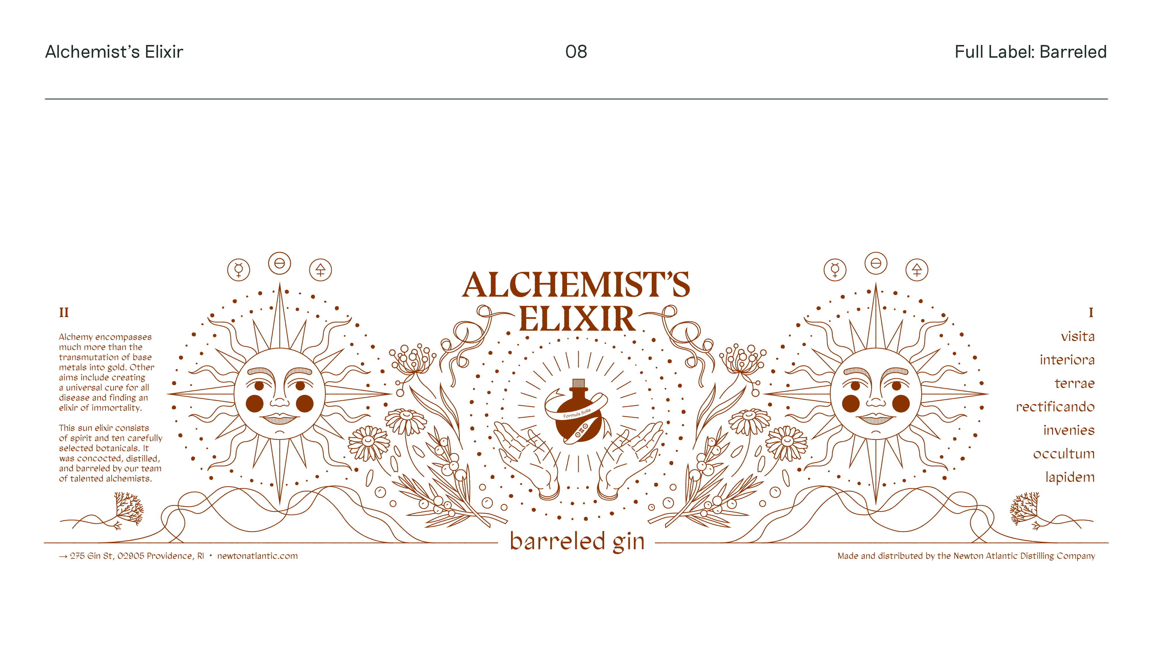
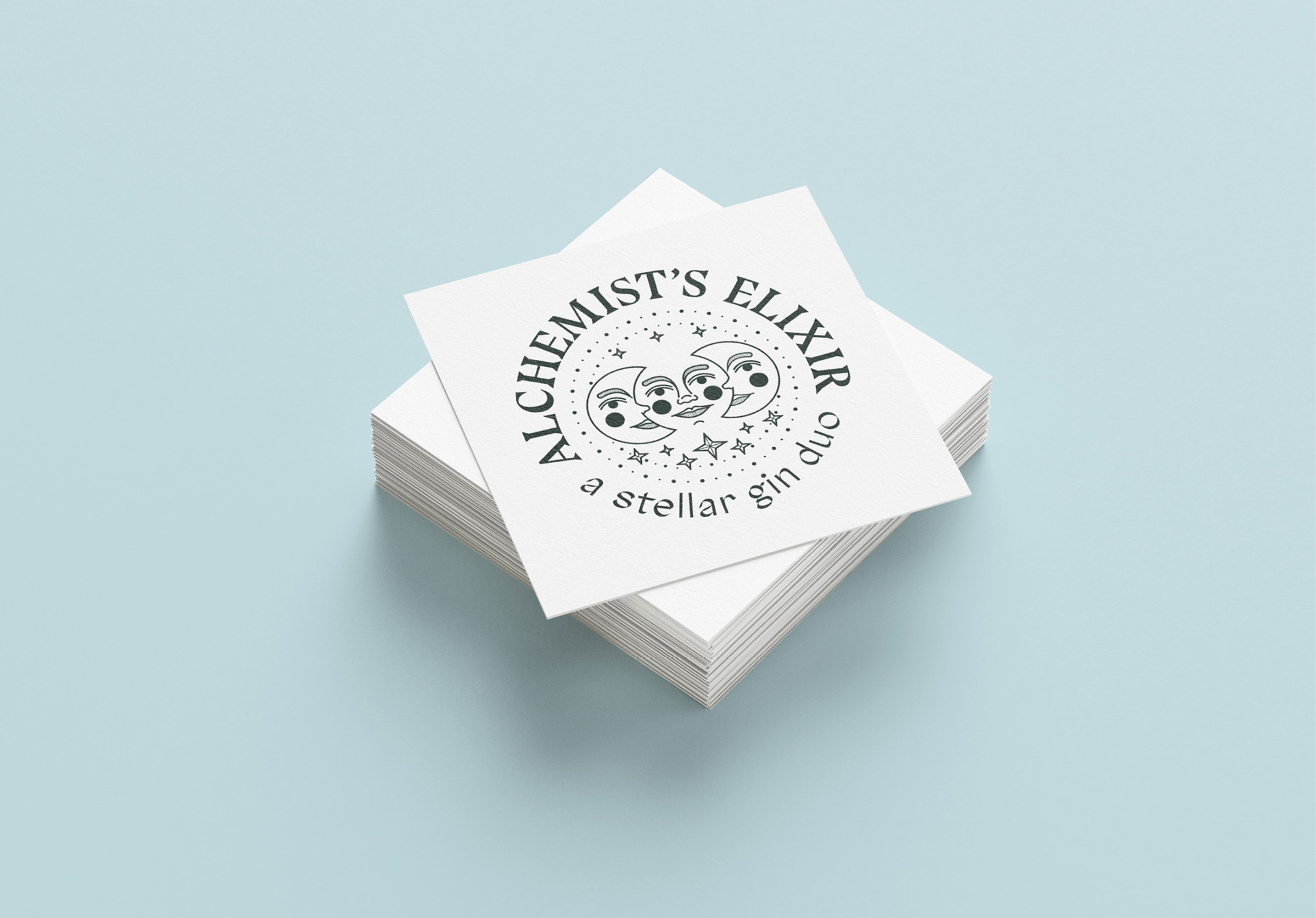
I created this project during a class in branding and packaging because I got an idea for a fictional distillery which makes a gin duo: one distilled, the other barreled. I thought it would be fun to research magic and alchemy, since their visual worlds have always fascinated me, and let those findings guide my label designs for the beverages. I also wanted to push myself and make something very ornamented, since I tend to gravitate towards visual restraint with my illustrations.
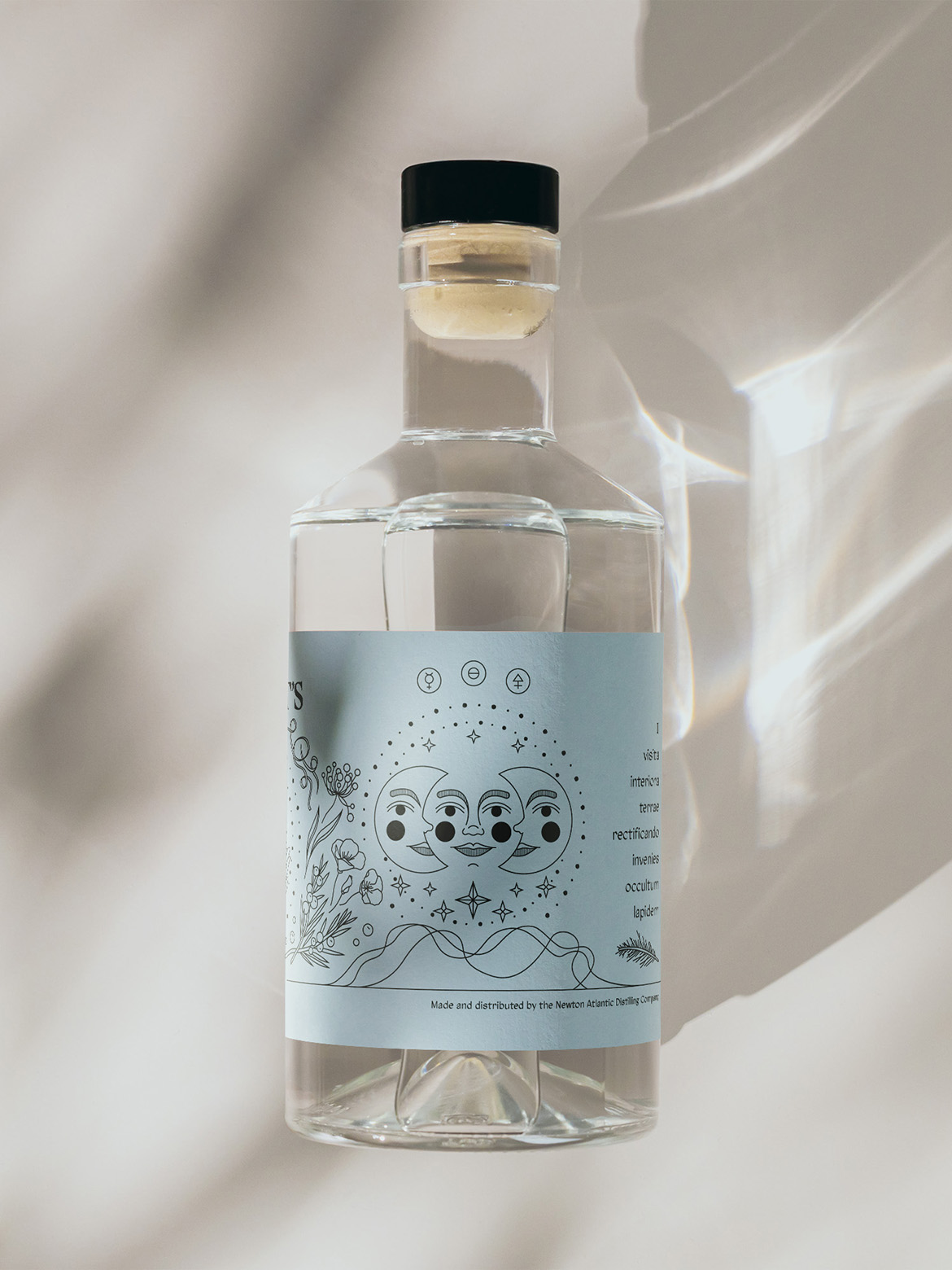
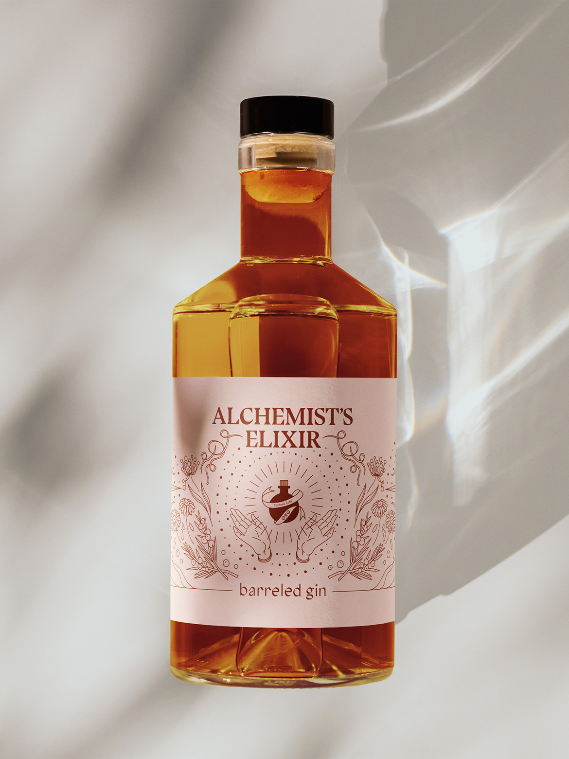
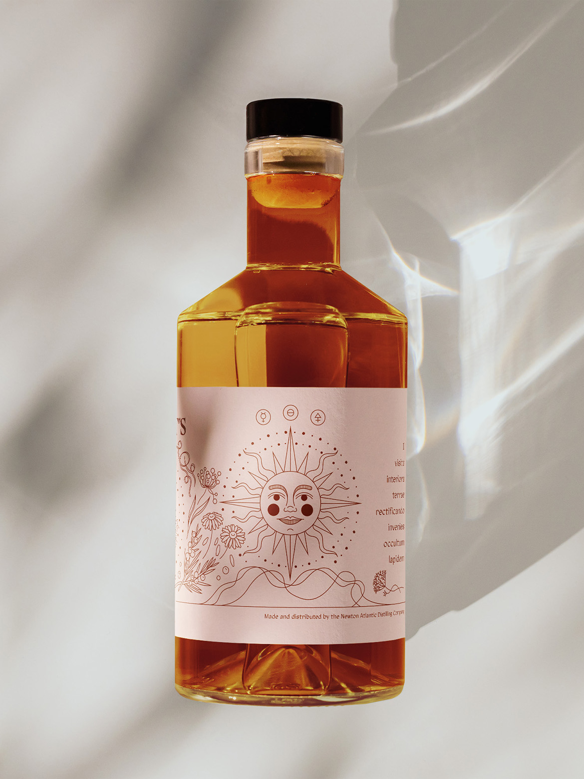
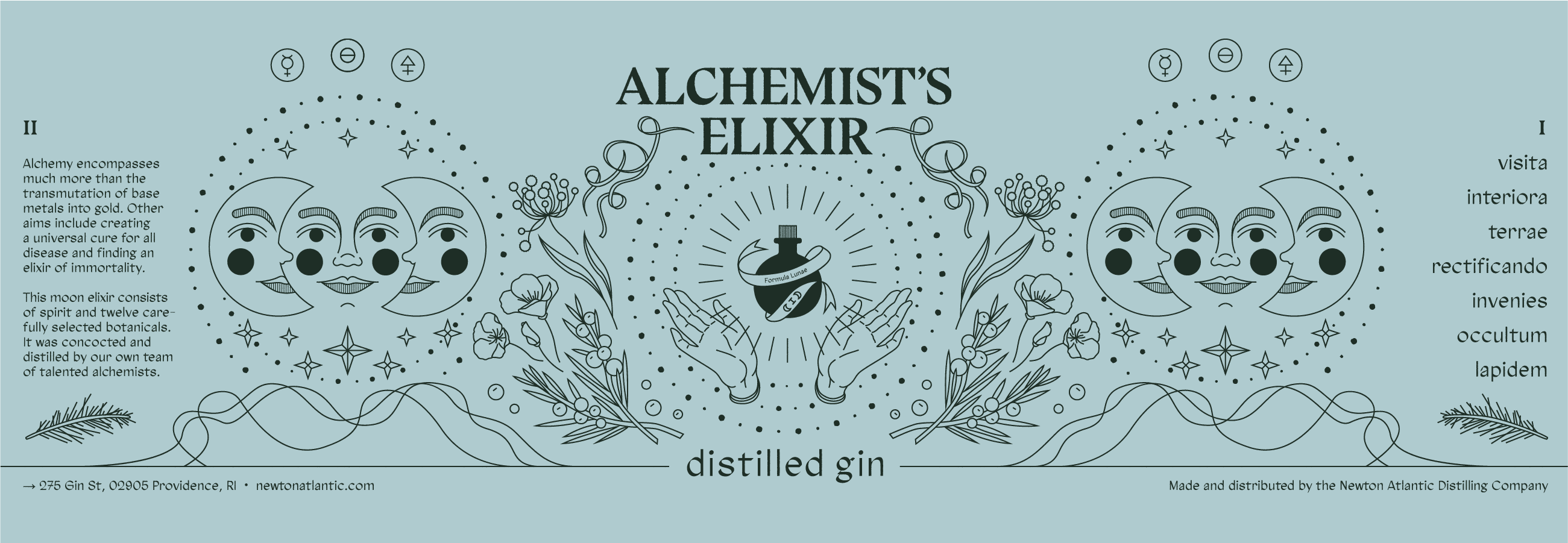
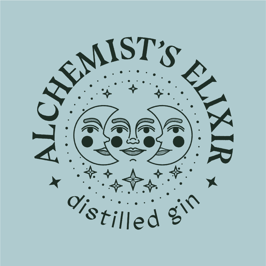
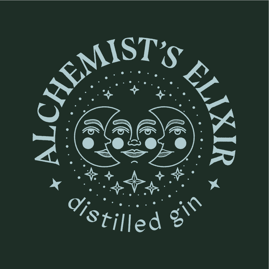
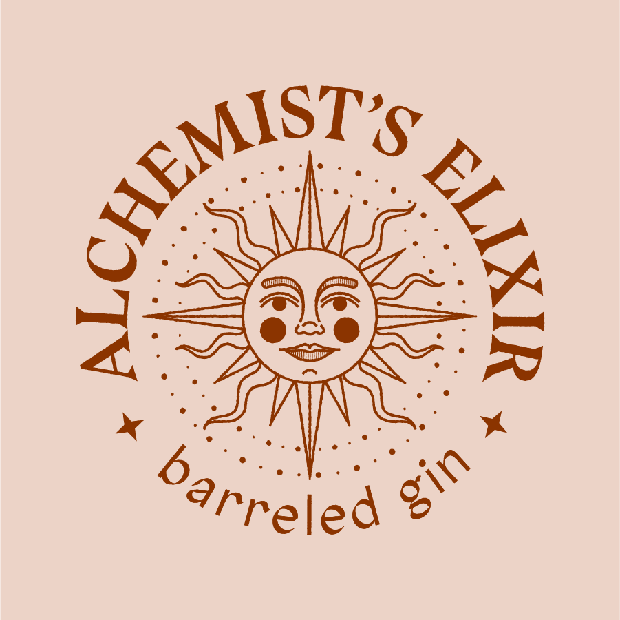
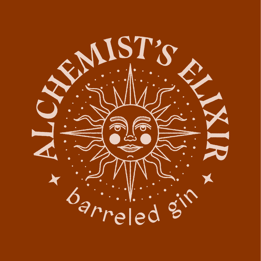
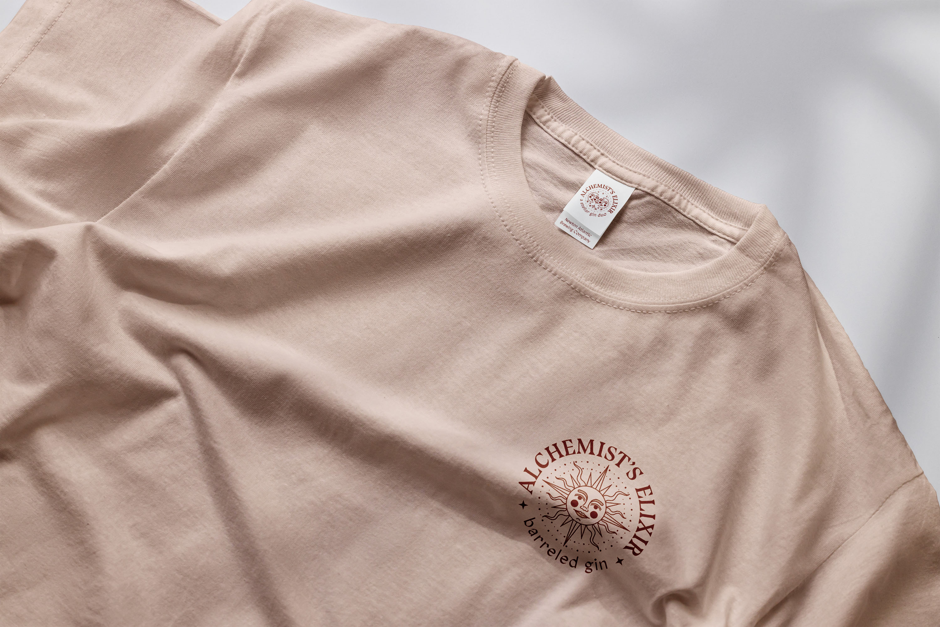
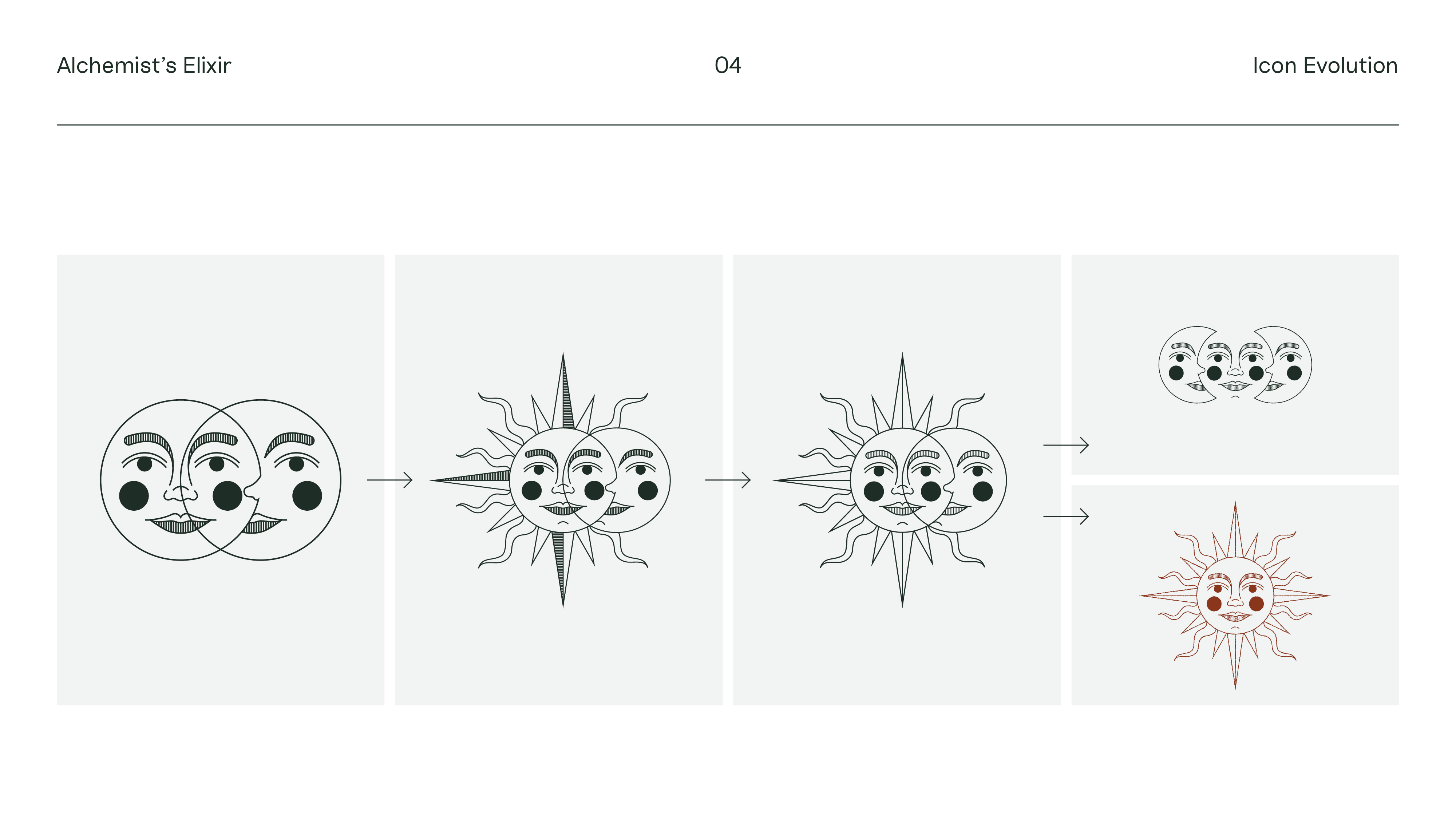
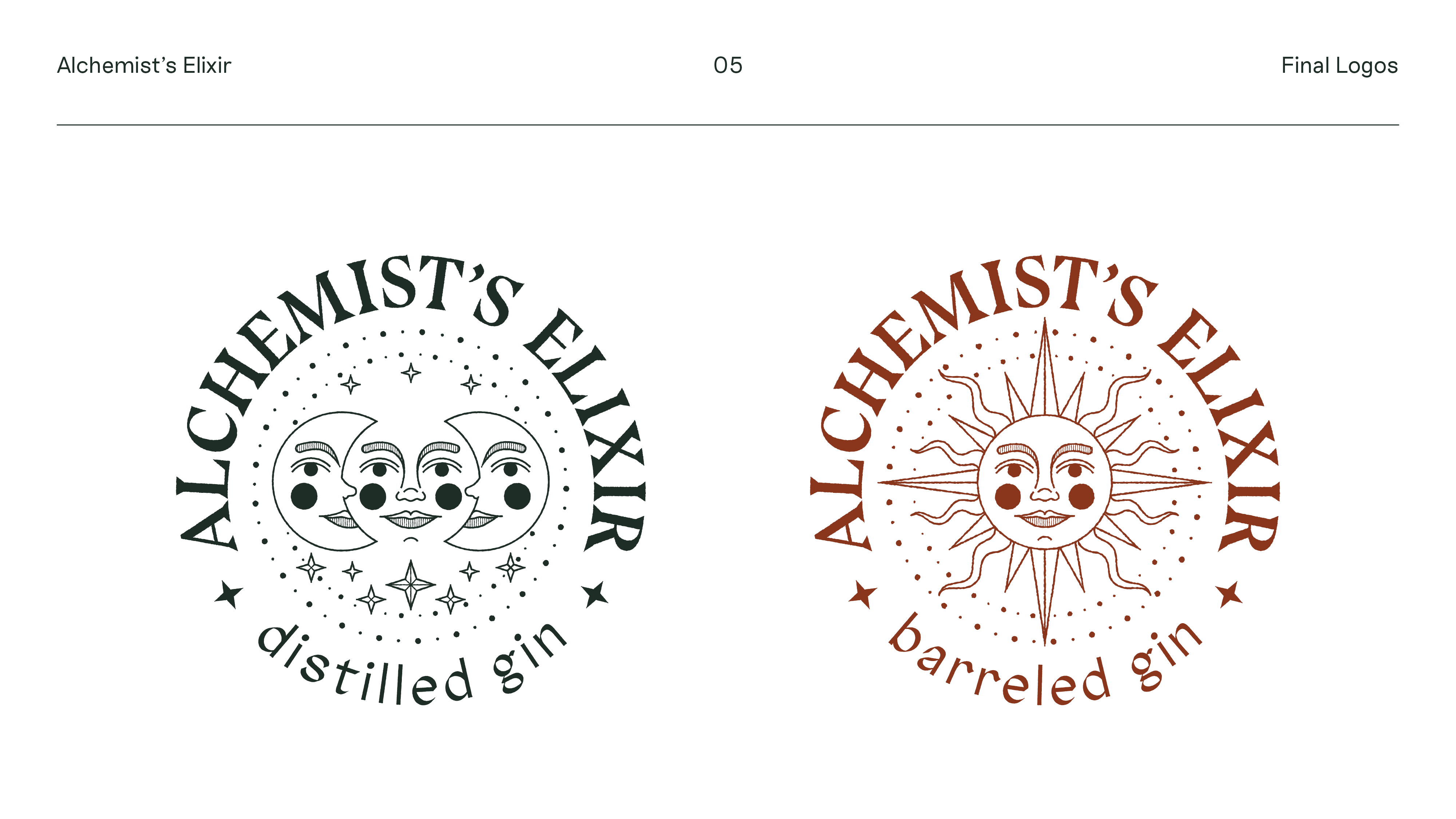
Both designs are inspired by celestial bodies: the moon for the clear distilled gin and the sun for the amber barreled gin, both central symbols in alchemy. These are complemented by floral illustrations, which represent the herbs used for the respective liquors. The colors are were chosen to match: a cool blue with a complementing green for the moon, and a warm beige with a complementing brown for the sun. Overall, the concept relies on juxtapositions to separate the two drinks: sun—moon / day—night / warm—cool / colorless—colorful.
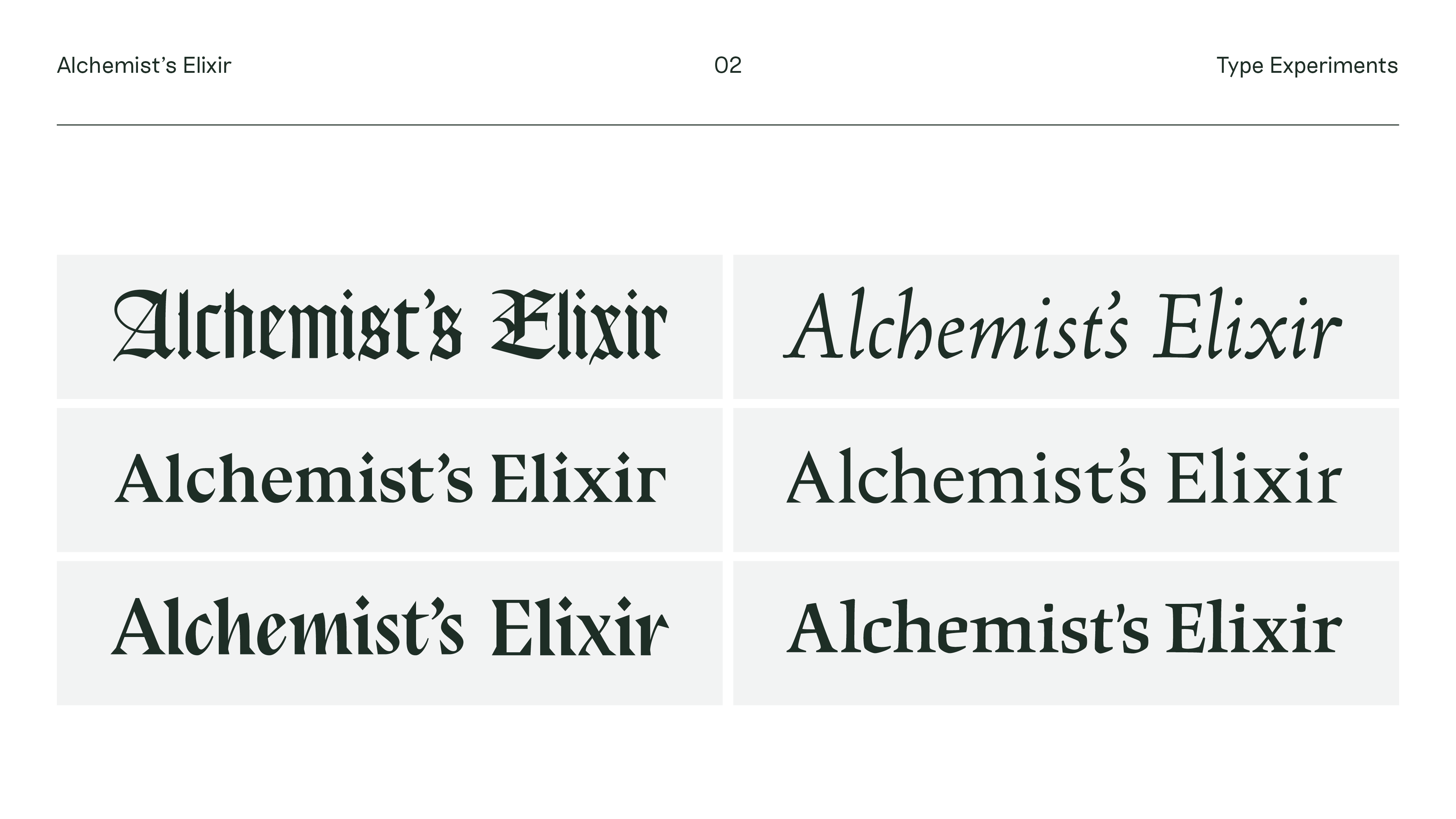
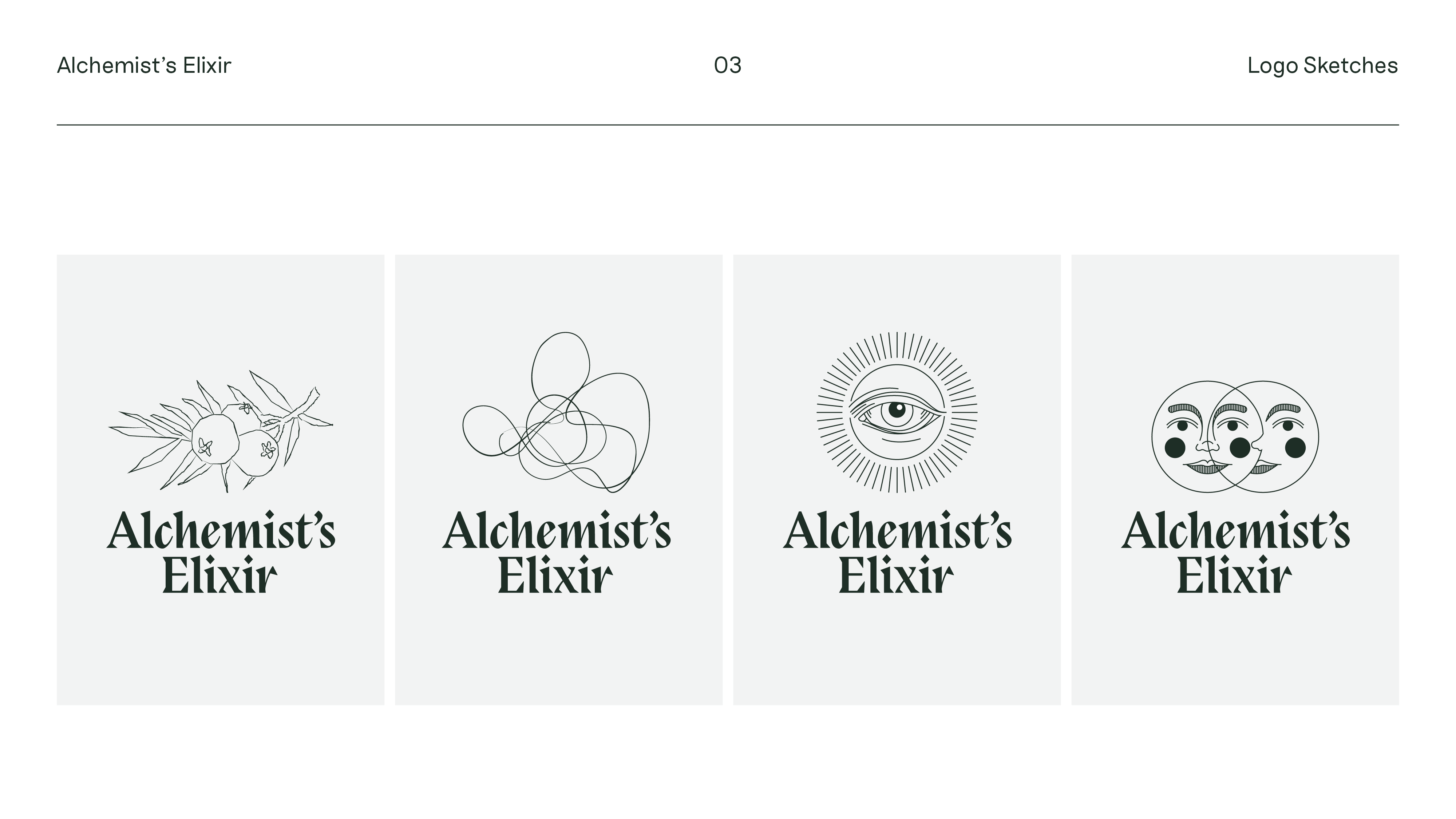
I’ve included a presentation deck which shows some of the steps of my design process.
Alchemist’s
Elixir
Type
Self-Initiated Work
Tags
Illustration
Packaging Design
Branding
Year
2018
I created this project during a class in branding and packaging because I got an idea for a fictional distillery which makes a gin duo: one distilled, the other barreled. I thought it would be fun to research magic and alchemy, since their visual worlds have always fascinated me, and let those findings guide my label designs for the beverages. I also wanted to push myself and make something very ornamented, since I tend to gravitate towards visual restraint with my illustrations.
Both designs are inspired by celestial bodies: the moon for the clear distilled gin and the sun for the amber barreled gin, both central symbols in alchemy. These are complemented by floral illustrations, which represent the herbs used for the respective liquors. The colors are were chosen to match: a cool blue with a complementing green for the moon, and a warm beige with a complementing brown for the sun. Overall, the concept relies on juxtapositions to separate the two drinks: sun—moon / day—night / warm—cool / colorless—colorful.
I’ve included a presentation deck which shows some of the steps of my design process.
Alchemist’s Elixir
Type Self-Initiated Work
Tags Illustration. Packaging Design, Branding
Year 2018
I created this project during a class in branding and packaging because I got an idea for a fictional distillery which makes a gin duo: one distilled, the other barreled. I thought it would be fun to research magic and alchemy, since their visual worlds have always fascinated me, and let those findings guide my label designs for the beverages. I also wanted to push myself and make something very ornamented, since I tend to gravitate towards visual restraint with my illustrations.
Both designs are inspired by celestial bodies: the moon for the clear distilled gin and the sun for the amber barreled gin, both central symbols in alchemy. These are complemented by floral illustrations, which represent the herbs used for the respective liquors. The colors are were chosen to match: a cool blue with a complementing green for the moon, and a warm beige with a complementing brown for the sun. Overall, the concept relies on juxtapositions to separate the two drinks: sun—moon / day—night / warm—cool / colorless—colorful.
Visit the desktop version of this site to view a presentation deck that shows some of the steps of my design process.
