Northern Dimension
Type
Client Work (Concept)
Client
The Northern Dimension
Tags
Branding
Logo Design
Year
2019
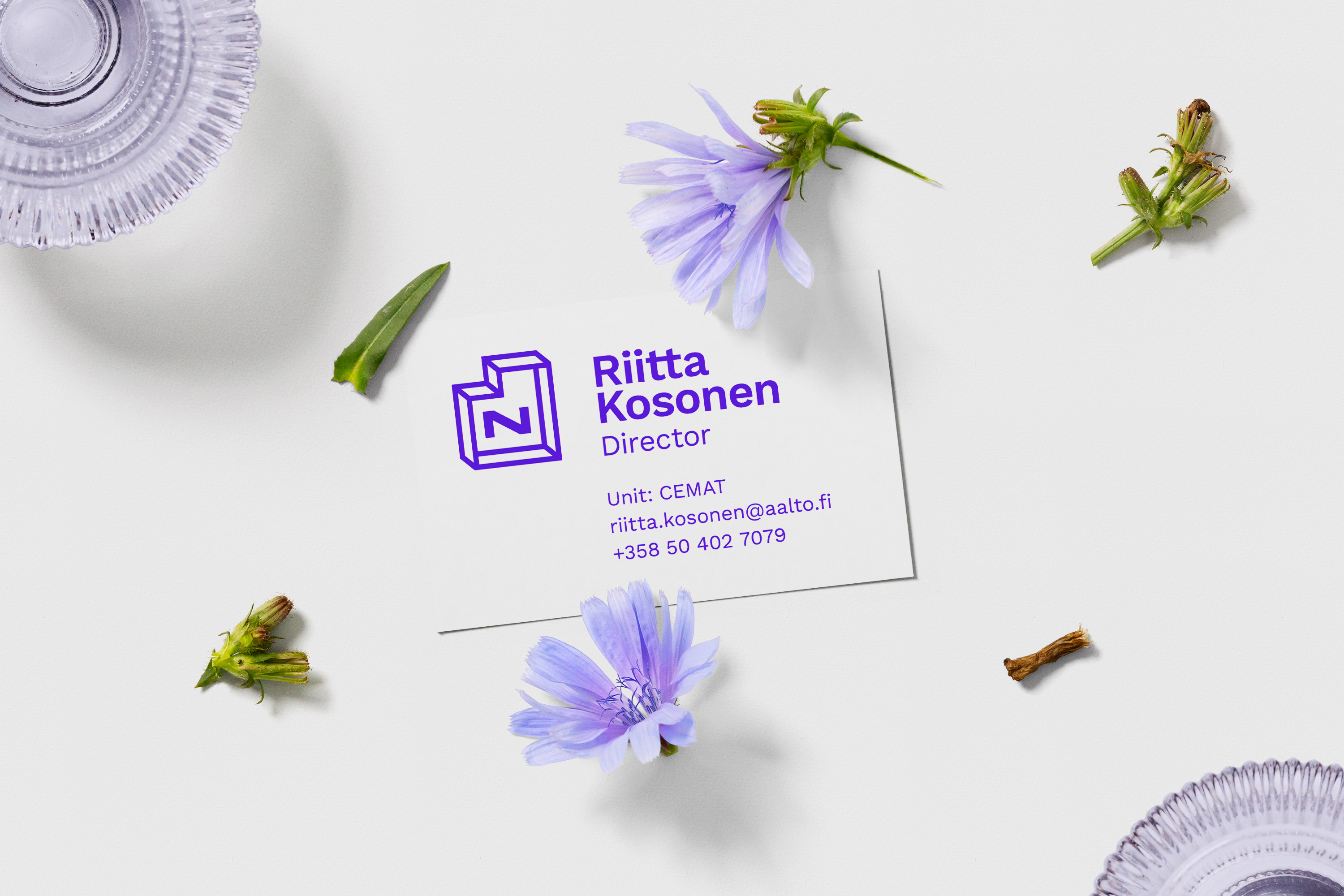
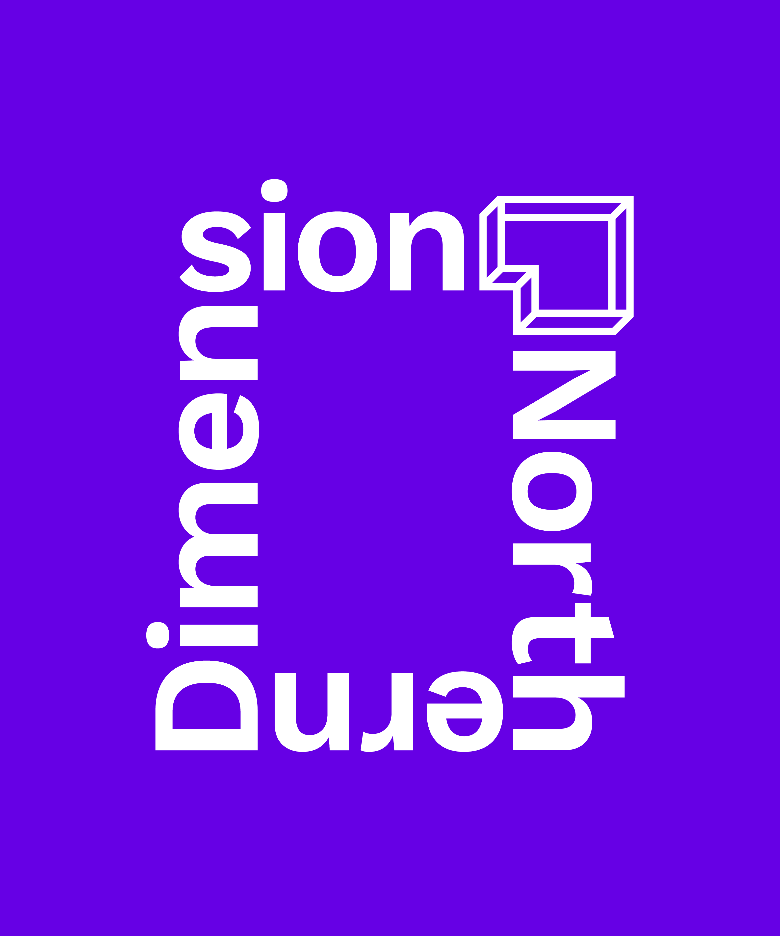
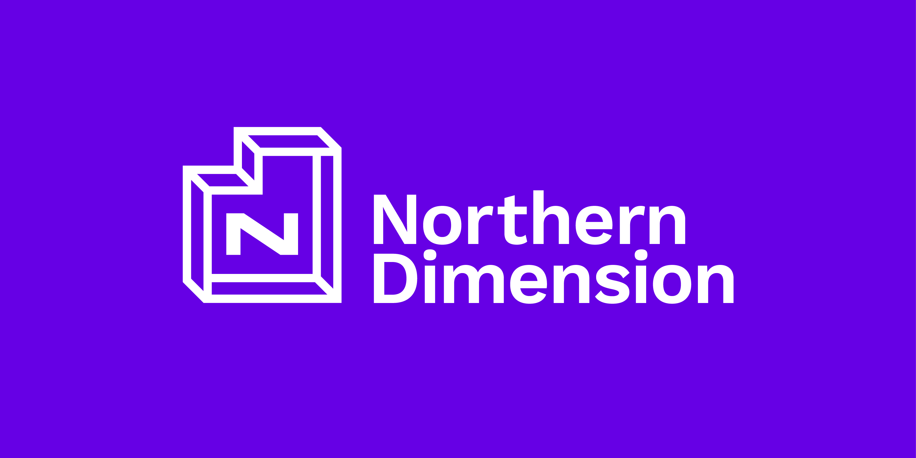
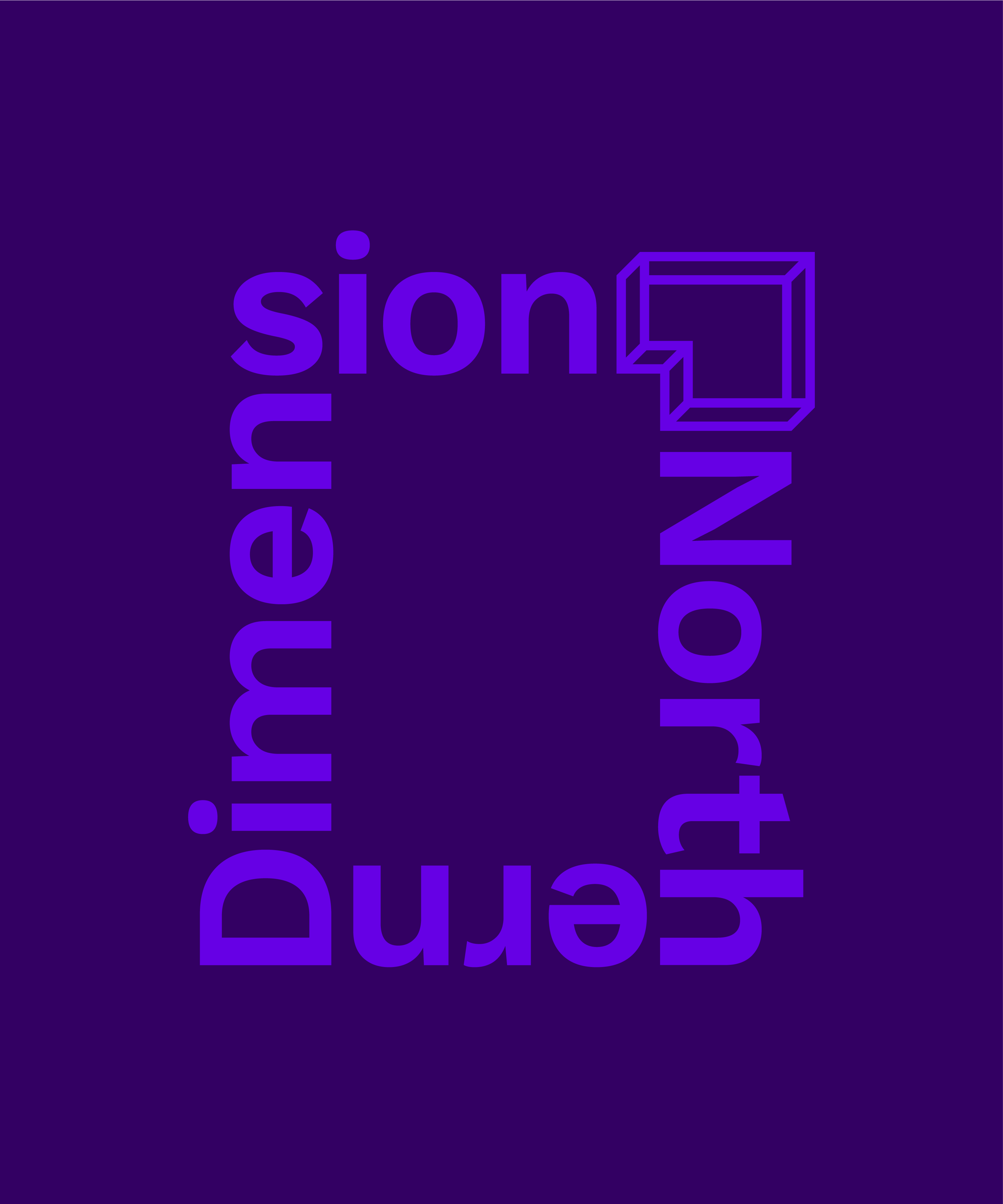
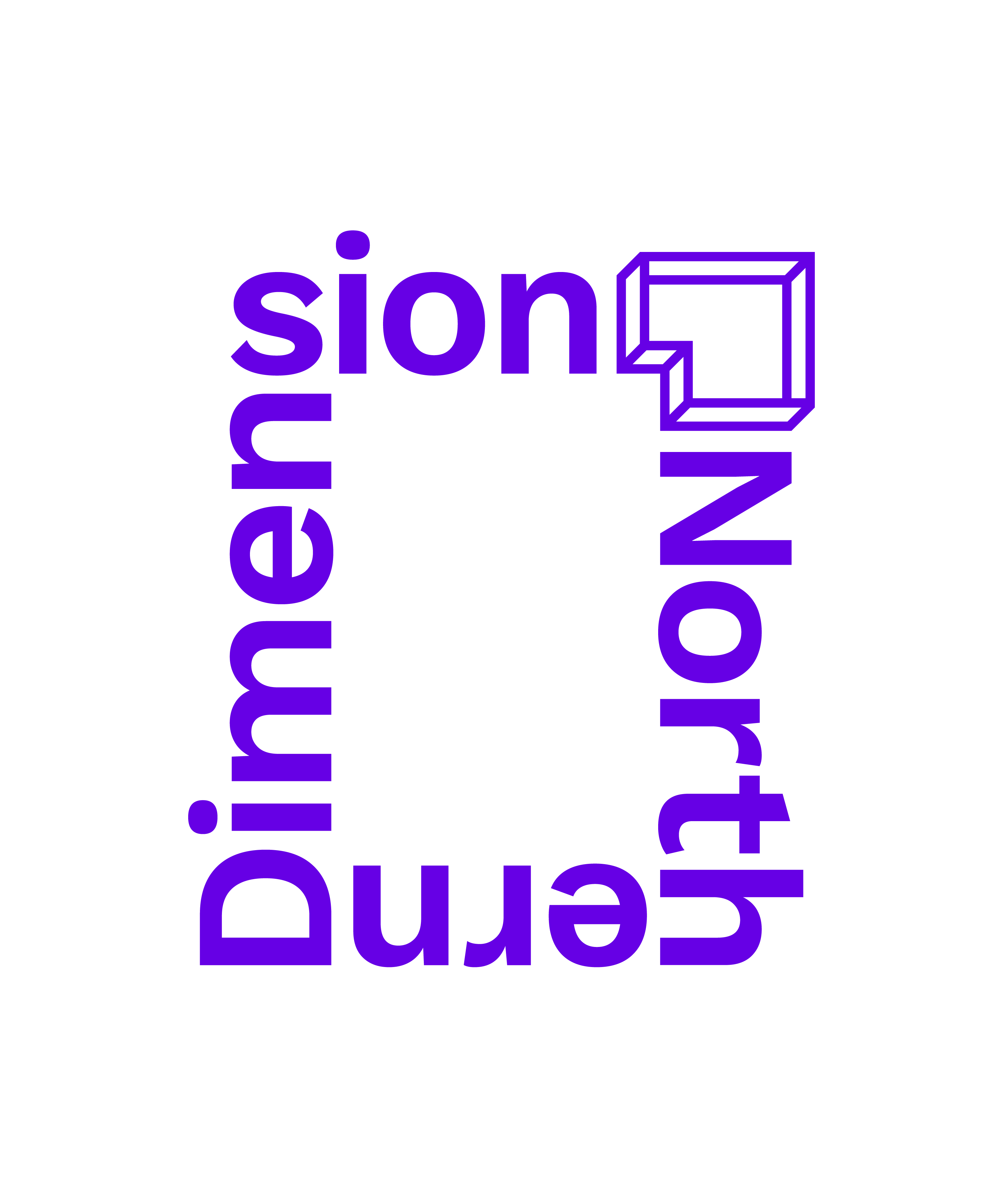
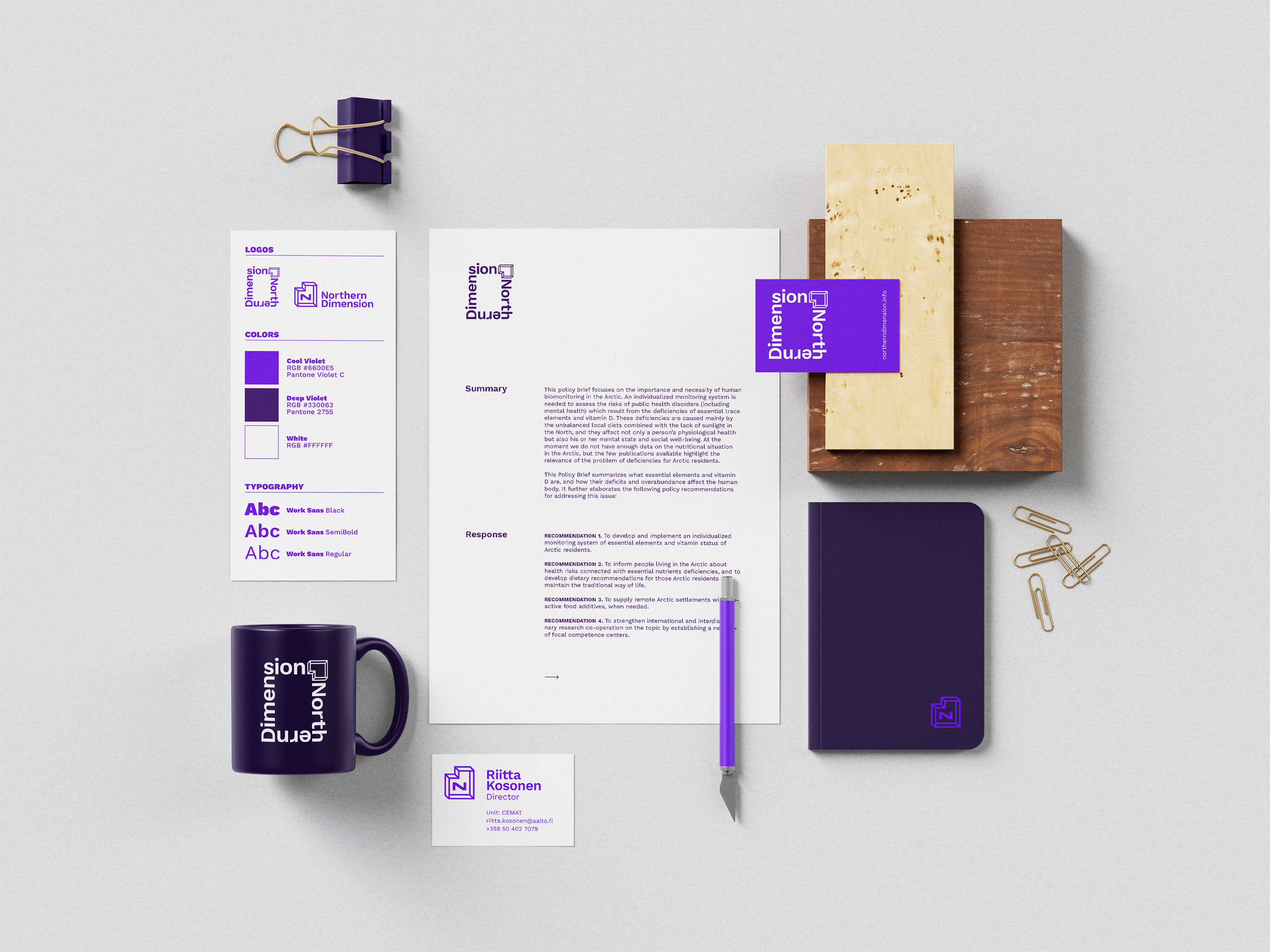
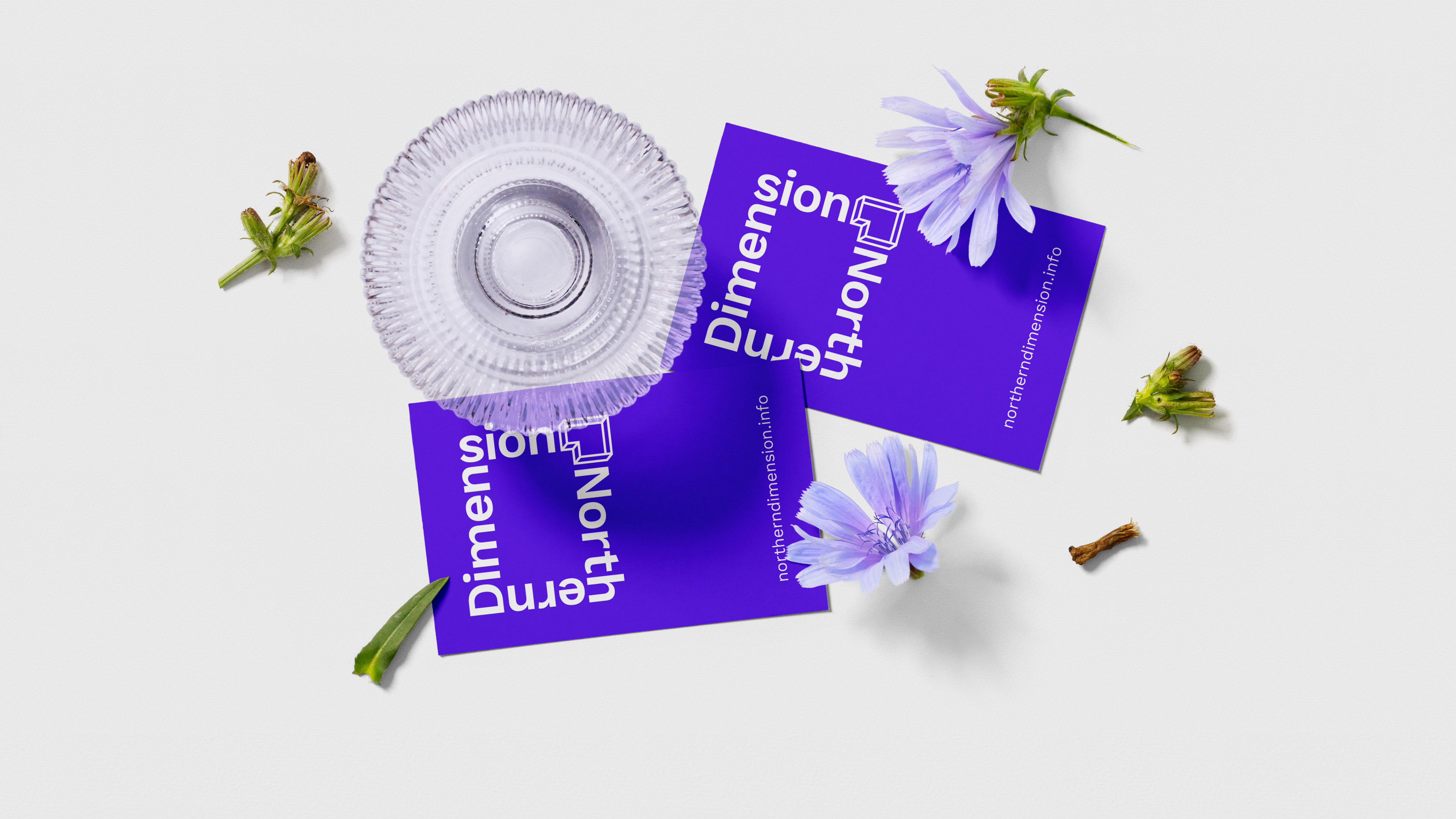
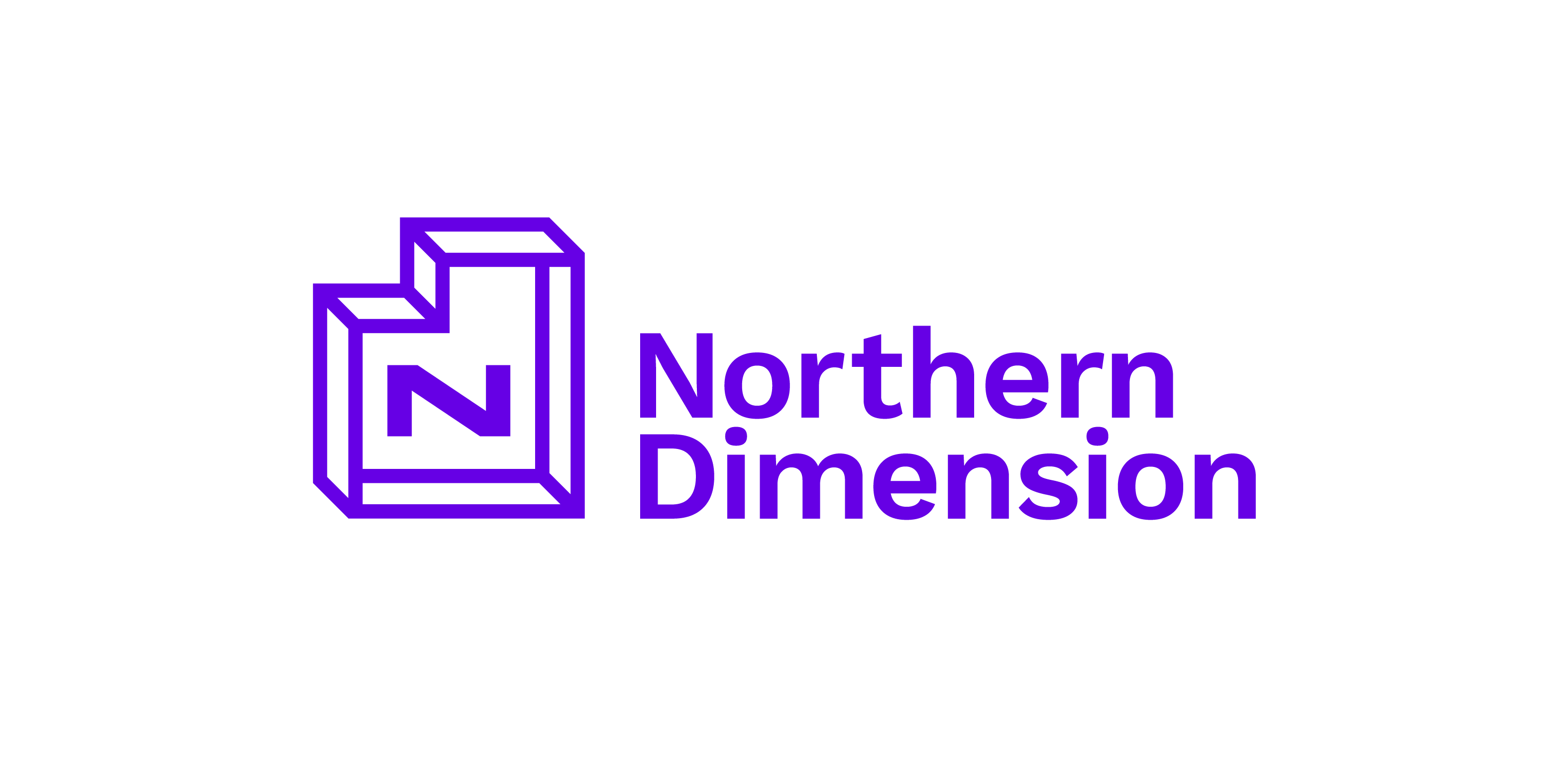
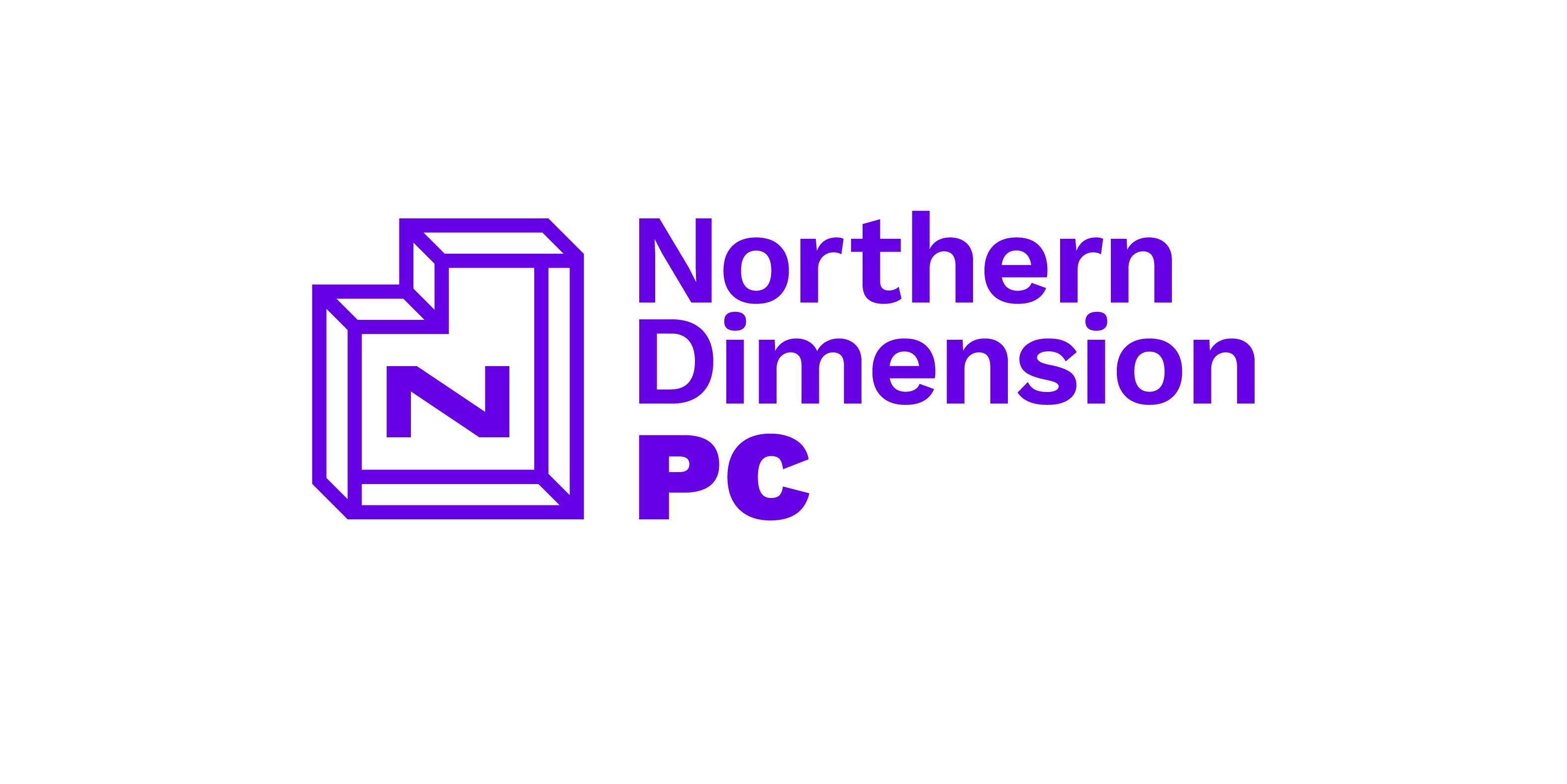
In 2019, Northern Dimension (ND), a joint policy between the EU, Norway, Iceland, and Russia, needed a new logo. My competition entry is inspired by the concepts of dimension and partnership. ND is* made up of four partners and works within four core areas. The main logo alludes to this through its dimensionality. The four sides represent the partners, working together to frame important issues and themes, and to tackle them.
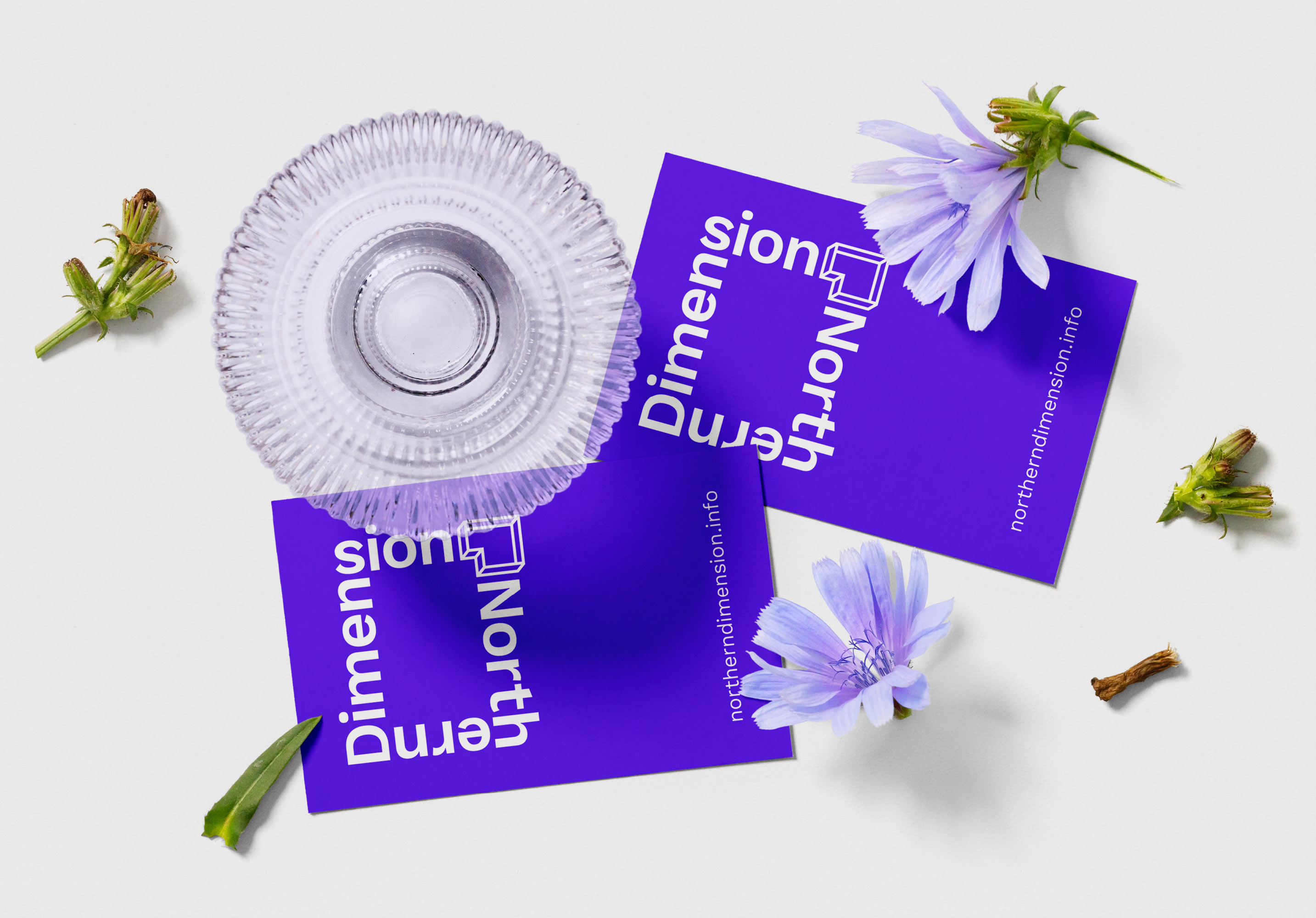
The frame in the logo is completed by a dimensional icon in the upper right corner. This marks the area where ND operates. If one thinks of the logo as a map of Europe, northeast is where the partners are located. The secondary logo repurposes the icon. Since it hints at the shape of a D, a monogram can be created by placing an N inside it. The logo has a bright, cool hue, which is a nod to the crisp climate the partners share.
* This was accurate when the logo was created. In March 2022, the three other members made a joint decision to cease all operations involving Russia, as a result of the country’s invasion of Ukraine.
Northern
Dimension
Type
Client Work (Concept)
Client
The Northern Dimension
Tags
Branding
Logo Design
Year
2019
In 2019, Northern Dimension (ND), a joint policy between the EU, Norway, Iceland, and Russia, needed a new logo. My competition entry is inspired by the concepts of dimension and partnership. ND is* made up of four partners and works within four core areas. The main logo alludes to this through its dimensionality. The four sides represent the partners, working together to frame important issues and themes, and to tackle them.
The frame in the logo is completed by a dimensional icon in the upper right corner. This marks the area where ND operates. If one thinks of the logo as a map of Europe, northeast is where the partners are located. The secondary logo repurposes the icon. Since it hints at the shape of a D, a monogram can be created by placing an N inside it. The logo has a bright, cool hue, which is a nod to the crisp climate the partners share.
* This was accurate when the logo was created. In March 2022, the three other members made a joint decision to cease all operations involving Russia, as a result of the country’s invasion of Ukraine.
Northern Dimension
Type Client Work (Concept)
Client The Northern Dimension
Tags Branding, Logo Design
Year 2019
In 2019, Northern Dimension (ND), a joint policy between the EU, Norway, Iceland, and Russia, needed a new logo. My competition entry is inspired by the concepts of dimension and partnership. ND is* made up of four partners and works within four core areas. The main logo alludes to this through its dimensionality. The four sides represent the partners, working together to frame important issues and themes, and to tackle them.
The frame in the logo is completed by a dimensional icon in the upper right corner. This marks the area where ND operates. If one thinks of the logo as a map of Europe, northeast is where the partners are located. The secondary logo repurposes the icon. Since it hints at the shape of a D, a monogram can be created by placing an N inside it. The logo has a bright, cool hue, which is a nod to the crisp climate the partners share.
* This was accurate when the logo was created. In March 2022, the three other members made a joint decision to cease all operations involving Russia, as a result of the country’s invasion of Ukraine.
