Sanoma B2C
Design System
Type
Client Work
Client
Sanoma Media Finland
Tags
Design Systems
Icon Design
User Interface Design
Year
2025
I worked in Sanoma’s B2C Design System team, which has created and maintains the Design System used by the company’s news sites and applications. Since I have a keen eye for visual unity, I was put in charge of cleaning up their icon library. Said library mostly consists of icons from Google’s Material Symbols, with some in-house additions. However, they were organized nonoptimally, named incongruously, and styled eclectically: a mix of sharp corners and rounded ones, and varying visual sizes. The first task I undertook was unifying them.
My love for both visual harmony and icon design was noted, and I was asked to create the icons and pictograms for a revamped Menokone, Sanoma’s event-finding service. The first set consists of 18 icons, which match the size and design of the Material Symbols icons, tying Menokone’s visuals to Sanoma’s news brands. The second set consists of 25 pictograms, which have the same stroke width and visual style as the icons, and are used to illustrate different categories of events in the service.
My keen eye for details was both praised and put to good use by the Design System team. As a result of these projects, I’m more familiar with working in the intersection of design and software development, and better understand how a well-made Design System enables the creation of agile and cohesive digital products.


01
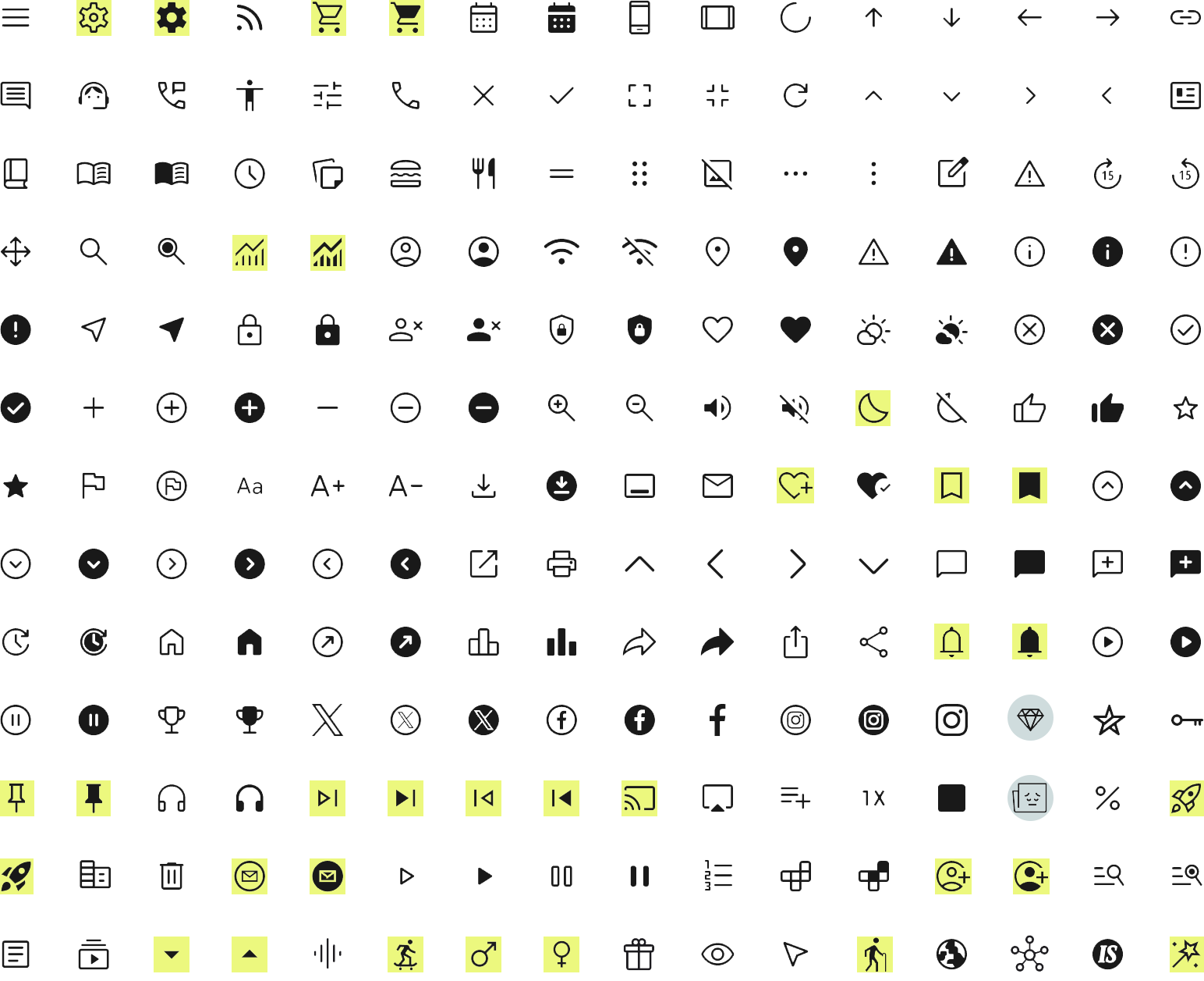
While most of the icons had a unified stroke width, they varied in size and design. According to the Design System guidelines, the icons were all supposed have rounded corners, but 34 out of 208 (16%!) had sharp ones instead. These icons are highlighted above.
02
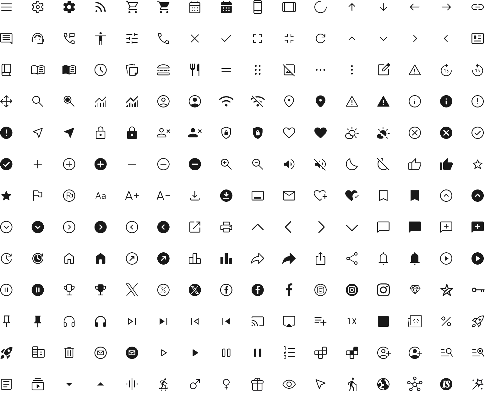
I unified the icons so they all* had rounded corners, the same stroke width, and a similar visual size. In some cases, this could be done with the click of a button in Figma, while in others, it meant combining existing designs or making something totally new in Illustrator.
03
* I made two exceptions; these are highlighted with teal circles above. The main one was the diamond-shaped Helsingin Sanomat paywall icon, which is used extensively and is too integral to the HS brand to be changed without chatting with the newspaper’s own designers.


For the social media icons, I unified their visual sizing throughout, and made sure that the circled icons didn’t change in size when active.


A Skip15 icon doesn’t exist in Material Symbols; someone at Sanoma had made it. I built a more cohesive Skip15 from MS’ Skip10/Skip5 icons.


This had also been made in-house. I used the FlagCircle icon as my reference for stroke width when drawing a new, rounded envelope for it.


Another Sanoma creation, this icon needed rounded corners. I combined MS’ AccountCircle and HeartPlus icons for the new version.
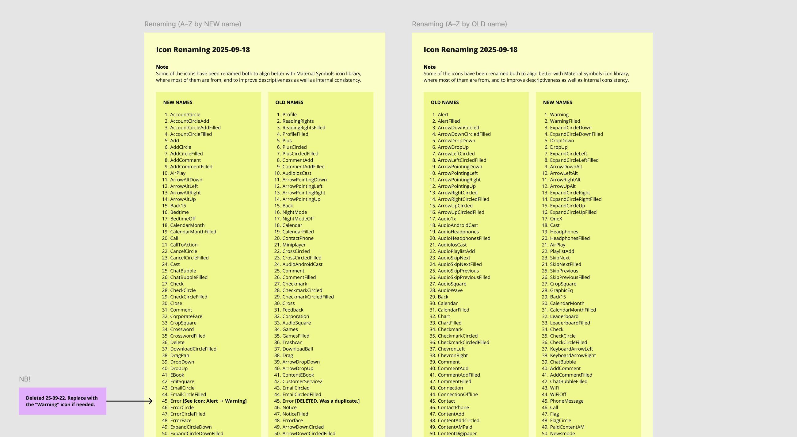
As a final touch to make the icon library easier to use, I renamed all of the icons to match their Material Symbols counterparts.
Previously, they had been named in-house based on their primary use case, which could get confusing when the same icons were used for multiple purposes. It also made finding them in Material Symbols’ Figma plugin unnecessarily difficult.
While cleaning up, I noticed a couple of duplicate icons (the same image but a different name) and removed those.


Some of the icon sets that should be named similarly, arrows in particular, had differing naming conventions. I unified these.


None of the social media icons were named according to the naming conventions in use in the overall set, which I rectified.
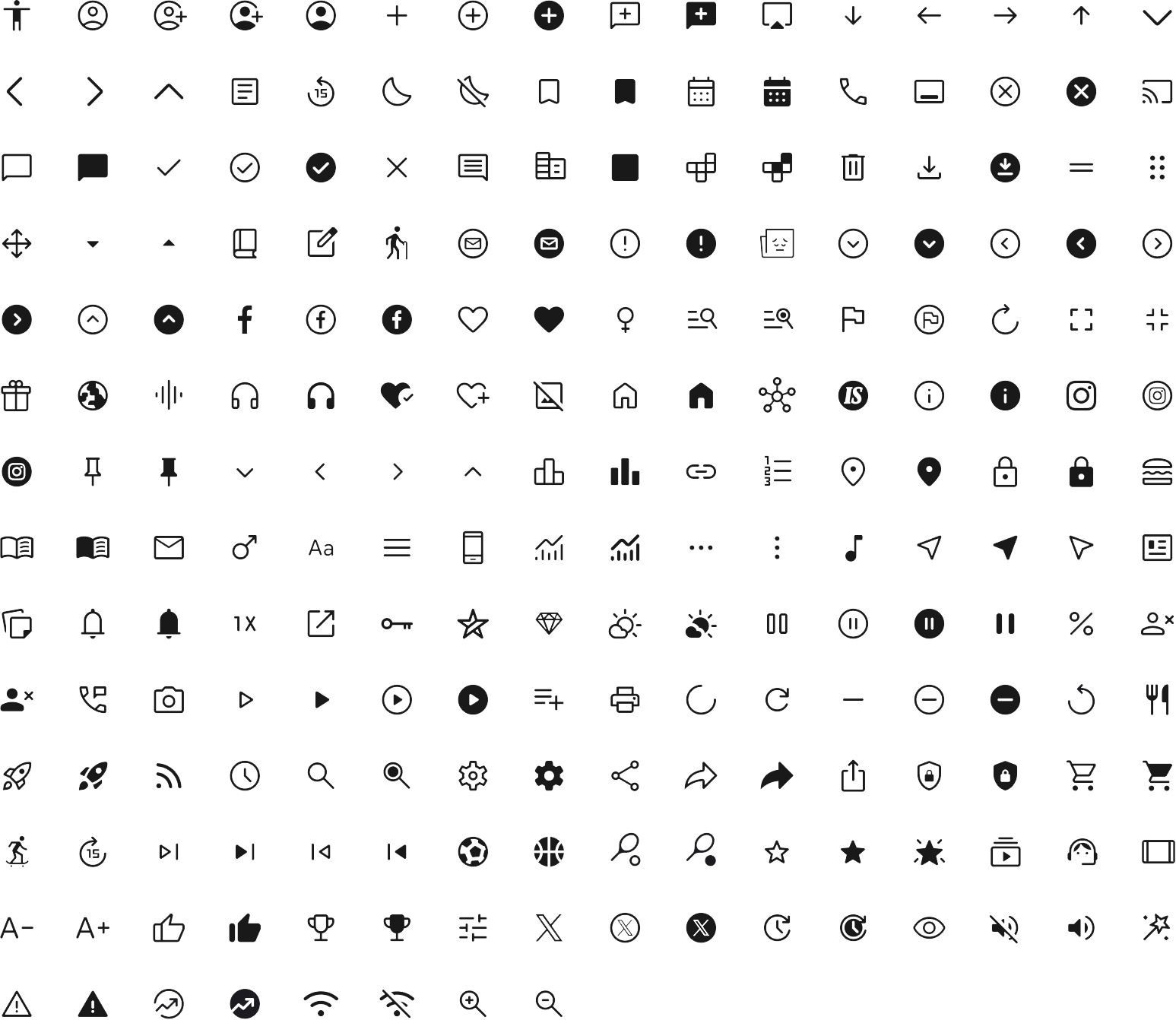
To the left, you’ll see the complete Sanoma Design System icon library as it was left by me at the end of my time at the company.
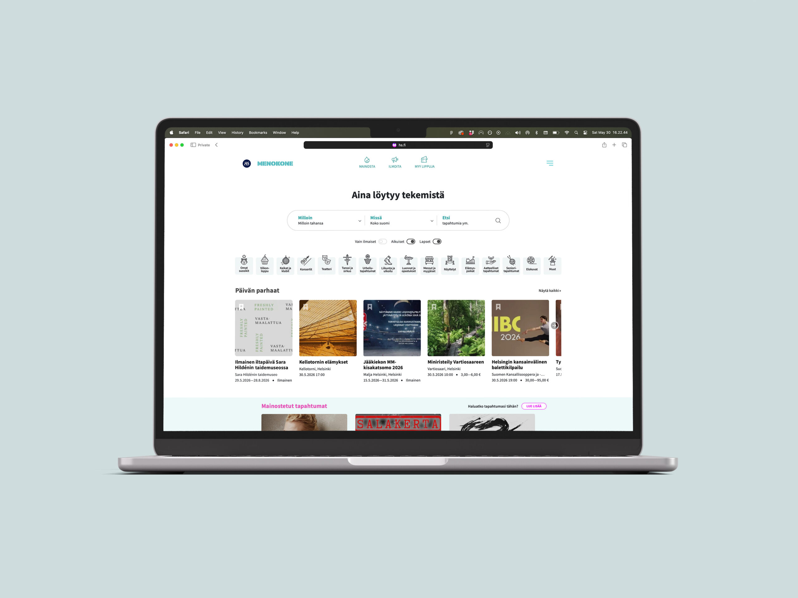


I was asked to design icons for Helsingin Sanomat’s event-finding service Menokone.


They have the same visual size and stroke width as the existing set, ensuring brand consistency.


In addition to icons, I designed pictograms specifically for the event-finding service.


On the site, these are primarily used to illustrate the different event categories one can filter by.


They, too, have the same stroke width, to assure that all available visual assets work in unison.
Weekend (Alternate)
Misc. (Default)
Sports
Theater
Experiences
Weekend (Default)
01
I employed many tactics in making this set of pictograms visually unified. One of them is the reuse of similar elements. The sparkles seen in both Weekend (Alt.) and Misc. above are a good example. Also note that the rectangular shapes of the hat brim in Misc. and the basketball hoop rim in Sports are of the same height.
02
In order to feel cohesive, the pictograms use a limited set of angles, which were chosen by taking a right angle and the acute angles one gets by halving the previous one: 90°, 45°, 22.5°, and 11.25°. Above, you can see that the basketball net in Sports and the comedic mask in Theater have the same 22.5° angle.
03
I also employed similar sizing and spacing for elements in order to unify the set. Firstly, each stroke is the same width. Note also how the eyebrows in Theater and the roller coaster cars in Experiences are similarly sized. The spacing of the vertical bars in Experiences is similar to Weekend (Default), as seen above.
Sanoma B2C
Design System
Type
Client Work
Client
Sanoma Media Finland
Tags
Design Systems
Icon Design
User Interface Design
Year
2025
I worked in Sanoma’s B2C Design System team, which has created and maintains the Design System used by the company’s news sites and applications. Since I have a keen eye for visual unity, I was put in charge of cleaning up their icon library. Said library mostly consists of icons from Google’s Material Symbols, with some in-house additions. However, they were organized nonoptimally, named incongruously, and styled eclectically: a mix of sharp corners and rounded ones, and varying visual sizes. The first task I undertook was unifying them.
My love for both visual harmony and icon design was noted, and I was asked to create the icons and pictograms for a revamped Menokone, Sanoma’s event-finding service. The first set consists of 18 icons, which match the size and design of the Material Symbols icons, tying Menokone’s visuals to Sanoma’s news brands. The second set consists of 25 pictograms, which have the same stroke width and visual style as the icons, and are used to illustrate different categories of events in the service.
My keen eye for details was both praised and put to good use by the Design System team. As a result of these projects, I’m more familiar with working in the intersection of design and software development, and better understand how a well-made Design System enables the creation of agile and cohesive digital products.
01
While most of the icons had a unified stroke width, they varied in size and design. According to the Design System guidelines, the icons were all supposed have rounded corners, but 34 out of 208 (16%!) had sharp ones instead. These icons are highlighted above.
02
I unified the icons so they all* had rounded corners, the same stroke width, and a similar visual size. In some cases, this could be done with the click of a button in Figma, while in others, it meant combining existing designs or making something totally new in Illustrator.
03
* I made two exceptions; these are highlighted with teal circles above. The main one was the diamond-shaped Helsingin Sanomat paywall icon, which is used extensively and is too integral to the HS brand to be changed without chatting with the newspaper’s own designers.
For the social media icons, I unified their visual sizing throughout, and made sure that the circled icons didn’t change in size when active.
A Skip15 icon doesn’t exist in Material Symbols; someone at Sanoma had made it. I built a more cohesive Skip15 from MS’ Skip10/Skip5 icons.
Another Sanoma creation, this icon needed rounded corners. I combined MS’ AccountCircle and HeartPlus icons for the new version.
This had also been made in-house. I used the FlagCircle icon as my reference for stroke width when drawing a new, rounded envelope for it.
As a final touch to make the icon library easier to use, I renamed all of the icons to match their Material Symbols counterparts.
Previously, they had been named in-house based on their primary use case, which could get confusing when the same icons were used for multiple purposes. It also made finding them in Material Symbols’ Figma plugin unnecessarily difficult.
While cleaning up, I noticed a couple of duplicate icons (the same image but a different name) and removed those.
Some of the icon sets that should be named similarly, arrows in particular, had differing naming conventions. I unified these.
None of the social media icons were named according to the naming conventions in use in the overall set, which I rectified.
Above, you’ll see the complete Sanoma Design System icon library as it was left by me at the end of my time at the company.
I was asked to design icons for Helsingin Sanomat’s event-finding service Menokone. They have the same visual size and stroke width as the existing set, ensuring brand consistency.
In addition to icons, I designed pictograms specifically for the event-finding service. On the site, these are primarily used to illustrate the different event categories one can filter by. They, too, have the same stroke width, to assure that all available visual assets work in unison.
Misc. (Default)
Sports
Theater
Experiences
Weekend (Default)
01
I employed many tactics in making this set of pictograms visually unified. One of them is the reuse of similar elements. The sparkles seen in both Weekend (Alt.) and Misc. above are a good example. Also note that the rectangular shapes of the hat brim in Misc. and the basketball hoop rim in Sports are of the same height.
02
In order to feel cohesive, the pictograms use a limited set of angles, which were chosen by taking a right angle and the acute angles one gets by halving the previous one: 90°, 45°, 22.5°, and 11.25°. Above, you can see that the basketball net in Sports and the comedic mask in Theater have the same 22.5° angle.
03
I also employed similar sizing and spacing for elements in order to unify the set. Firstly, each stroke is the same width. Note also how the eyebrows in Theater and the roller coaster cars in Experiences are similarly sized. The spacing of the vertical bars in Experiences is similar to Weekend (Default), as seen above.
Sanoma B2C
Design System
Type Client Work
Client Sanoma Media Finland
Tags Design Systems, Icon Design, User Interface Design
Year 2025
I worked in Sanoma’s B2C Design System team, which has created and maintains the Design System used by the company’s news sites and applications. Since I have a keen eye for visual unity, I was put in charge of cleaning up their icon library. Said library mostly consists of icons from Google’s Material Symbols, with some in-house additions. However, they were organized nonoptimally, named incongruously, and styled eclectically: a mix of sharp corners and rounded ones, and varying visual sizes. The first task I undertook was unifying them.
My love for both visual harmony and icon design was noted, and I was asked to create the icons and pictograms for a revamped Menokone, Sanoma’s event-finding service. The first set consists of 18 icons, which match the size and design of the Material Symbols icons, tying Menokone’s visuals to Sanoma’s news brands. The second set consists of 25 pictograms, which have the same stroke width and visual style as the icons, and are used to illustrate different categories of events in the service.
My keen eye for details was both praised and put to good use by the Design System team. As a result of these projects, I’m more familiar with working in the intersection of design and software development, and better understand how a well-made Design System enables the creation of agile and cohesive digital products.
01
While most of the icons had a unified stroke width, they varied in size and design. According to the Design System guidelines, the icons were all supposed have rounded corners, but 34 out of 208 (16%!) had sharp ones instead. These icons are highlighted above.
02
I unified the icons so they all* had rounded corners, the same stroke width, and a similar visual size. In some cases, this could be done with the click of a button in Figma, while in others, it meant combining existing designs or making something totally new in Illustrator.
03
* I made two exceptions; these are highlighted with teal circles above. The main one was the diamond-shaped Helsingin Sanomat paywall icon, which is used extensively and is too integral to the HS brand to be changed without chatting with the newspaper’s own designers.
For the social media icons, I unified their visual sizing throughout, and made sure that the circled icons didn’t change in size when active.
A Skip15 icon doesn’t exist in Material Symbols; someone at Sanoma had made it. I built a more cohesive Skip15 from MS’ Skip10/Skip5 icons.
This had also been made in-house. I used the FlagCircle icon as my reference for stroke width when drawing a new, rounded envelope for it.
Another Sanoma creation, this icon needed rounded corners. I combined MS’ AccountCircle and HeartPlus icons for the new version.
I was asked to design icons for Helsingin Sanomat’s event-finding service Menokone. They have the same visual size and stroke width as the existing set, ensuring brand consistency.
In addition to icons, I designed pictograms specifically for the event-finding service. On the site, these are primarily used to illustrate the different event categories one can filter by. They, too, have the same stroke width, to assure that all available visual assets work in unison.
Weekend (Alternate)
Misc. (Default)
Sports
Theater
Experiences
Weekend (Default)
01
I employed many tactics in making this set of pictograms visually unified. One of them is the reuse of similar elements. The sparkles seen in both Weekend (Alt.) and Misc. above are a good example. Also note that the rectangular shapes of the hat brim in Misc. and the basketball hoop rim in Sports are of the same height.
02
In order to feel cohesive, the pictograms use a limited set of angles, which were chosen by taking a right angle and the acute angles one gets by halving the previous one: 90°, 45°, 22.5°, and 11.25°. Above, you can see that the basketball net in Sports and the comedic mask in Theater have the same 22.5° angle.
03
I also employed similar sizing and spacing for elements in order to unify the set. Firstly, each stroke is the same width. Note also how the eyebrows in Theater and the roller coaster cars in Experiences are similarly sized. The spacing of the vertical bars in Experiences is similar to Weekend (Default), as seen above.