Design Calendar
Type
Client Work
Client
Aalto University Student Union (AYY)
Tags
Editorial Design
Illustration
Year
2020
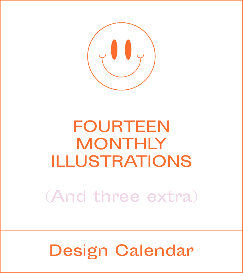
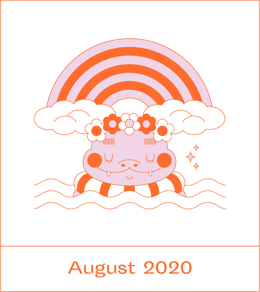
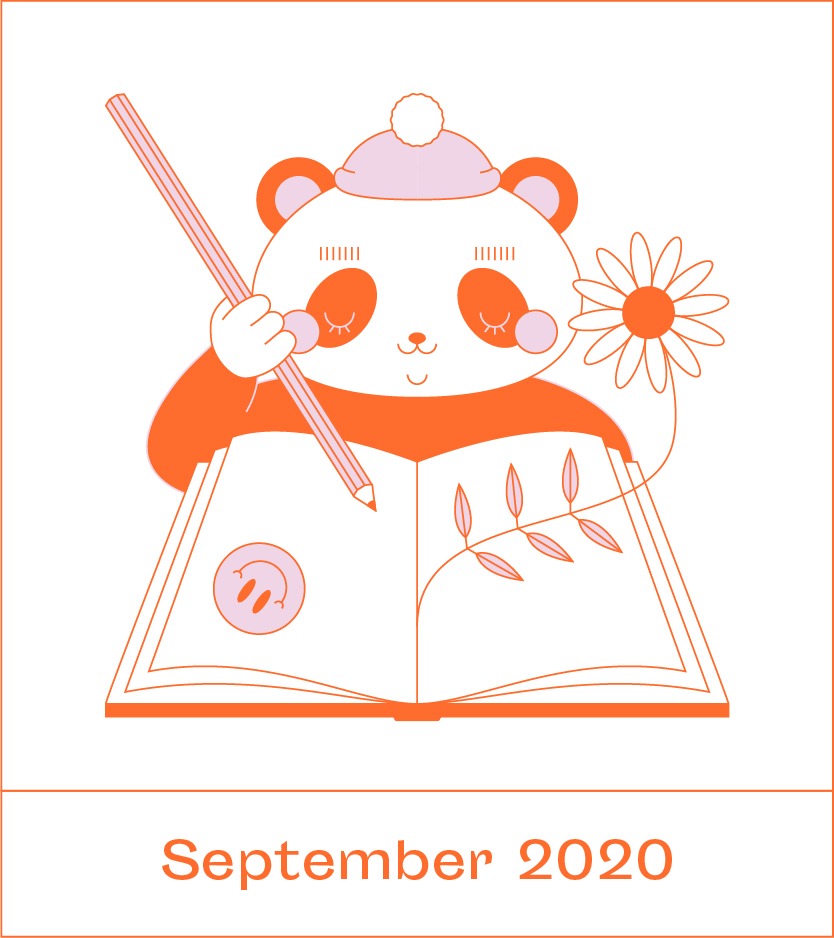
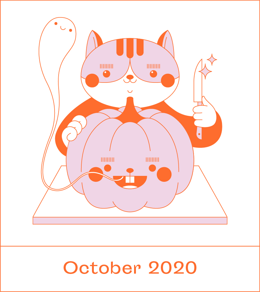
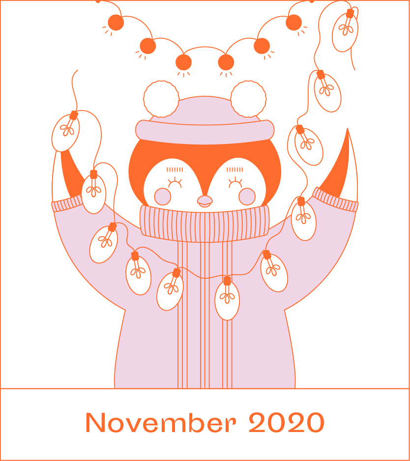
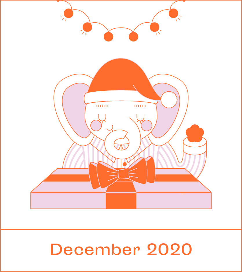
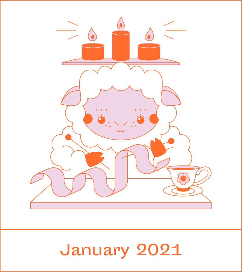
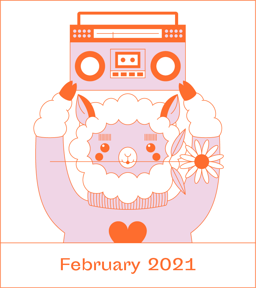
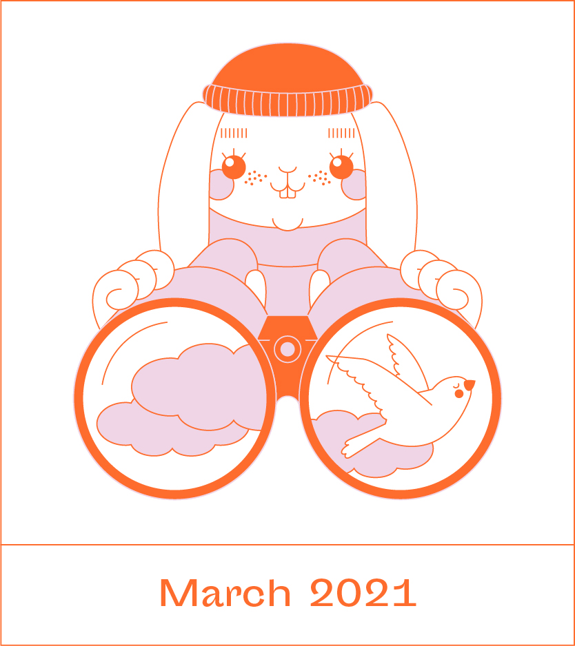
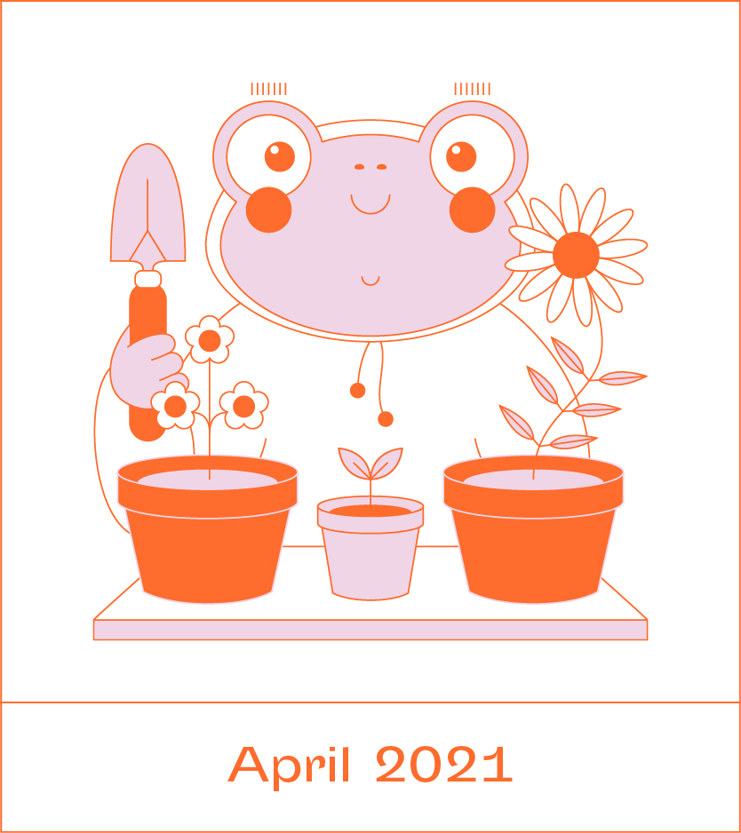
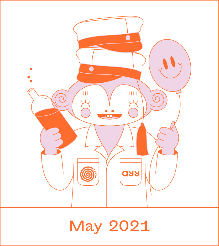
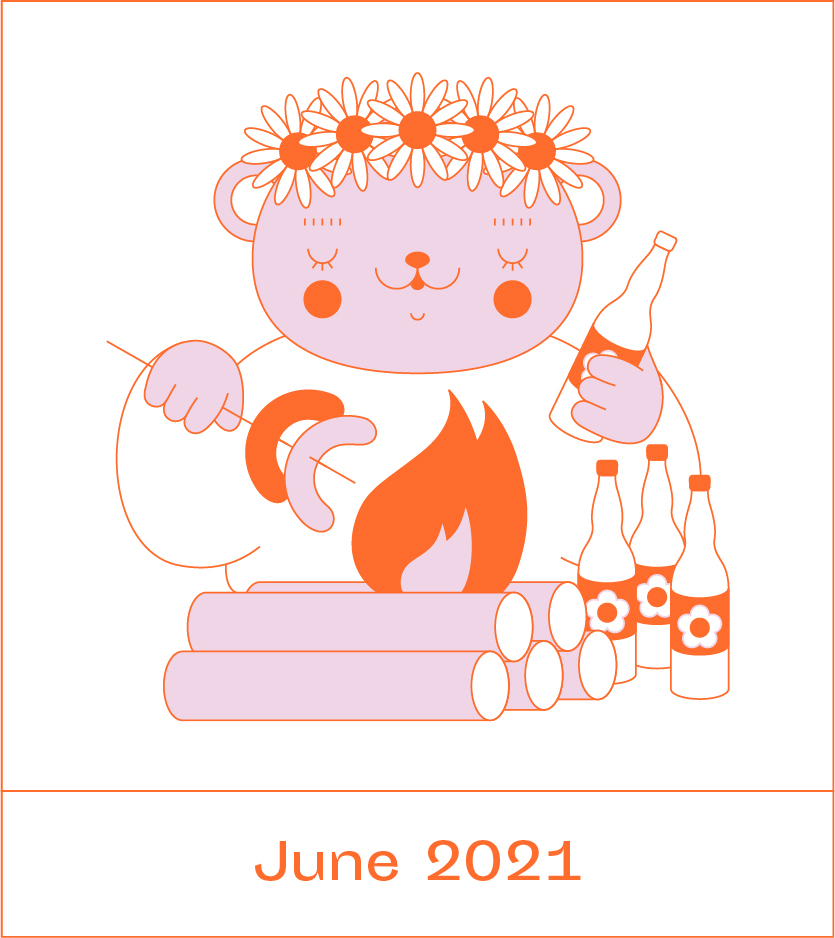
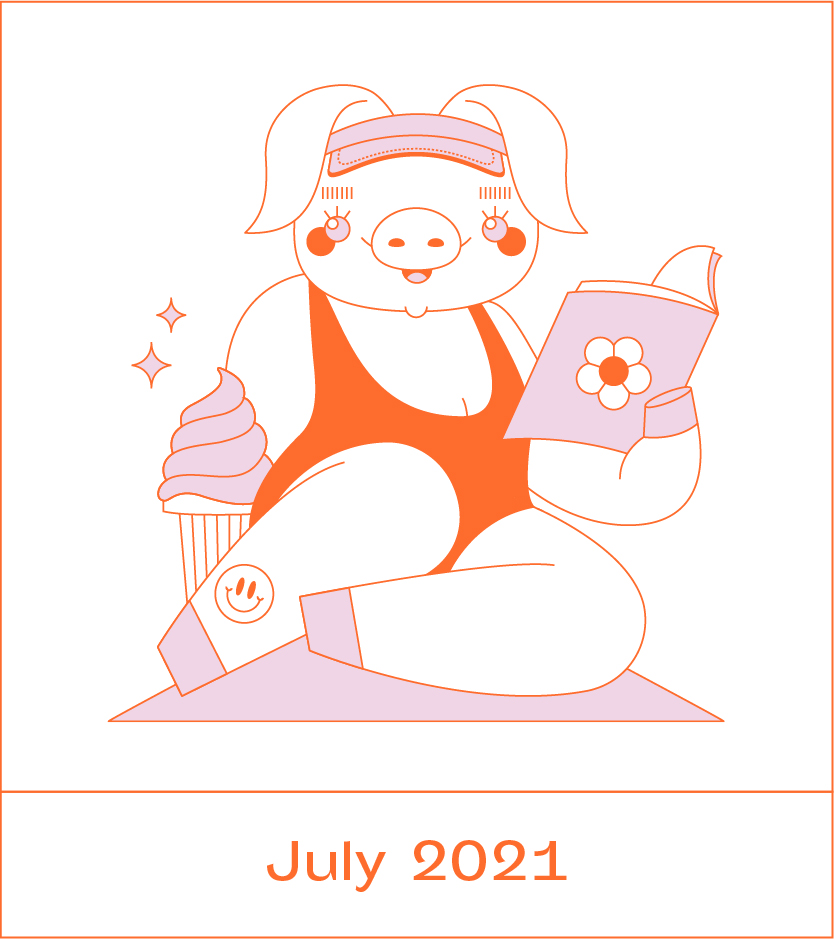
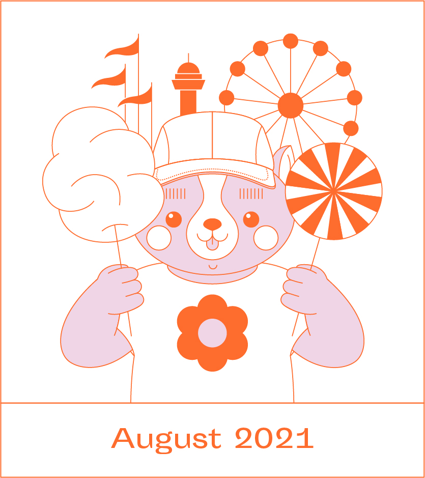
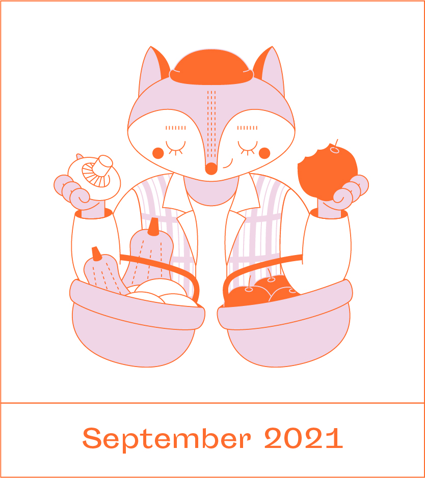
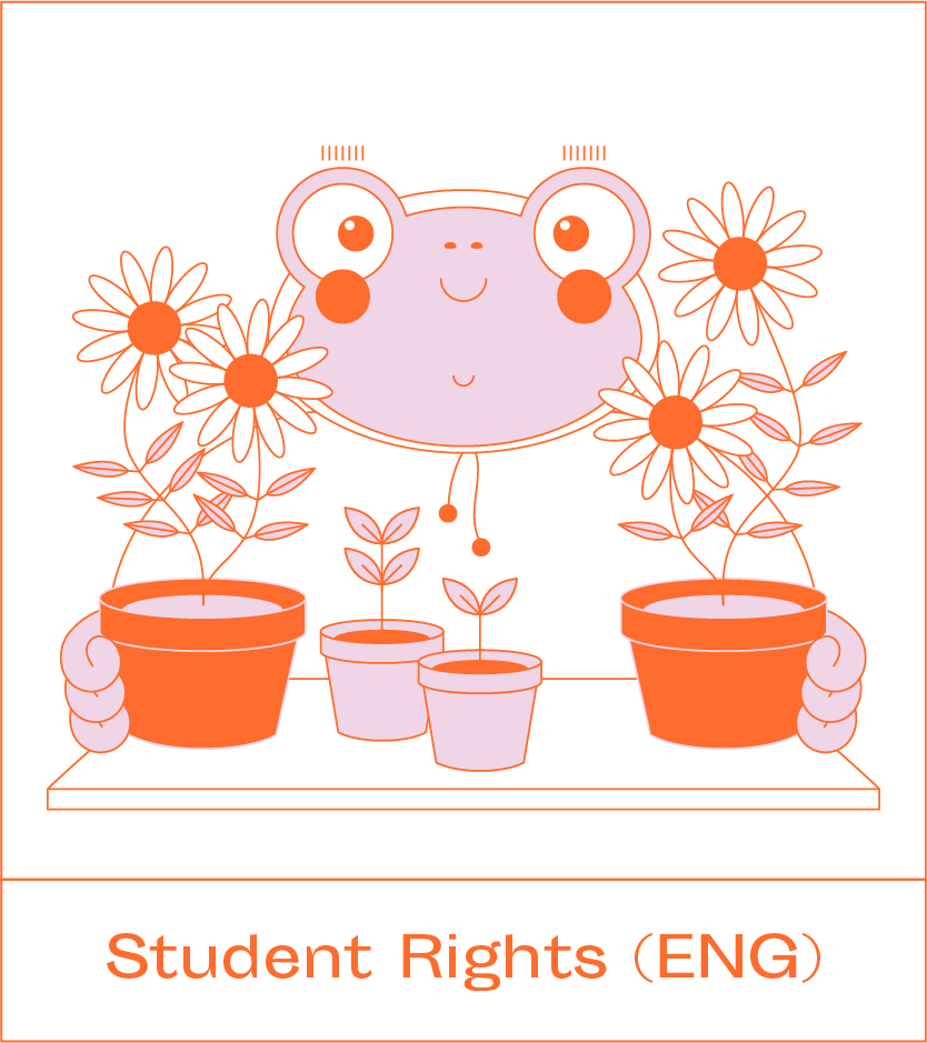
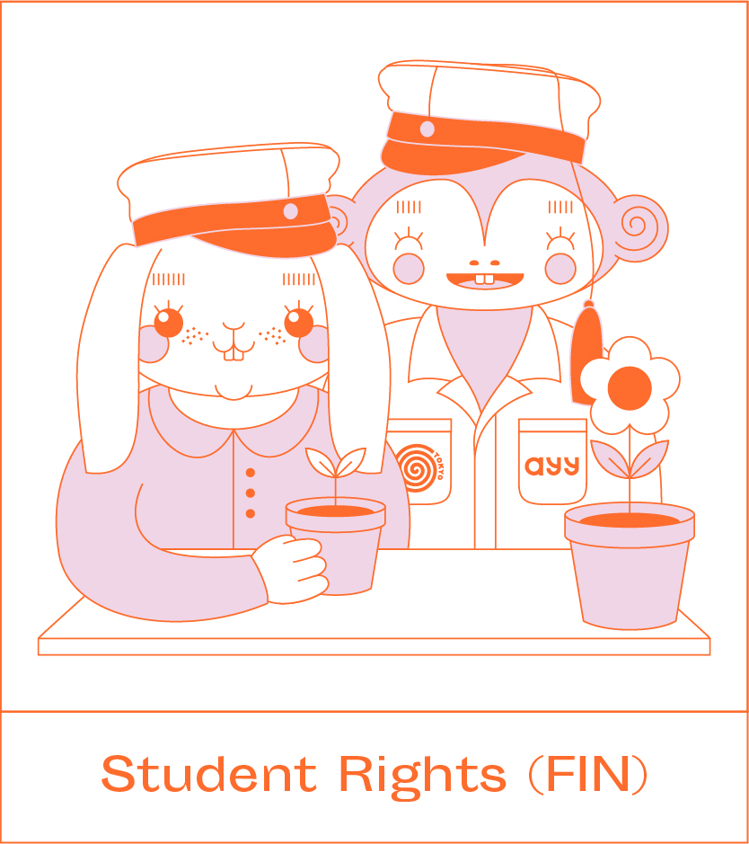
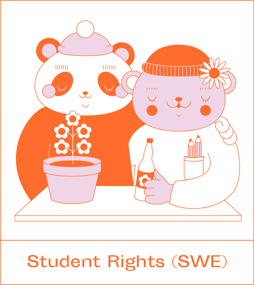
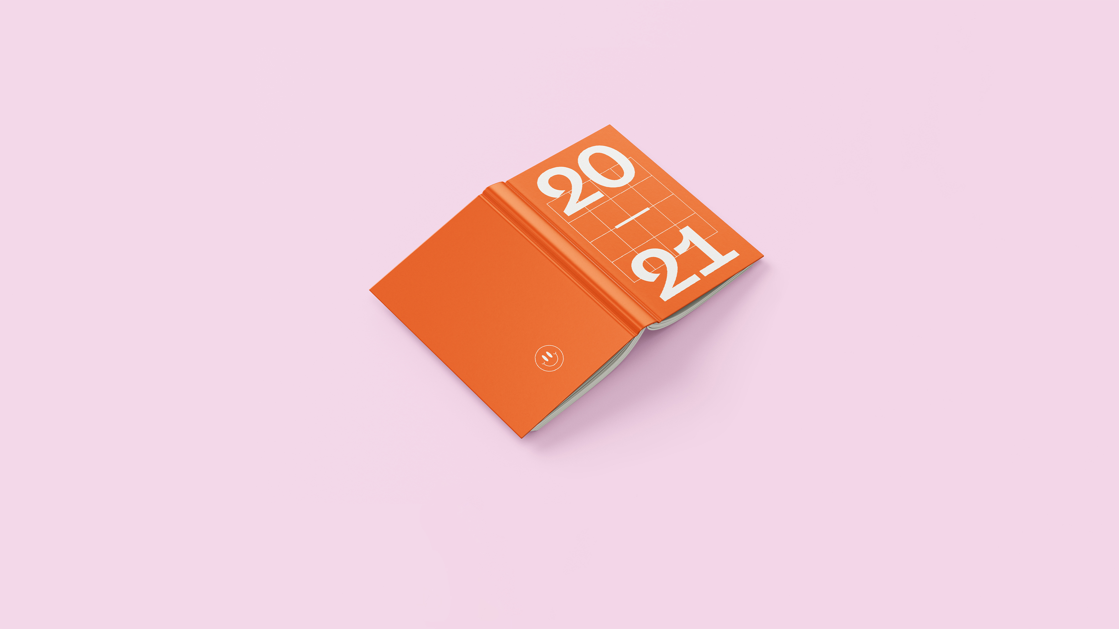
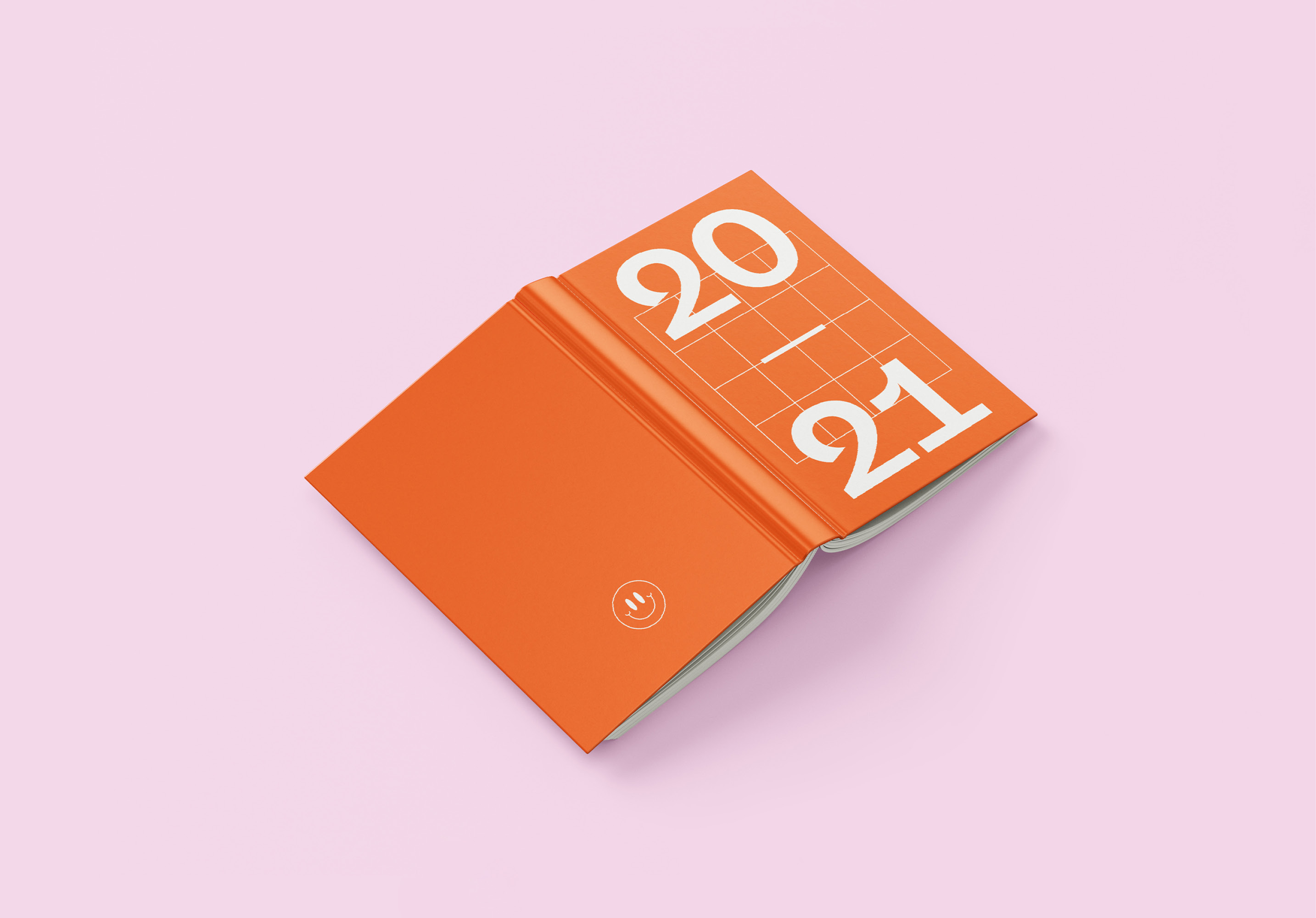
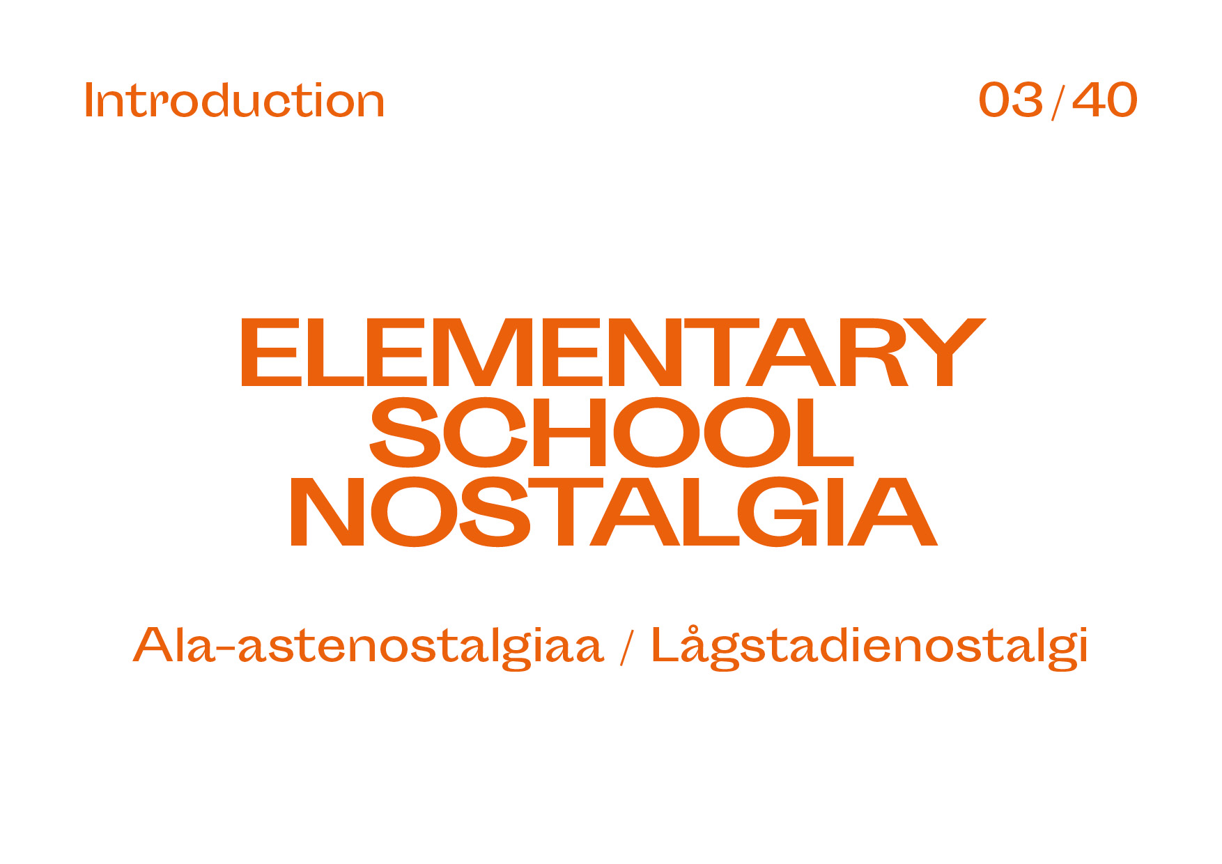
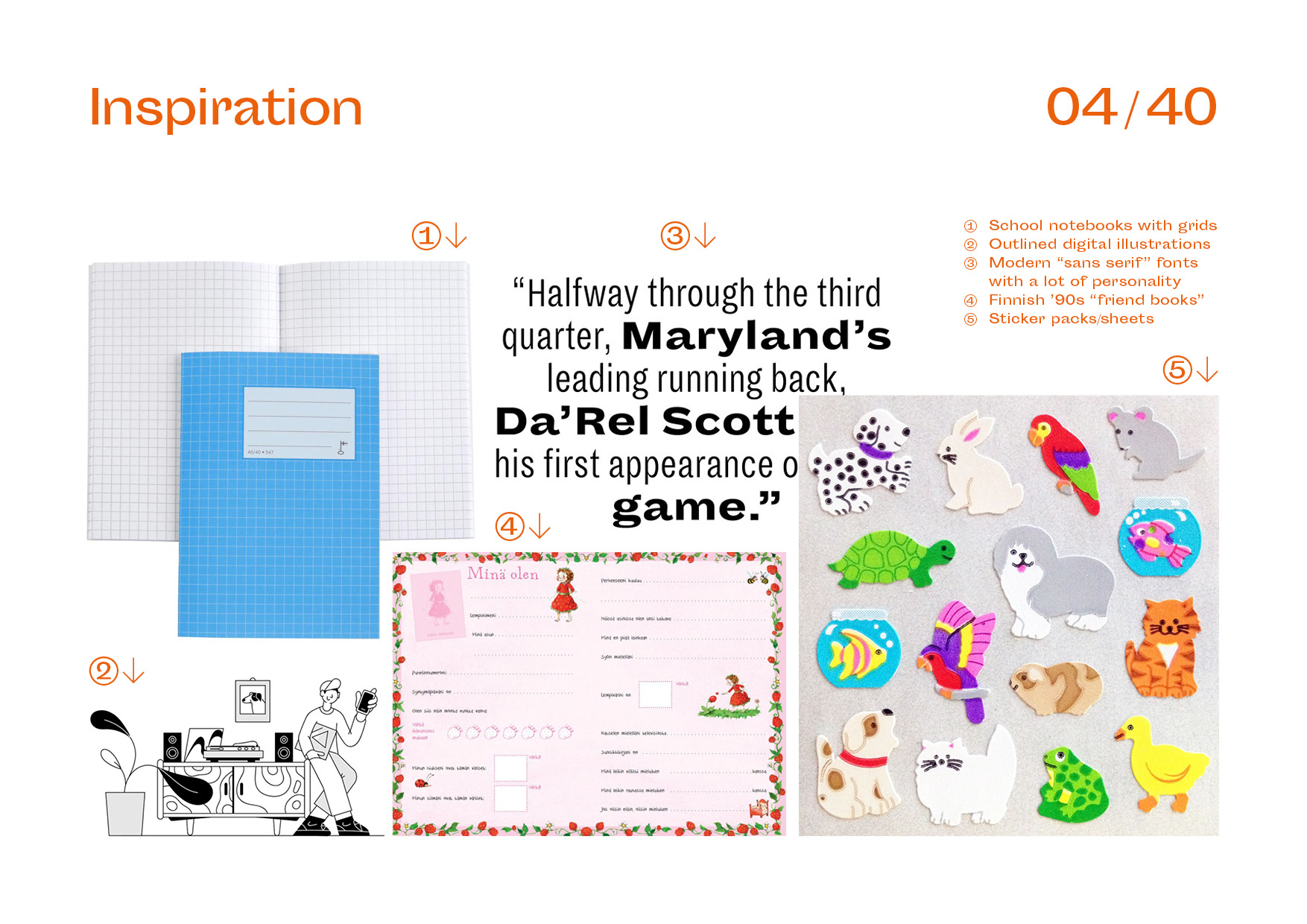
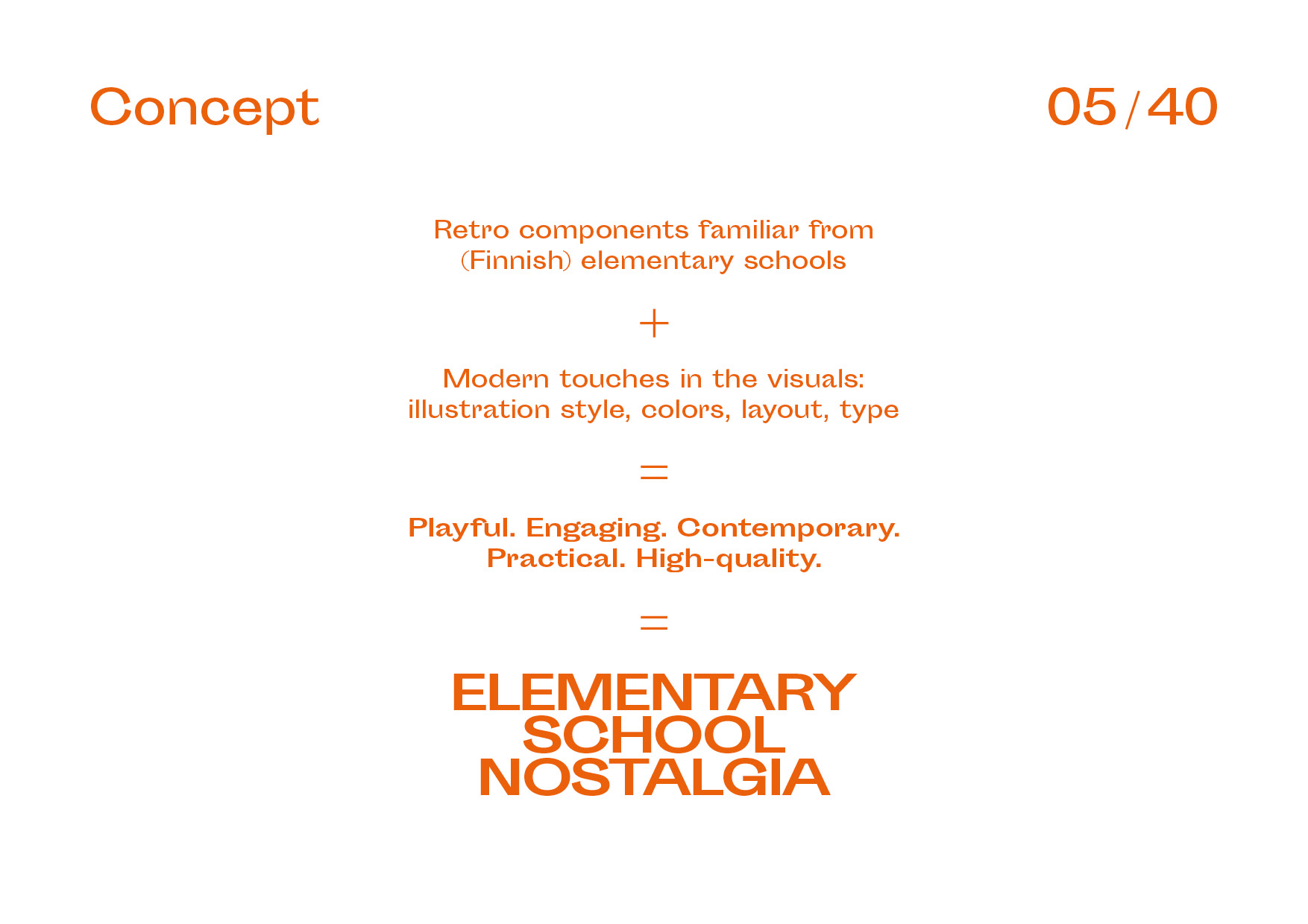
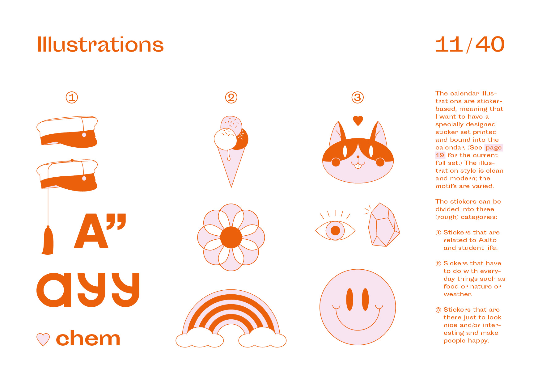
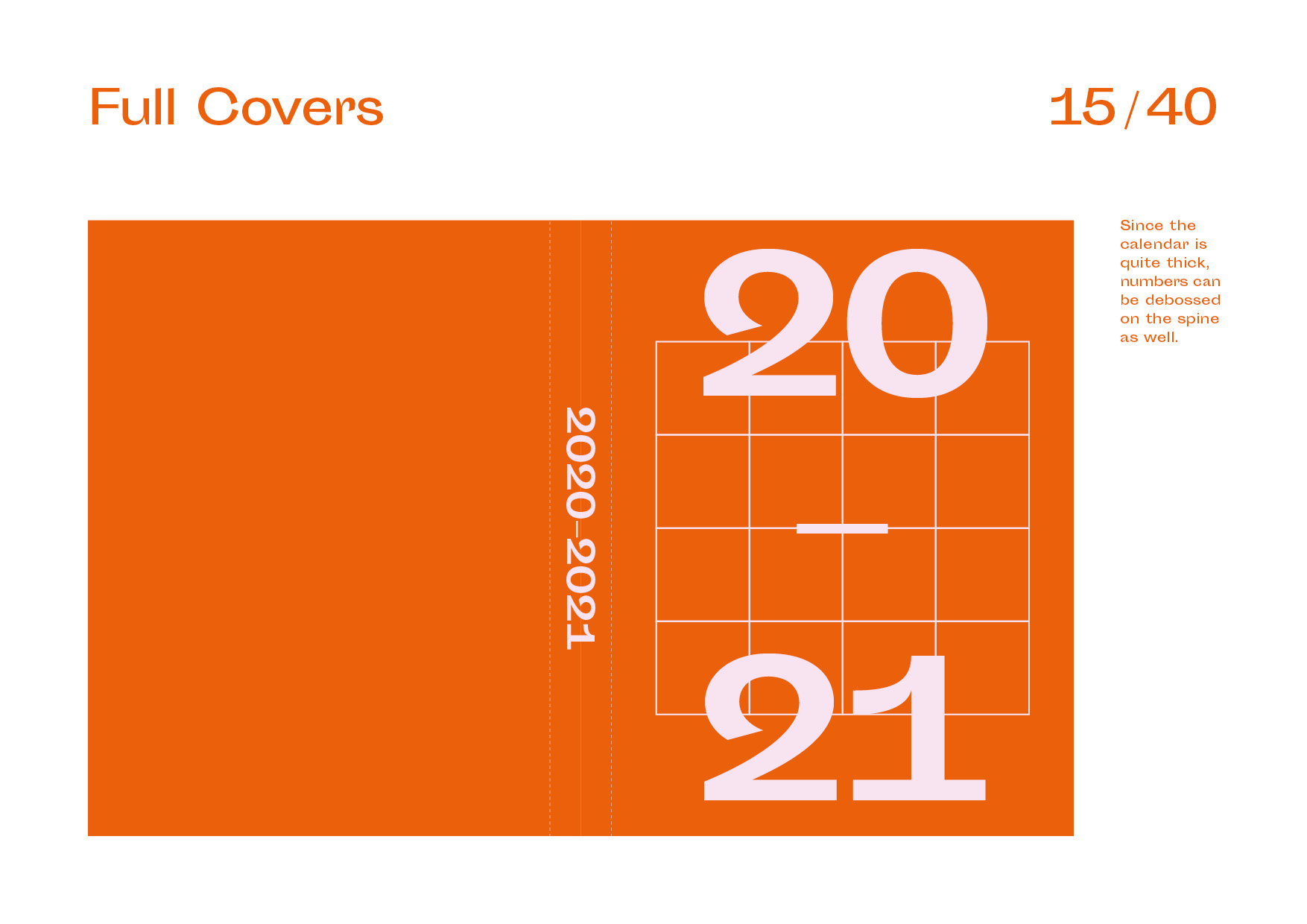
This project started out as a competition submission for the design of my university’s yearly printed pocket calendar. My concept was chosen, so I got to finish it and see it be distributed to each student at the school. The calendar’s theme is “Elementary School Nostalgia”, since the illustrations in it were inspired by the animal stickers I collected as a kid.
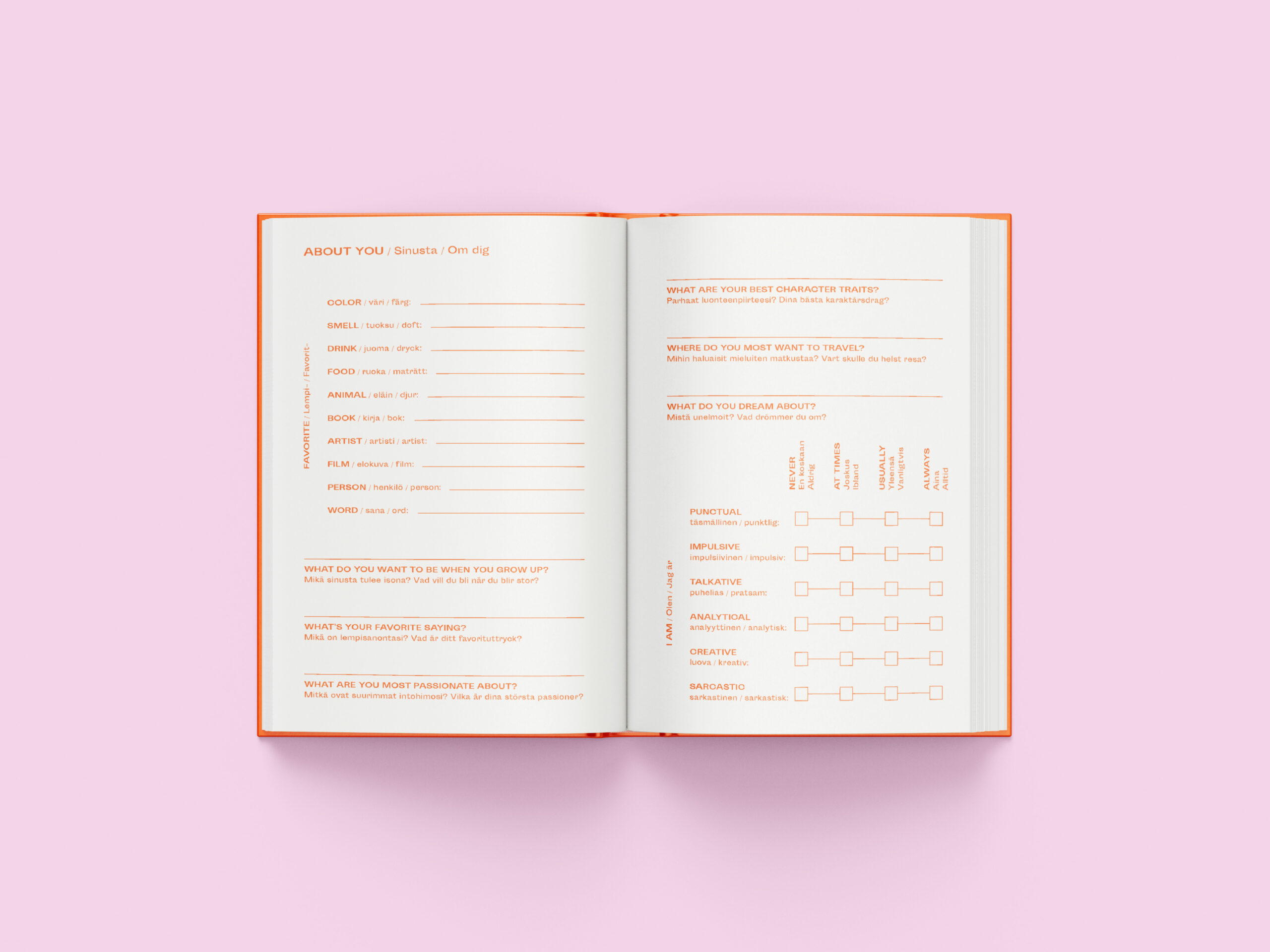
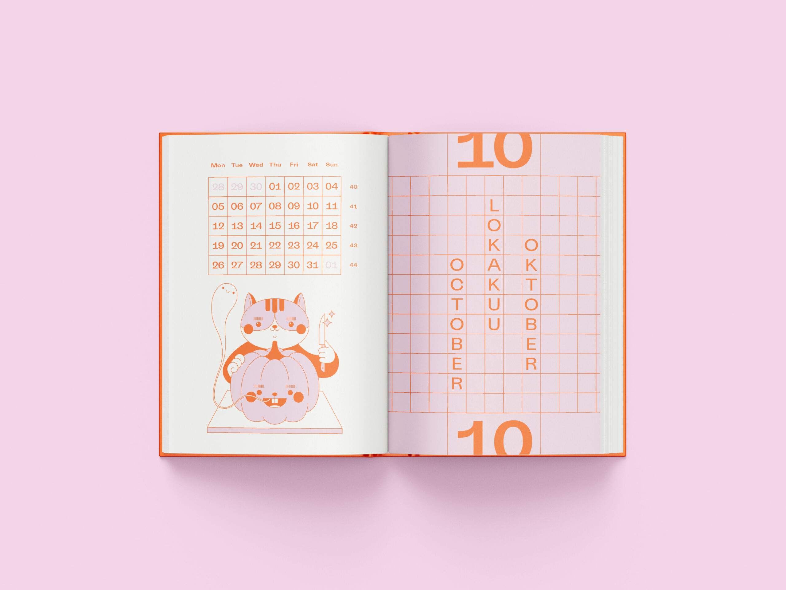
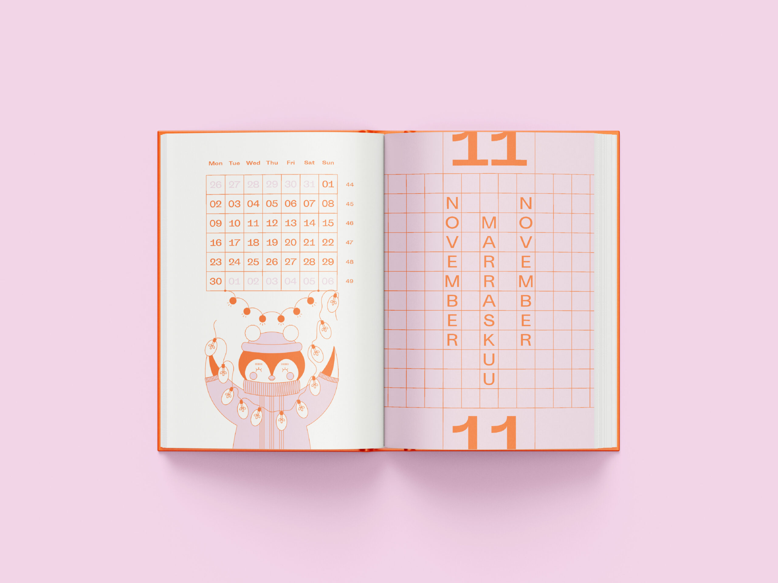
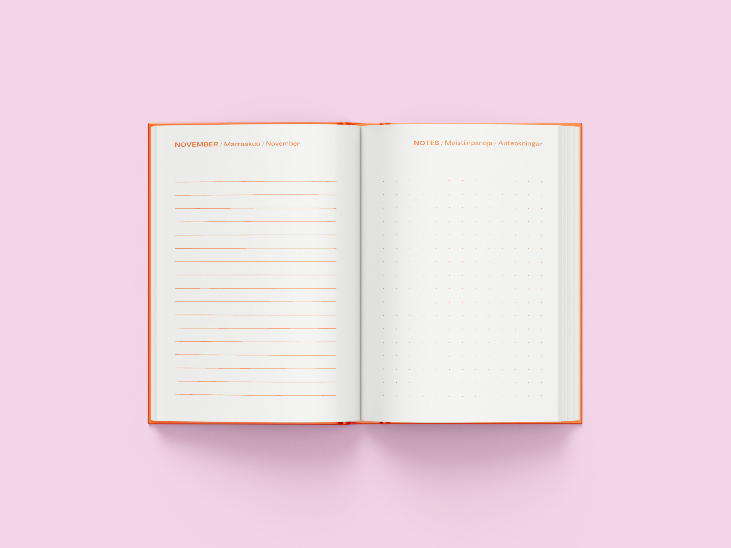
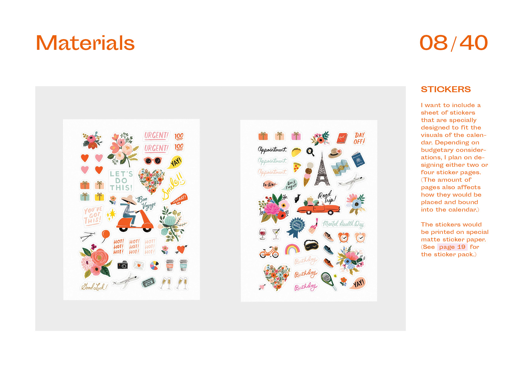
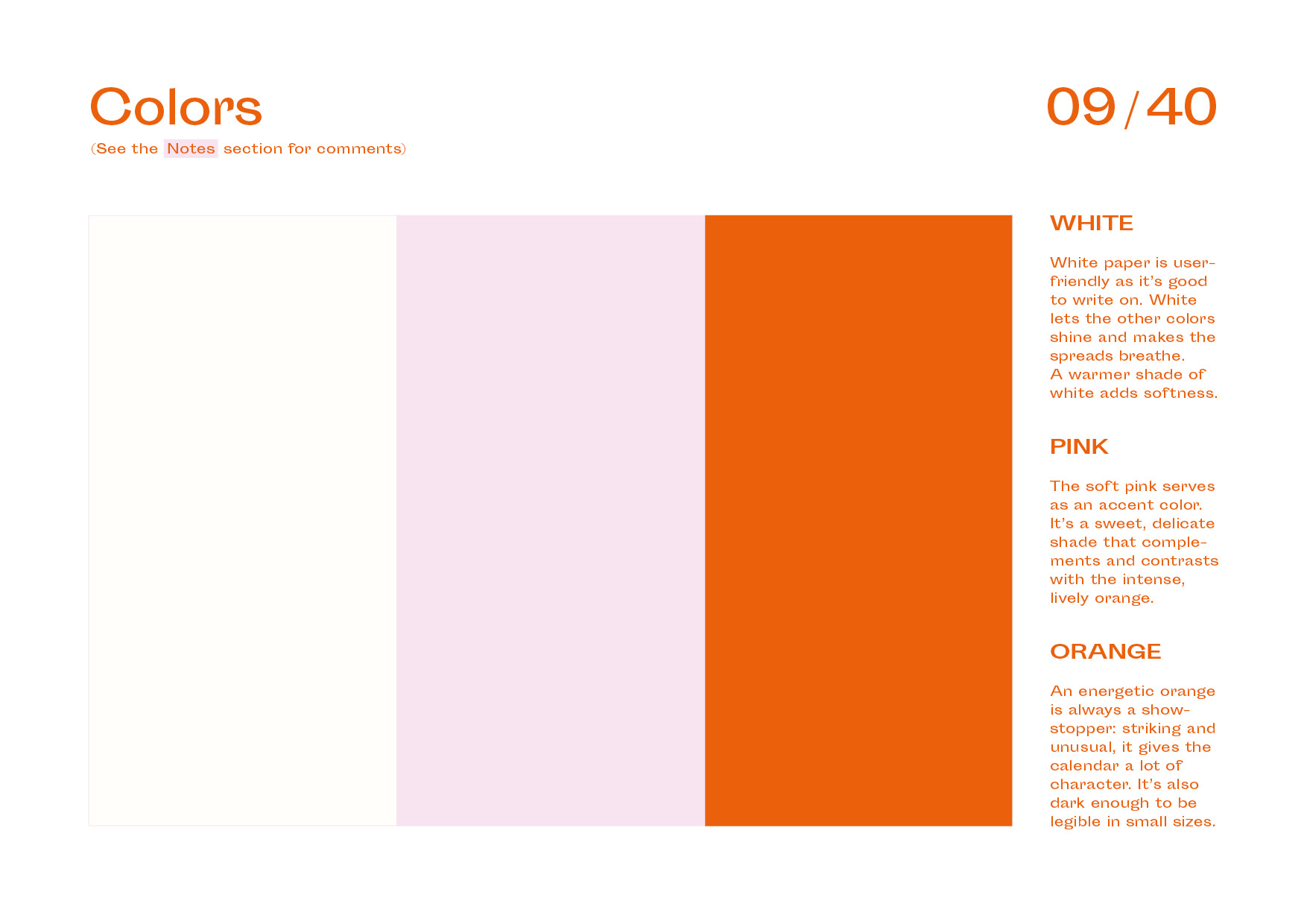
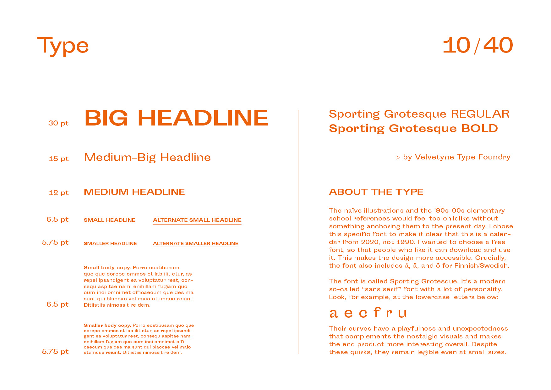
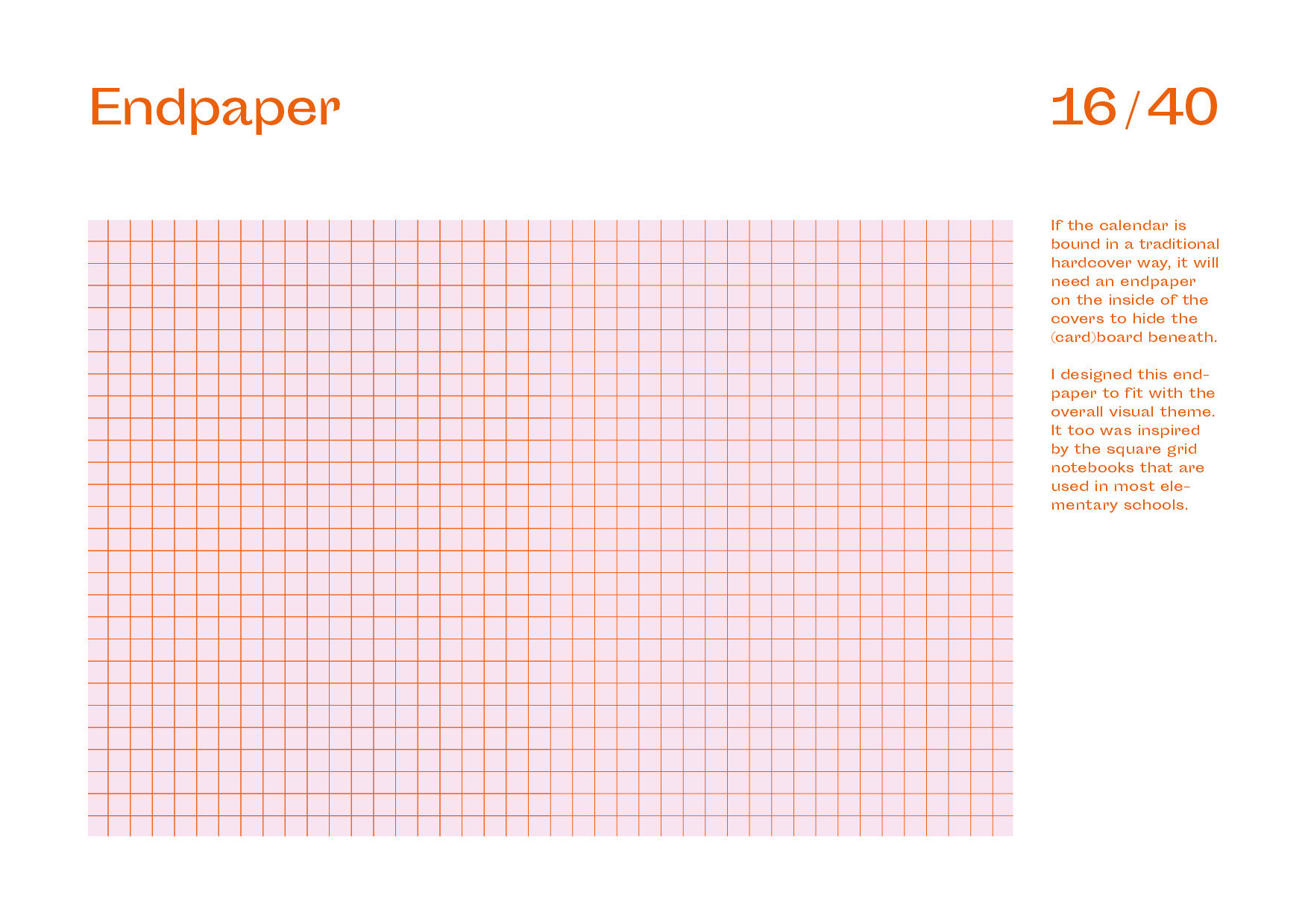
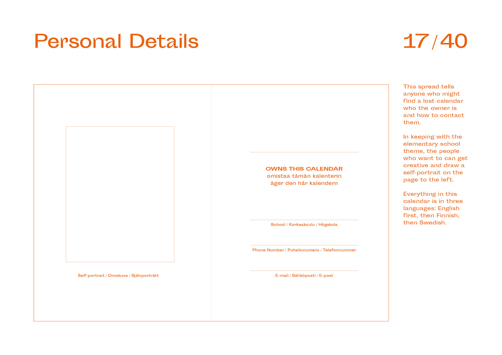
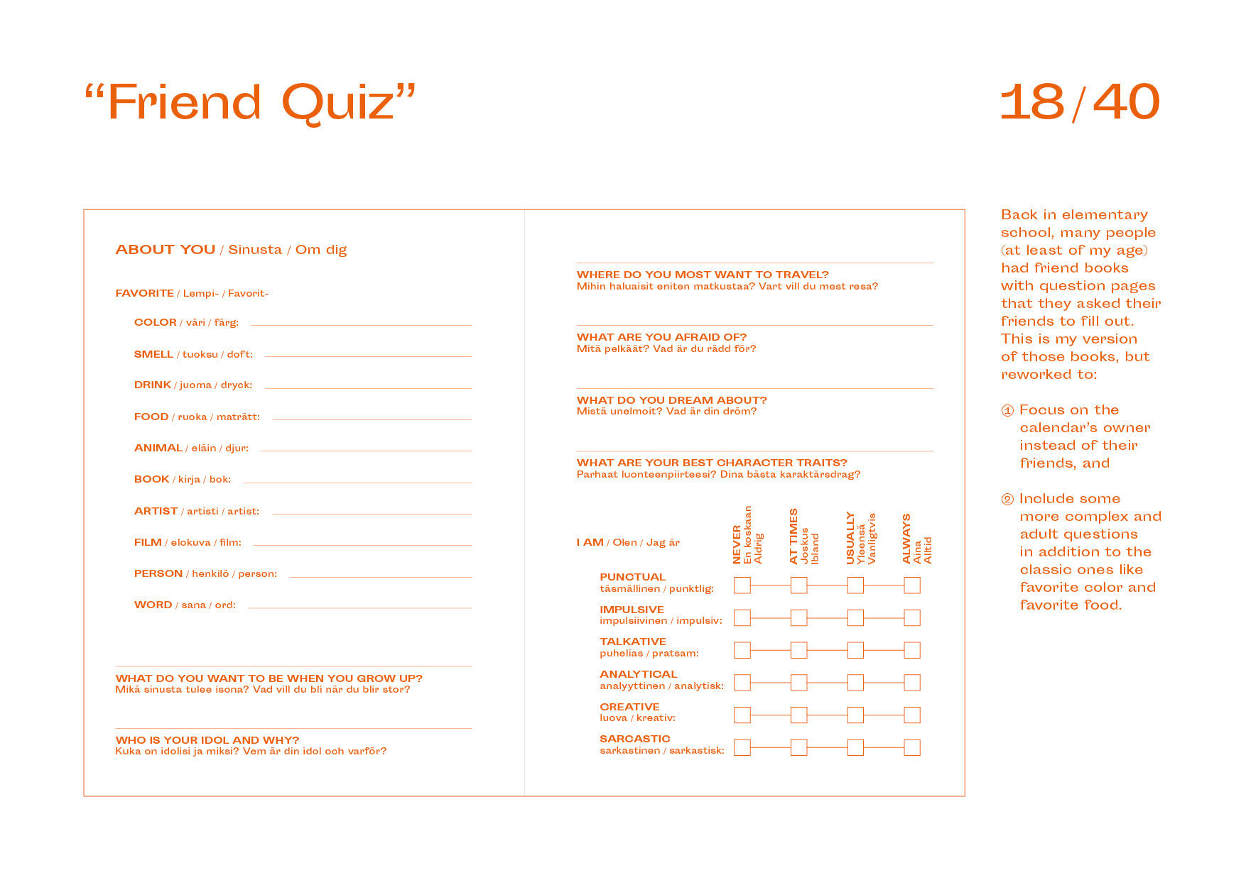
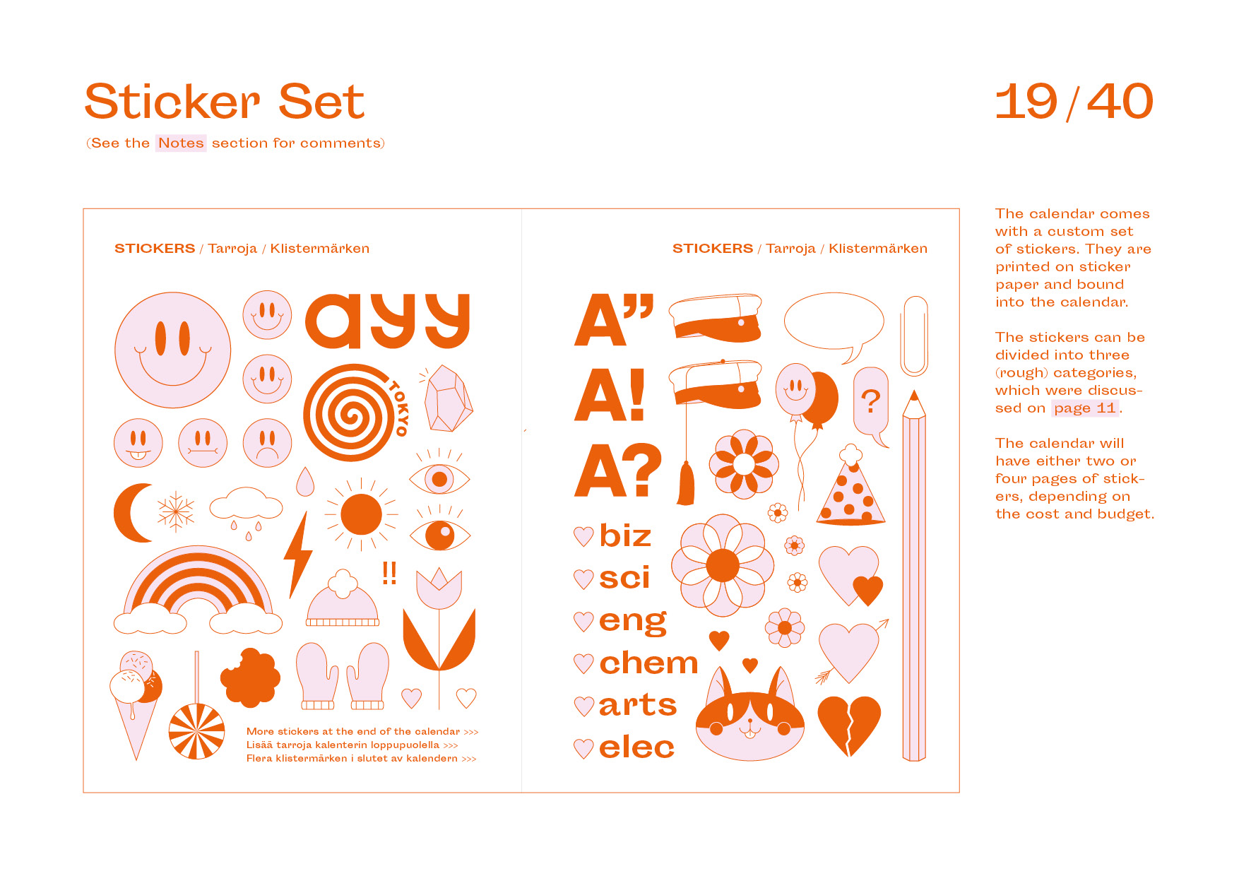
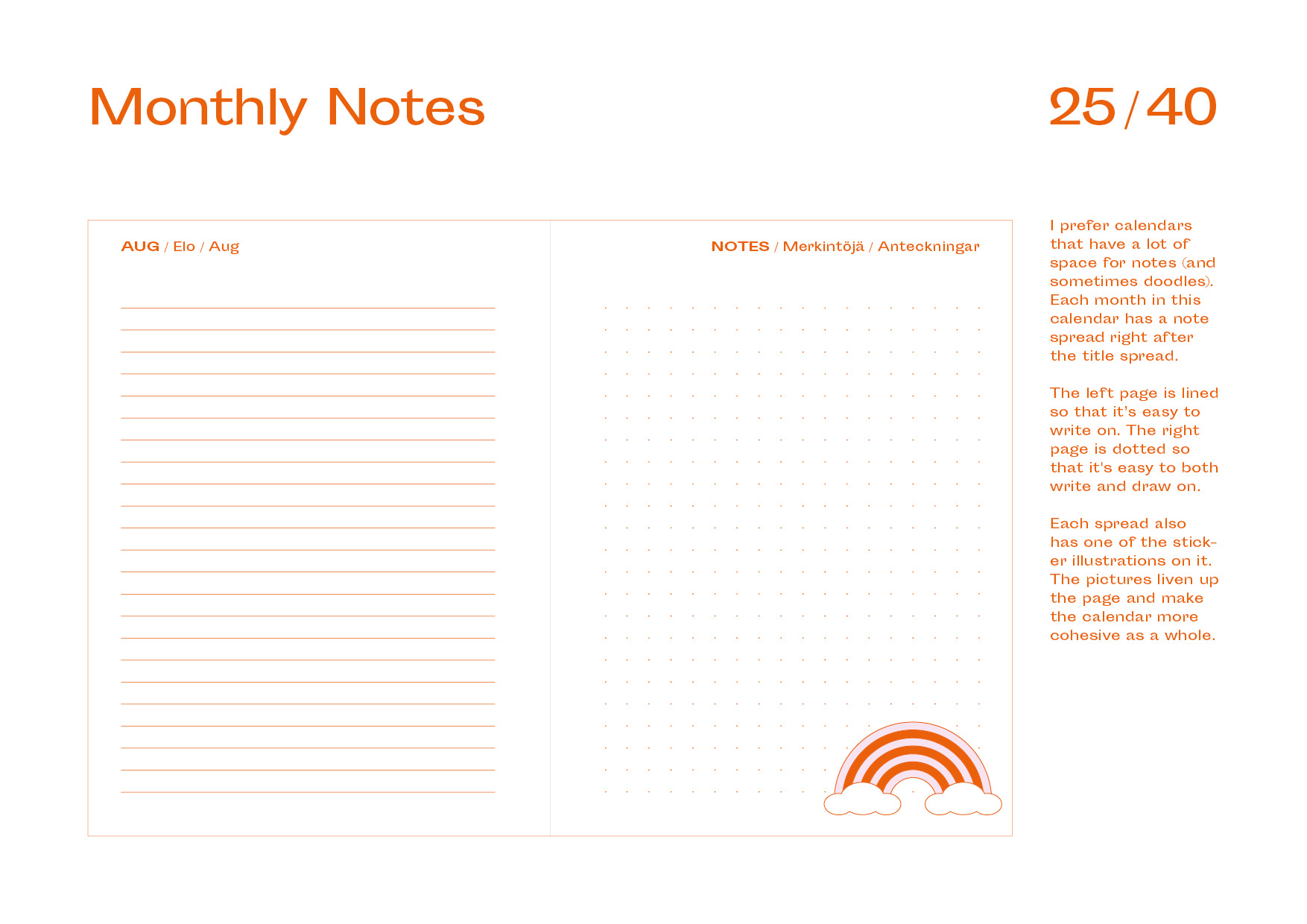
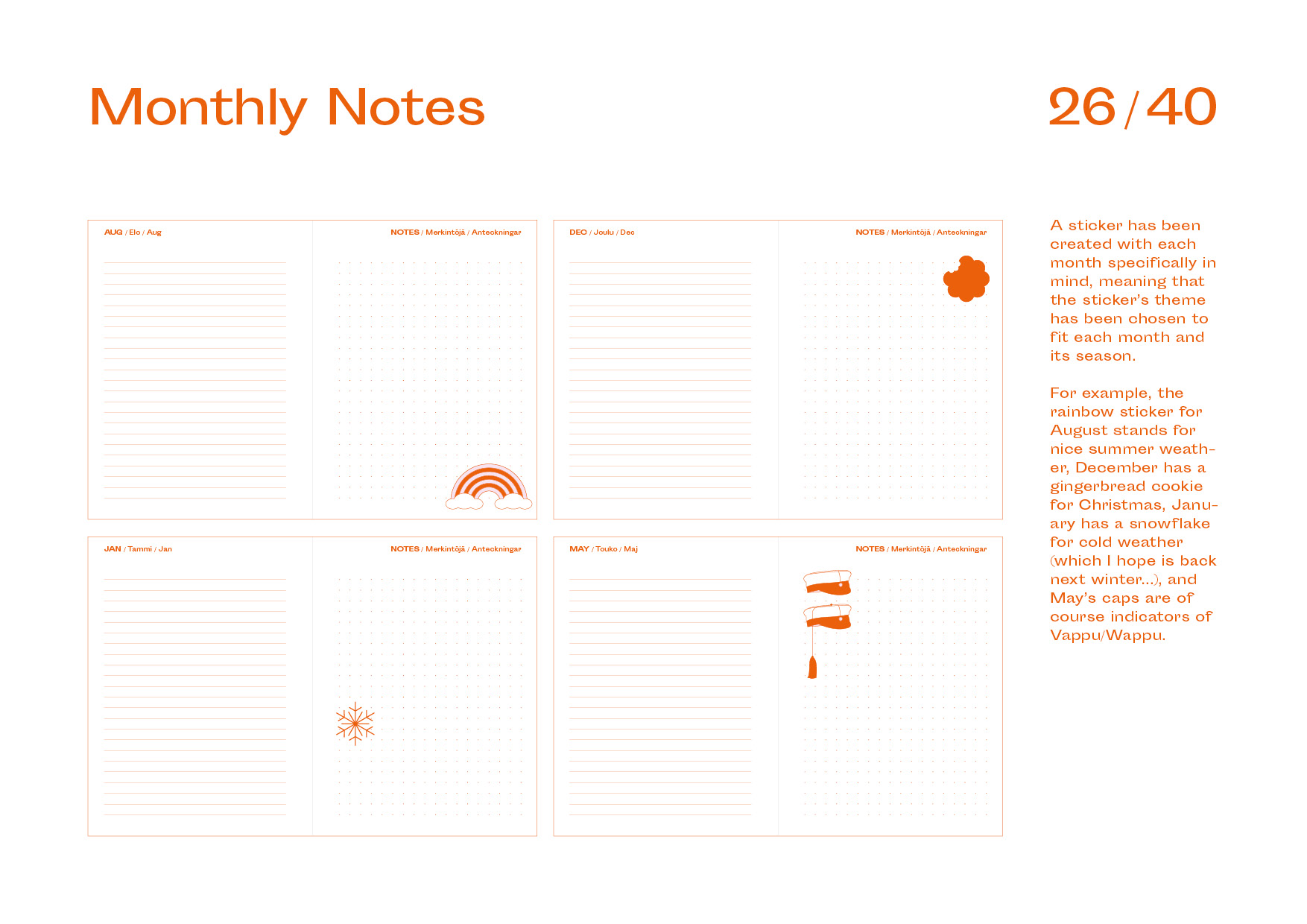
Originally, I had wanted to include a sticker set with the calendar, but that was deemed financially unfeasible by the client, so I instead reworked that idea into thematic illustrations for each month (14 in total). In addition, the calendar has fun throwbacks to my childhood in the ’90s, such as questions about the owner’s opinions and personality. It was printed with two spot colors: a bright orange and a soft pink. The typeface used is the quirky Sporting Grotesque by Velvetyne Type Foundry.
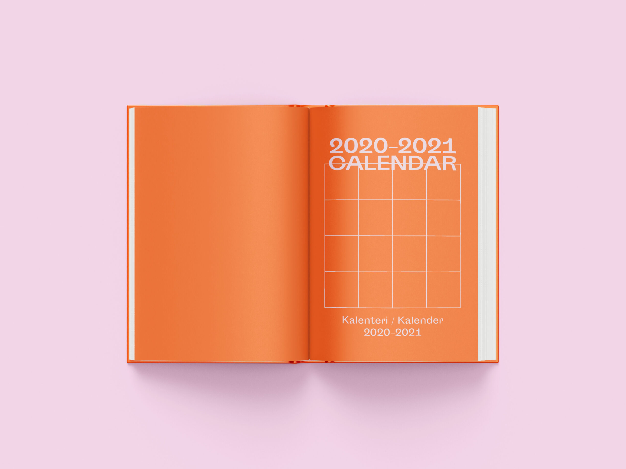
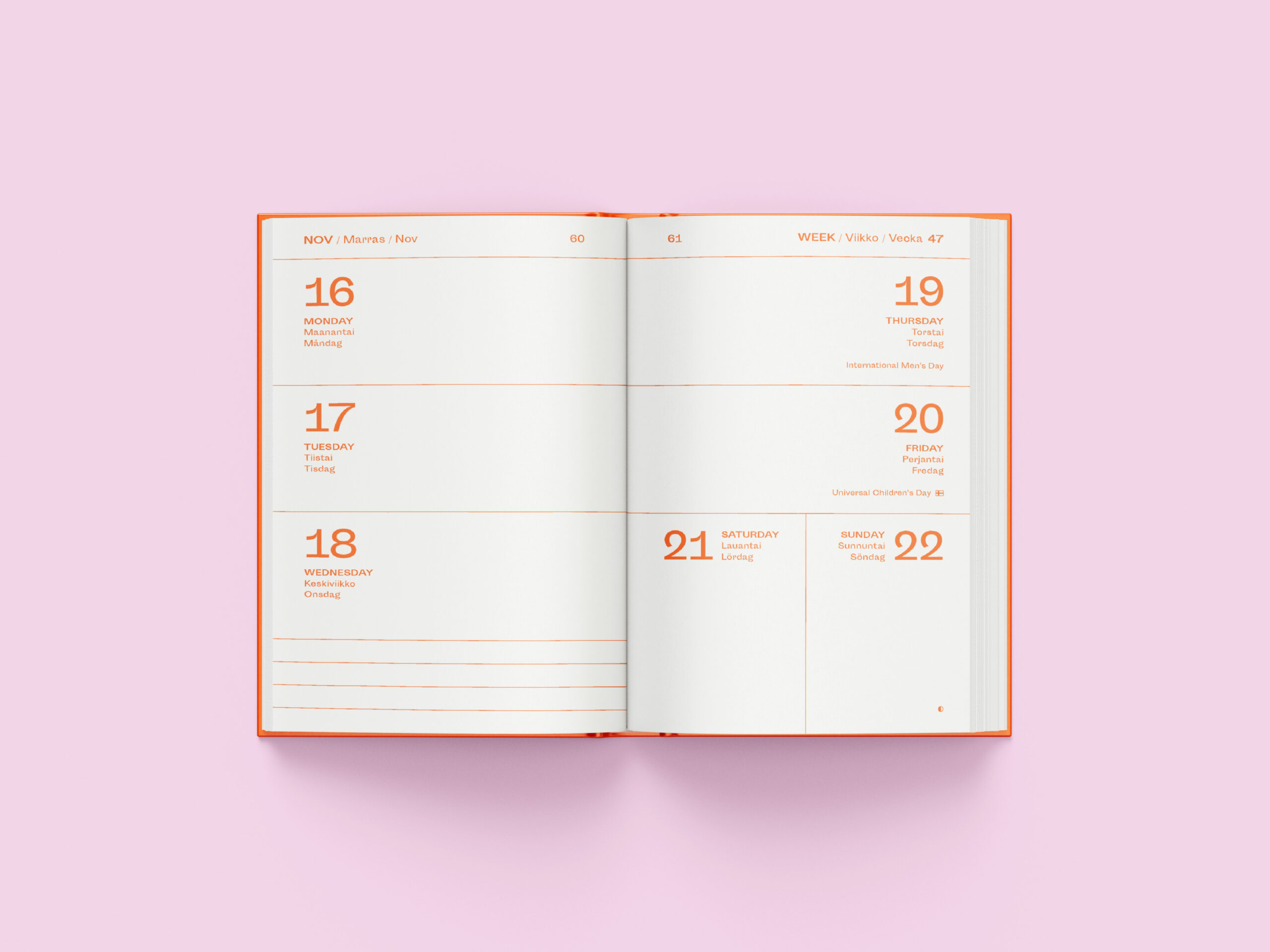
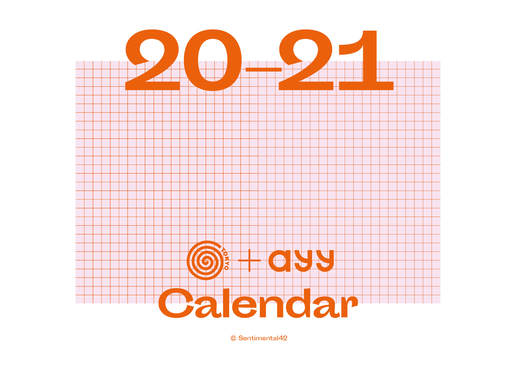
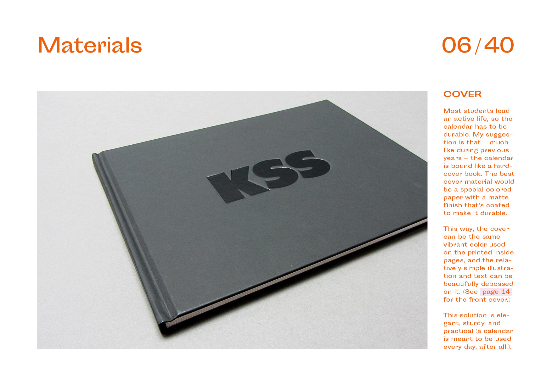
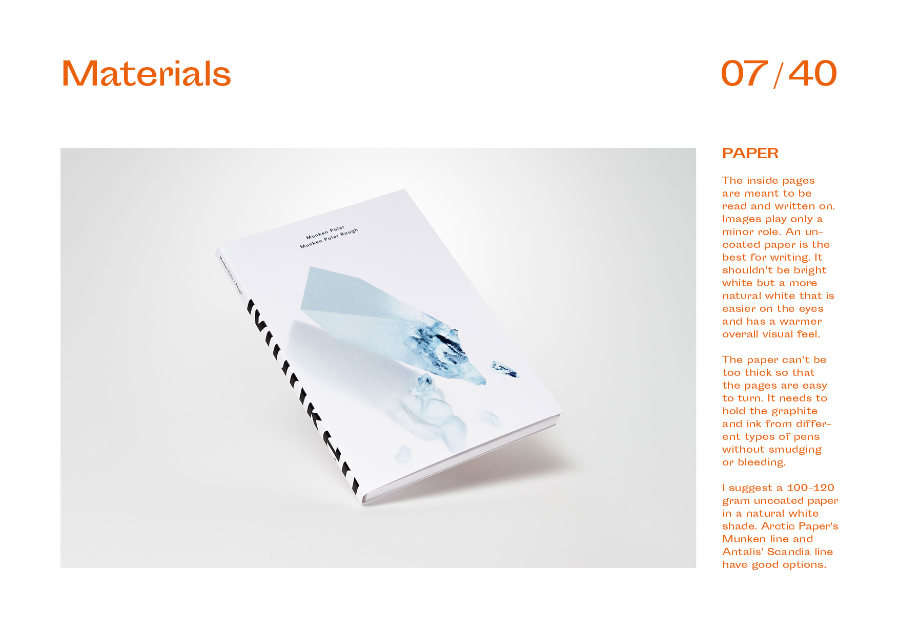
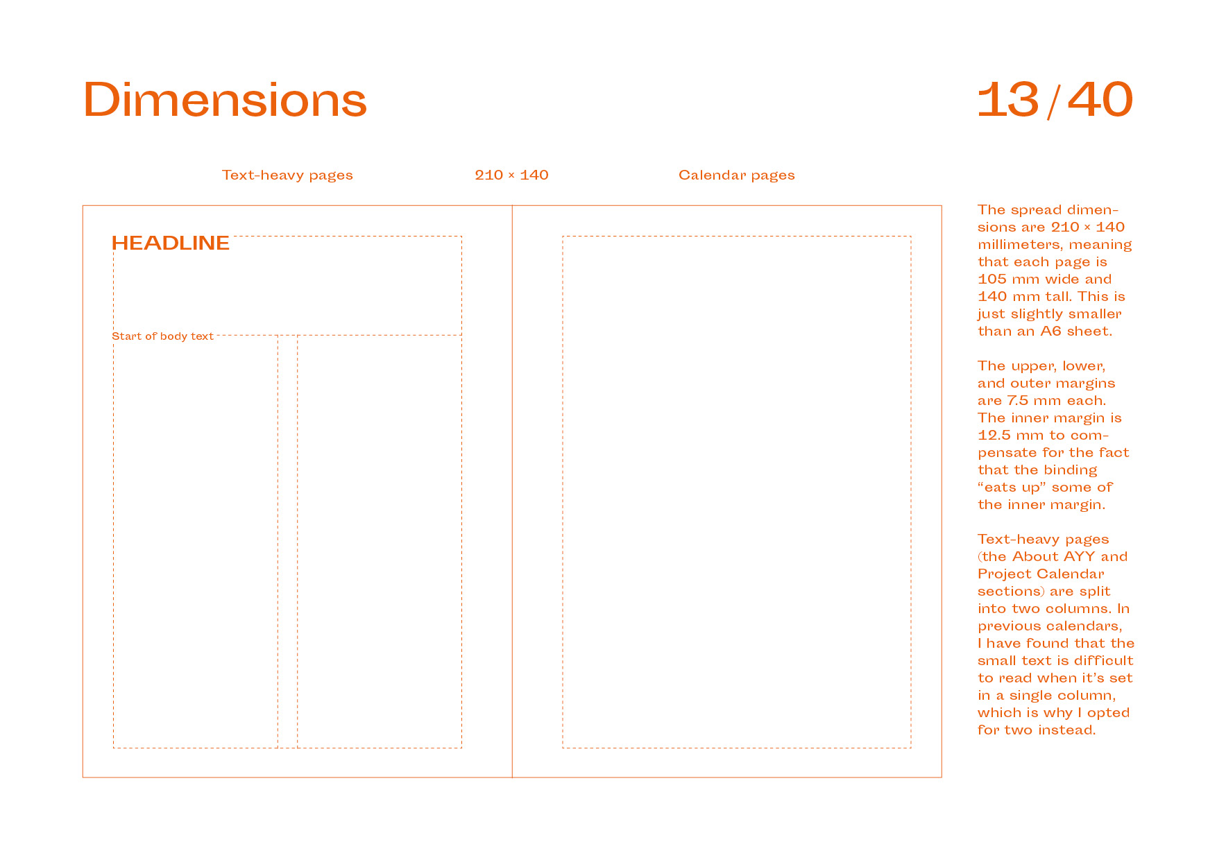
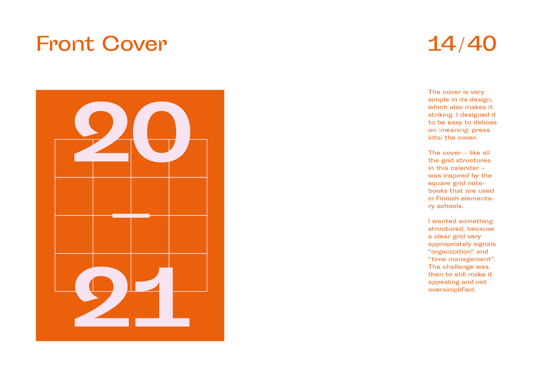
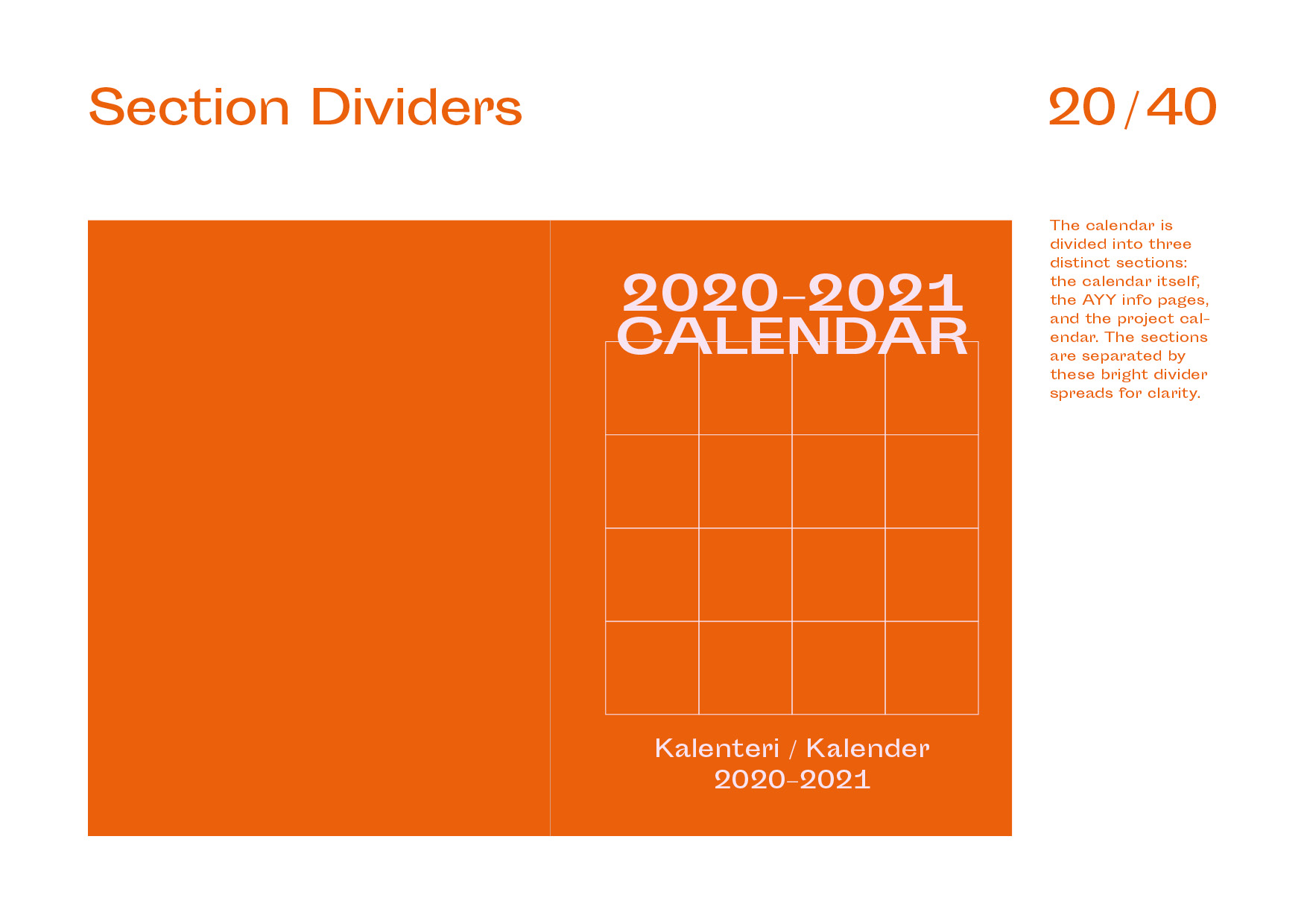
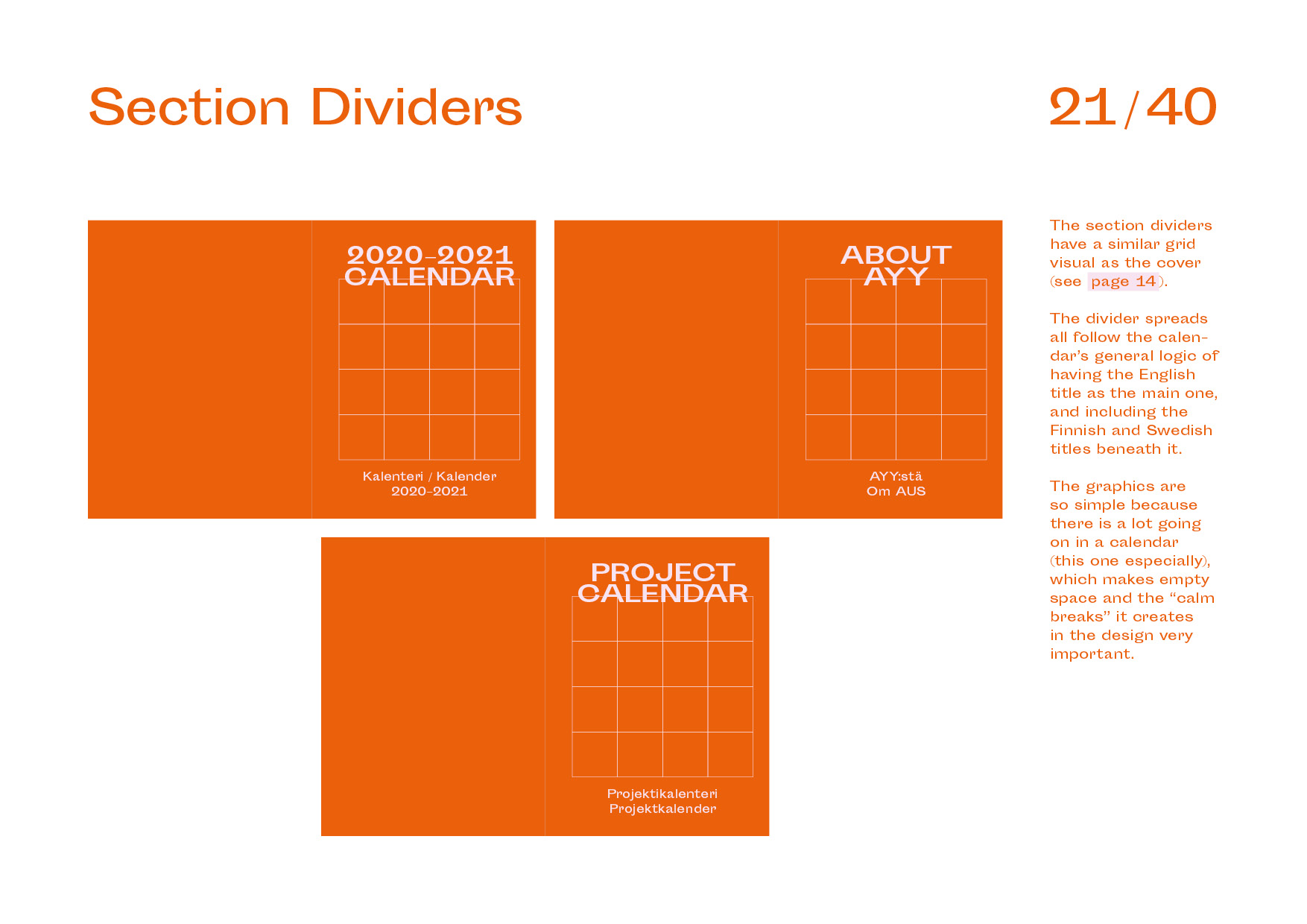
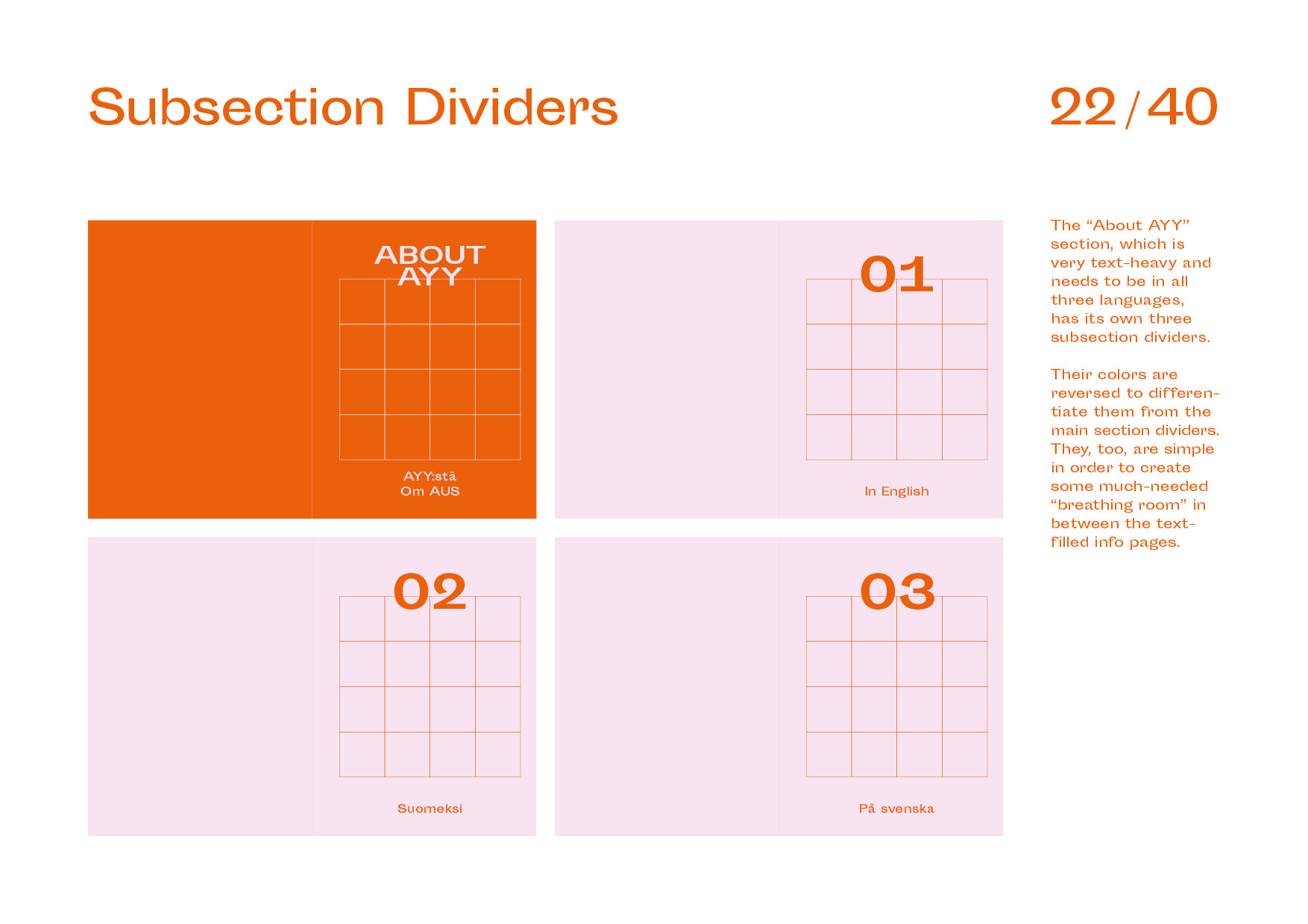
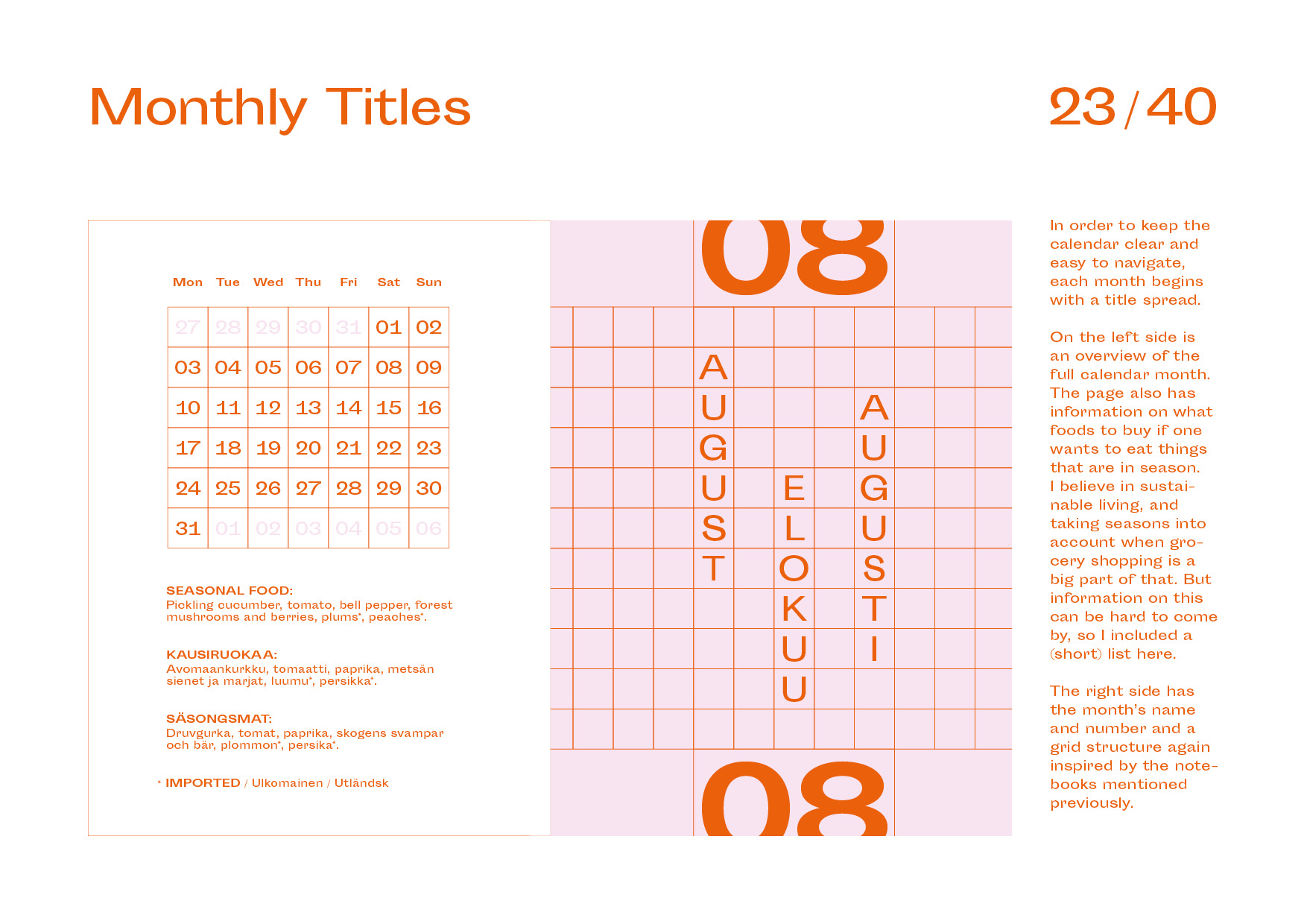
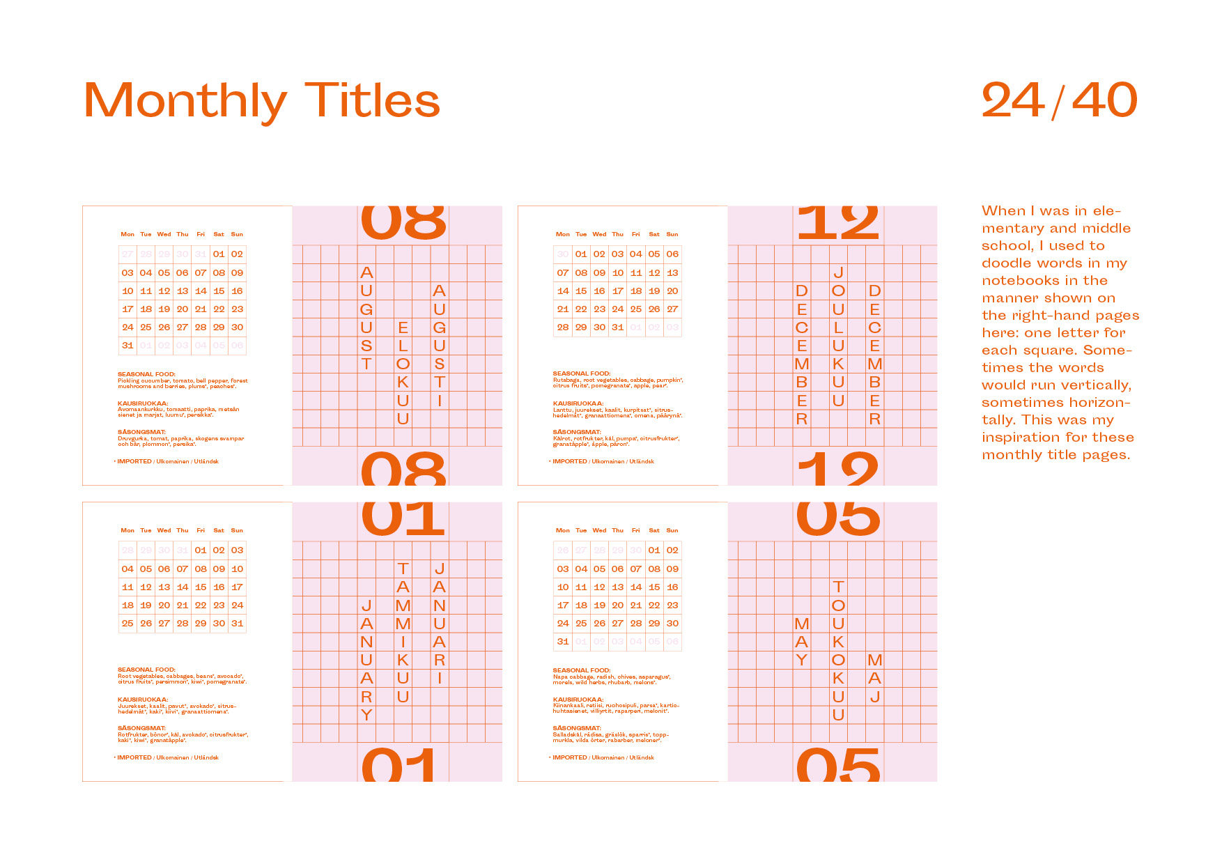
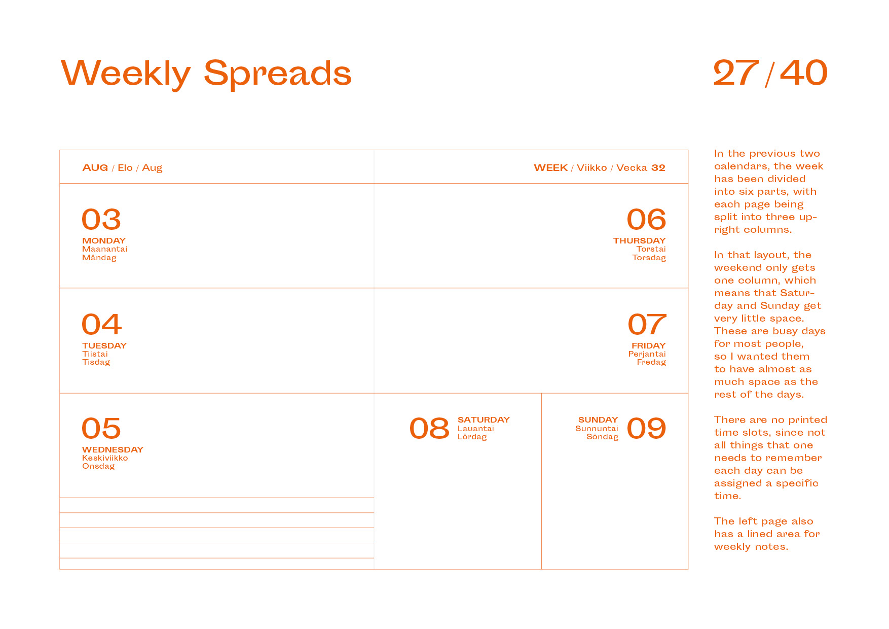
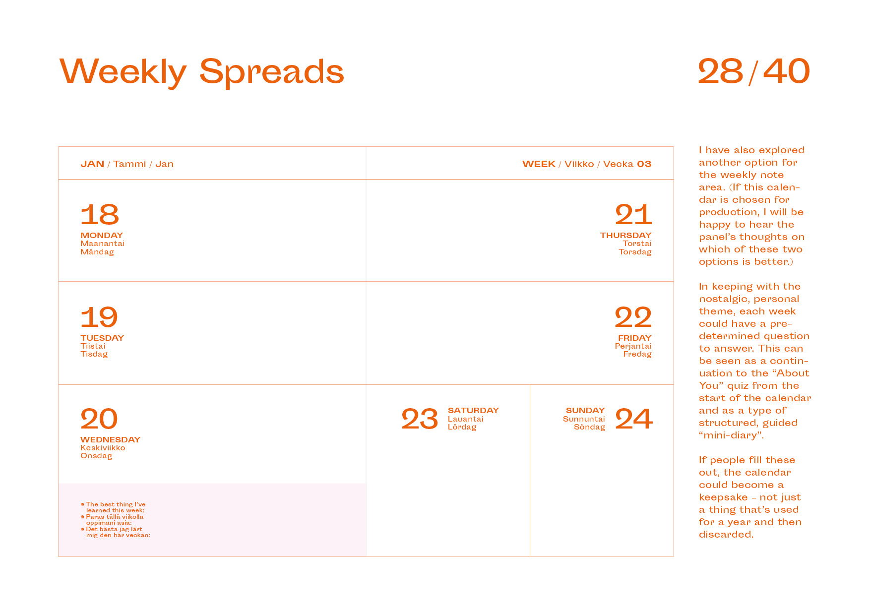
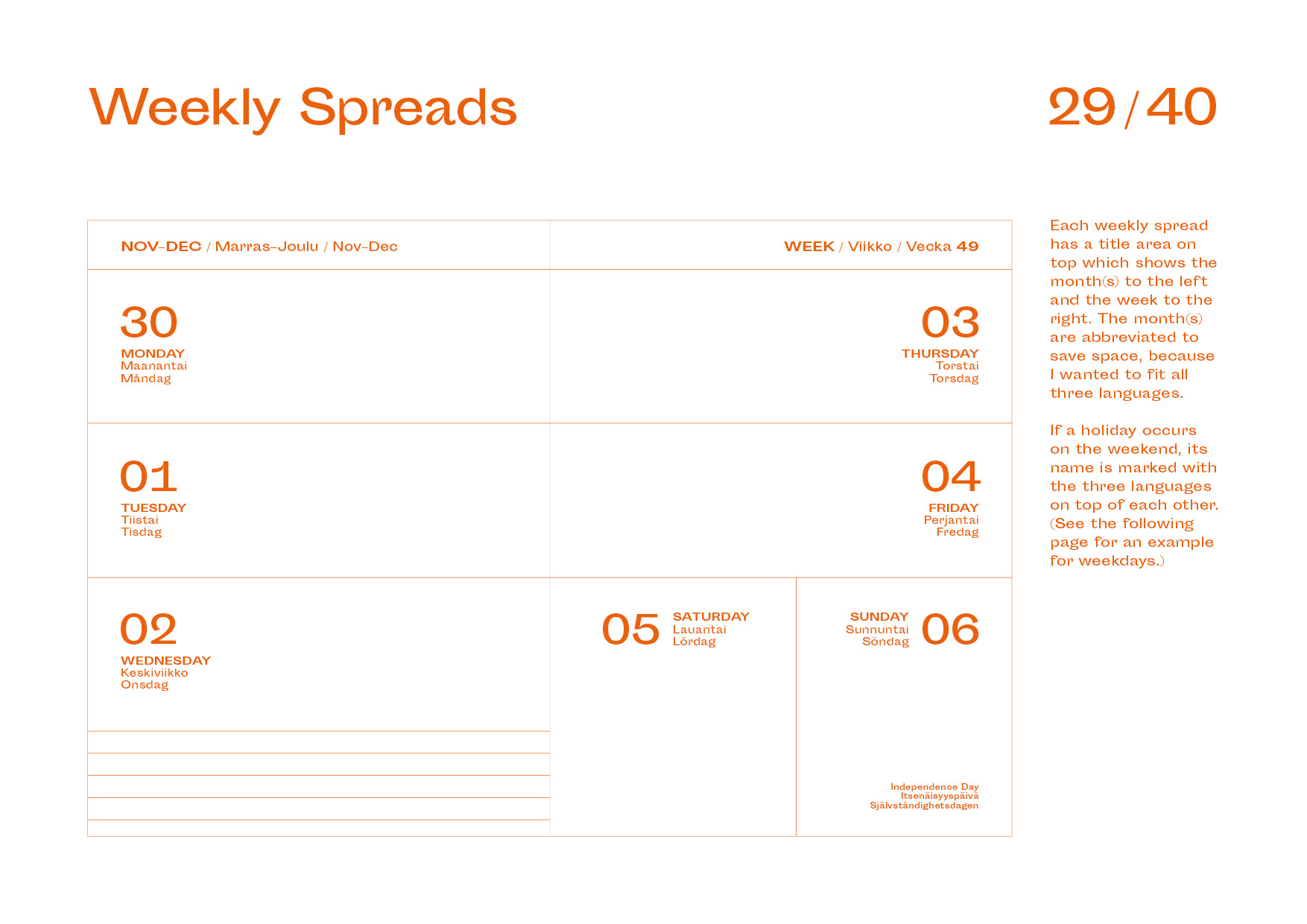
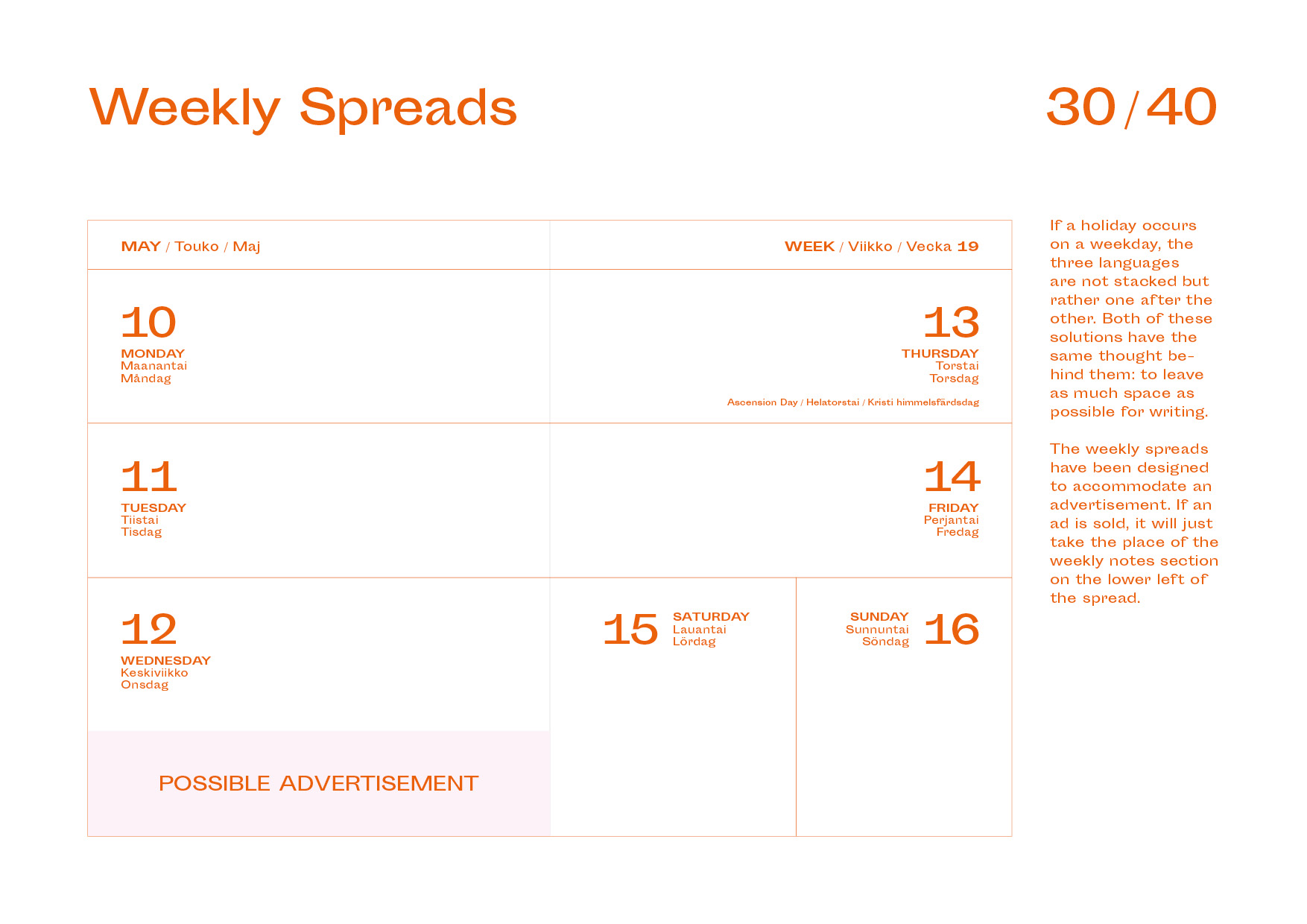
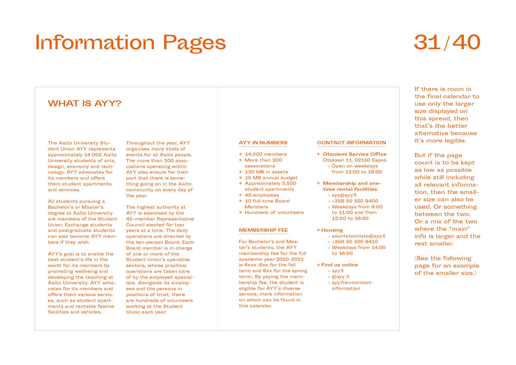
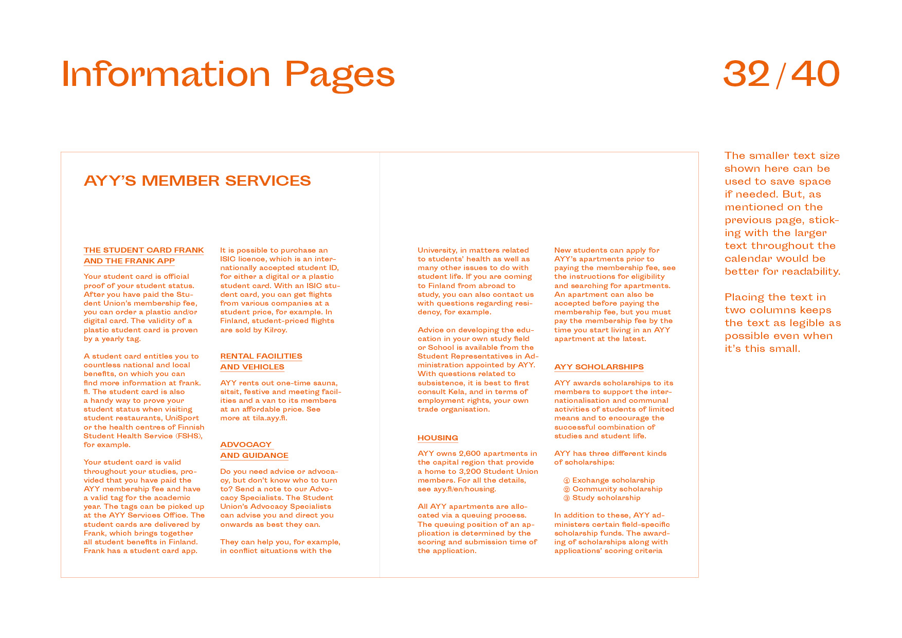
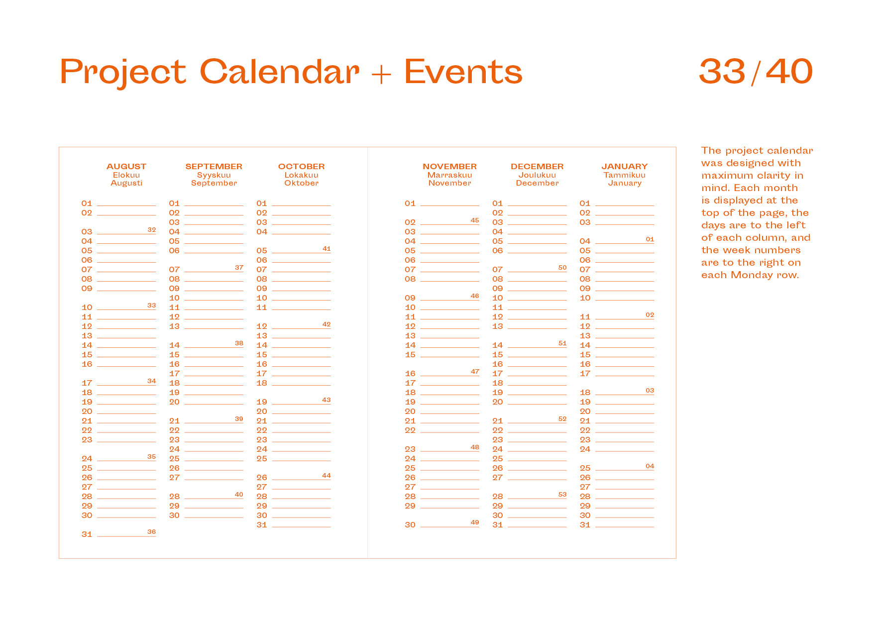
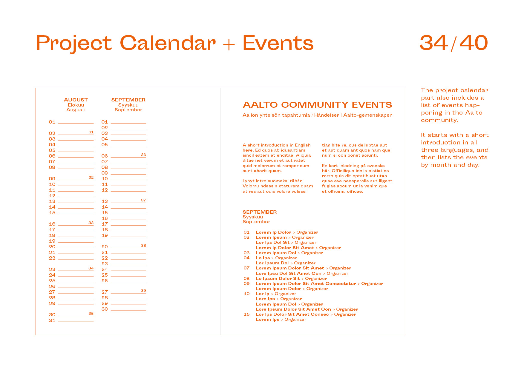
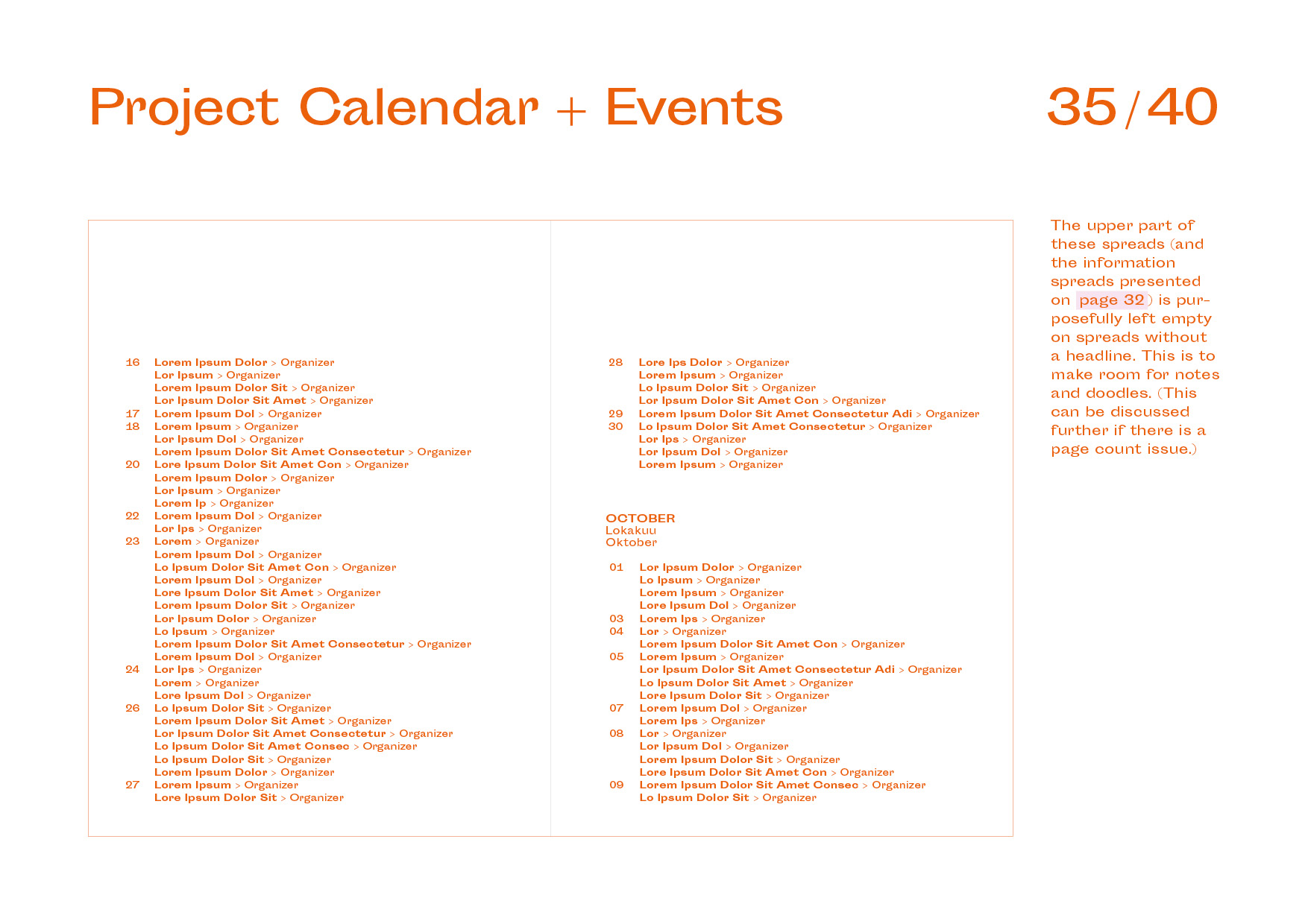
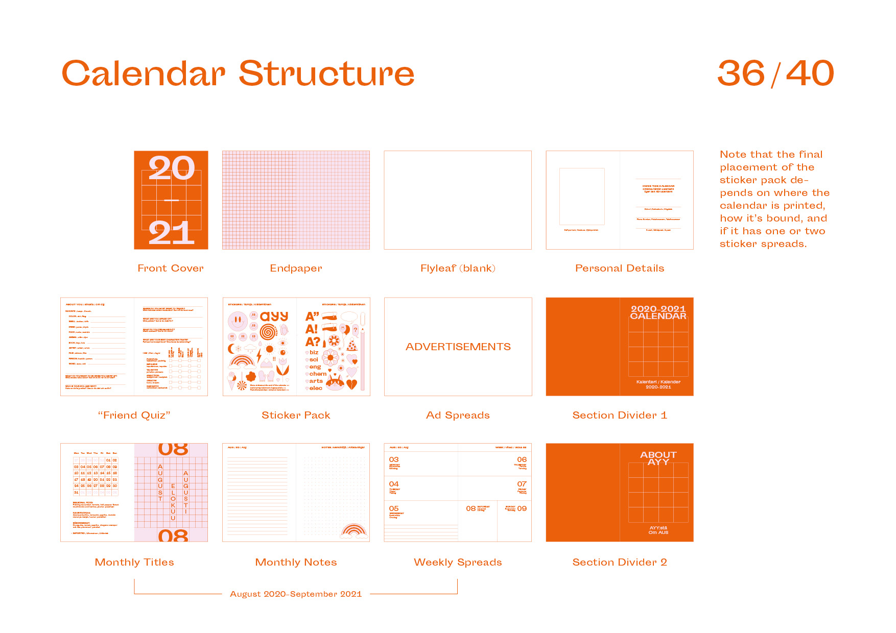
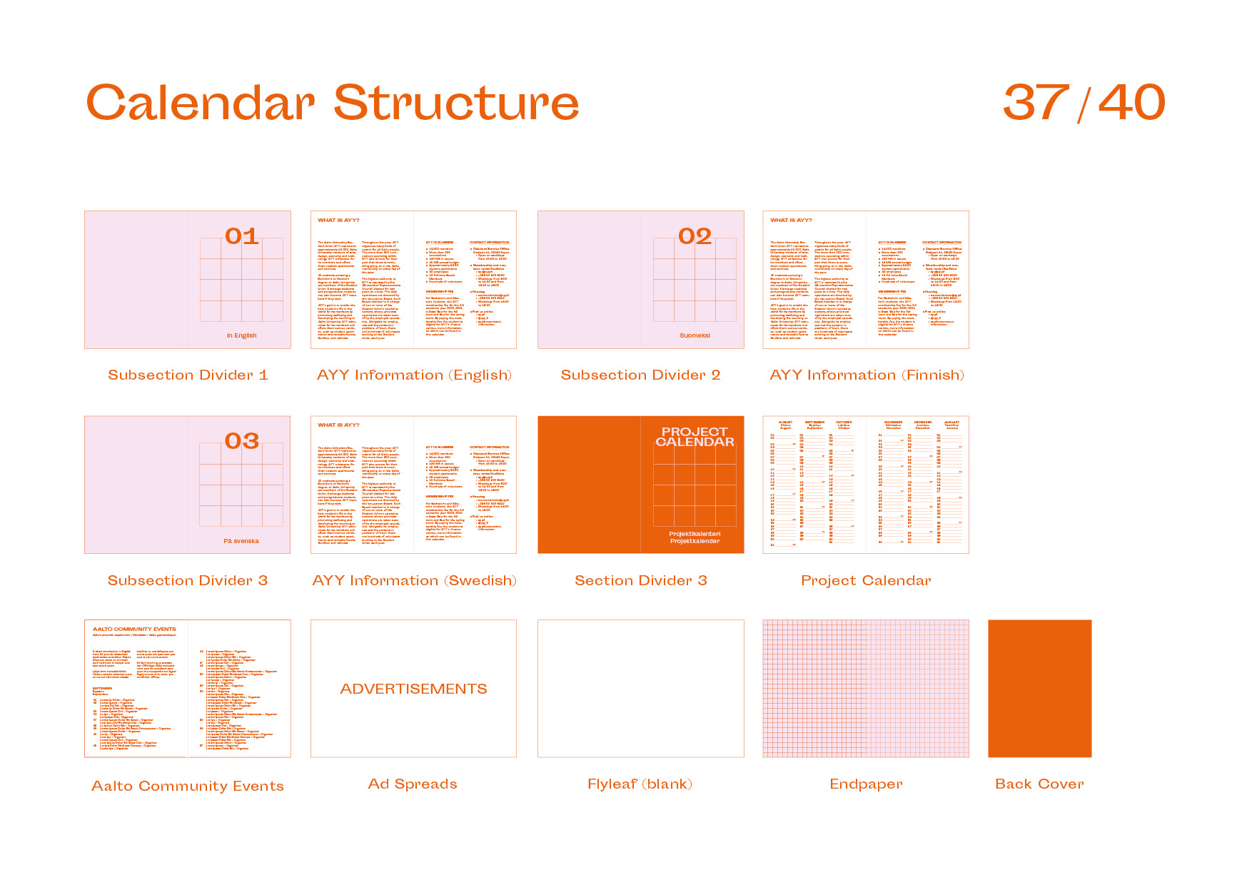
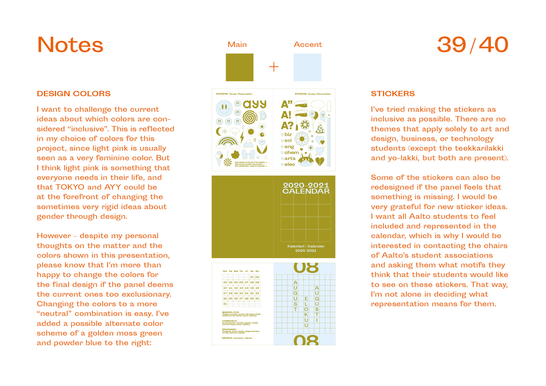
Scroll to the bottom to see the full anonymous pitch deck I sent to the calendar competition committee in 2019. It presents all the elements required by them: the cover, monthly title pages, weekly calendar spreads, section dividers, general information pages, and project planning pages. It also includes detailed examples of other things I thought were important to show, such as materials, colors, typography, illustrations, and the calendar’s stucture.
Design
Calendar
Type
Client Work
Client
Aalto University Student Union (AYY)
Tags
Editorial Design
Illustration
Year
2020
This project started out as a competition submission for the design of my university’s yearly printed pocket calendar. My concept was chosen, so I got to finish it and see it be distributed to each student at the school. The calendar’s theme is “Elementary School Nostalgia”, since the illustrations in it were inspired by the animal stickers I collected as a kid.
Originally, I had wanted to include a sticker set with the calendar, but that was deemed financially unfeasible by the client, so I instead reworked that idea into thematic illustrations for each month (14 in total). In addition, the calendar has fun throwbacks to my childhood in the ’90s, such as questions about the owner’s opinions and personality. It was printed with two spot colors: a bright orange and a soft pink. The typeface used is the quirky Sporting Grotesque by Velvetyne Type Foundry.
Scroll to the bottom to see the full anonymous pitch deck I sent to the calendar competition committee in 2019. It presents all the elements required by them: the cover, monthly title pages, weekly calendar spreads, section dividers, general information pages, and project planning pages. It also includes detailed examples of other things I thought were important to show, such as materials, colors, typography, illustrations, and the calendar’s stucture.


Design Calendar
Type Client Work
Client Aalto University Student Union (AYY)
Tags Editorial Design, Illustration
Year 2020
This project started out as a competition submission for the design of my university’s yearly printed pocket calendar. My concept was chosen, so I got to finish it and see it be distributed to each student at the school. The calendar’s theme is “Elementary School Nostalgia”, since the illustrations in it were inspired by the animal stickers I collected as a kid.
Originally, I had wanted to include a sticker set with the calendar, but that was deemed financially unfeasible by the client, so I instead reworked that idea into thematic illustrations for each month (14 in total). In addition, the calendar has fun throwbacks to my childhood in the ’90s, such as questions about the owner’s opinions and personality. It was printed with two spot colors: a bright orange and a soft pink. The typeface used is the quirky Sporting Grotesque by Velvetyne Type Foundry.
Visit the desktop version of this page to see the full anonymous pitch deck I sent to the calendar competition committee in 2019. It presents all the elements required by them: the cover, monthly title pages, weekly calendar spreads, section dividers, general information pages, and project planning pages. It also includes detailed examples of other things I thought were important to show, such as materials, colors, typography, illustrations, and the calendar’s stucture.
