Kylteri
Type
Client Work
Client
The KY Foundation
Tags
Editorial Design
Illustration
Website Design
Year
2023–2024
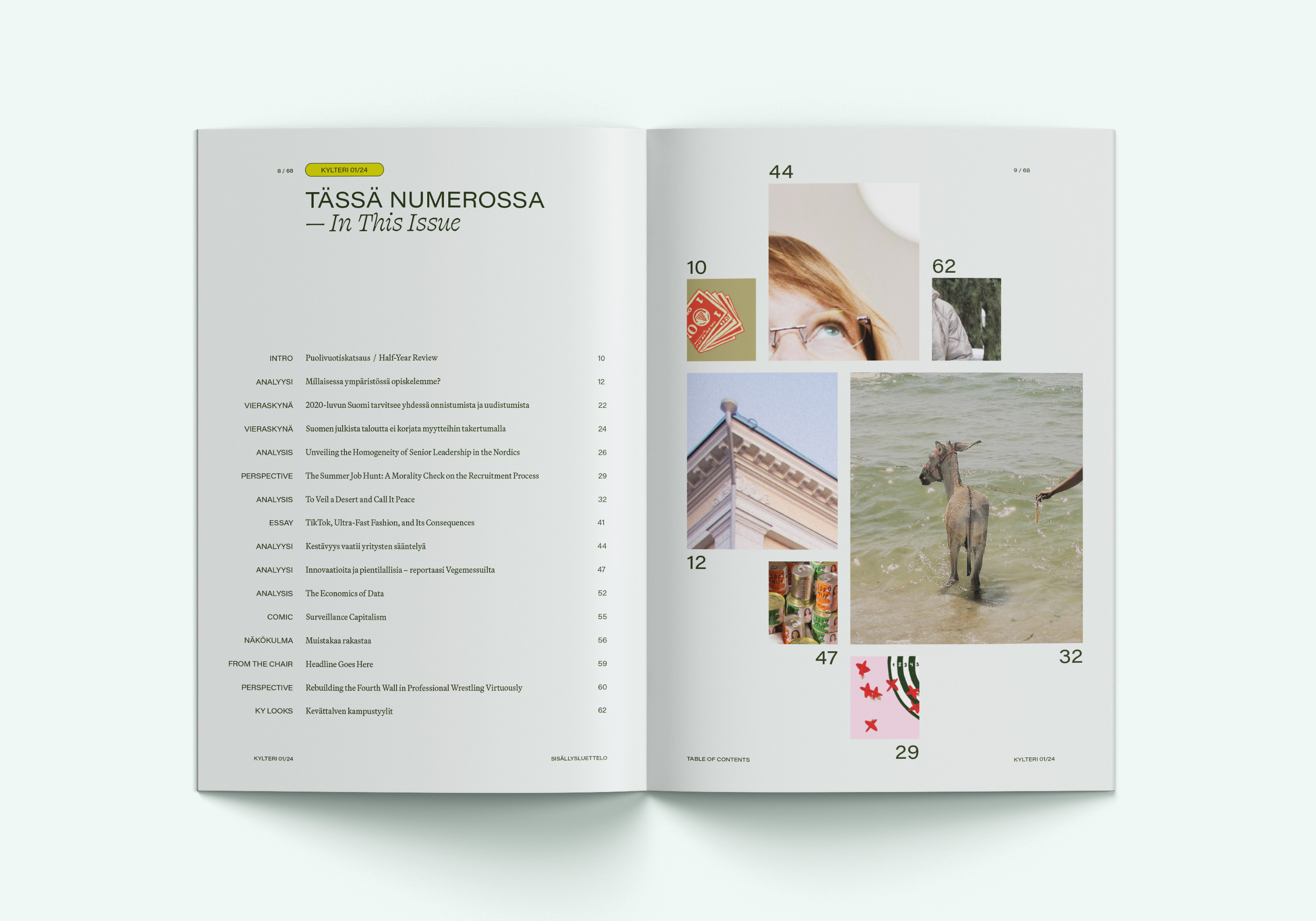
As the Art Director for KY, the Business Students’ association at Aalto University, one of my main responsibilities was overseeing the visual language of Kylteri Magazine, a bi-yearly student-led publication with a rich history and a self-decribed target audience of ”all business-minded people”. The magazine is bilingual, publishing articles in both Finnish and English.
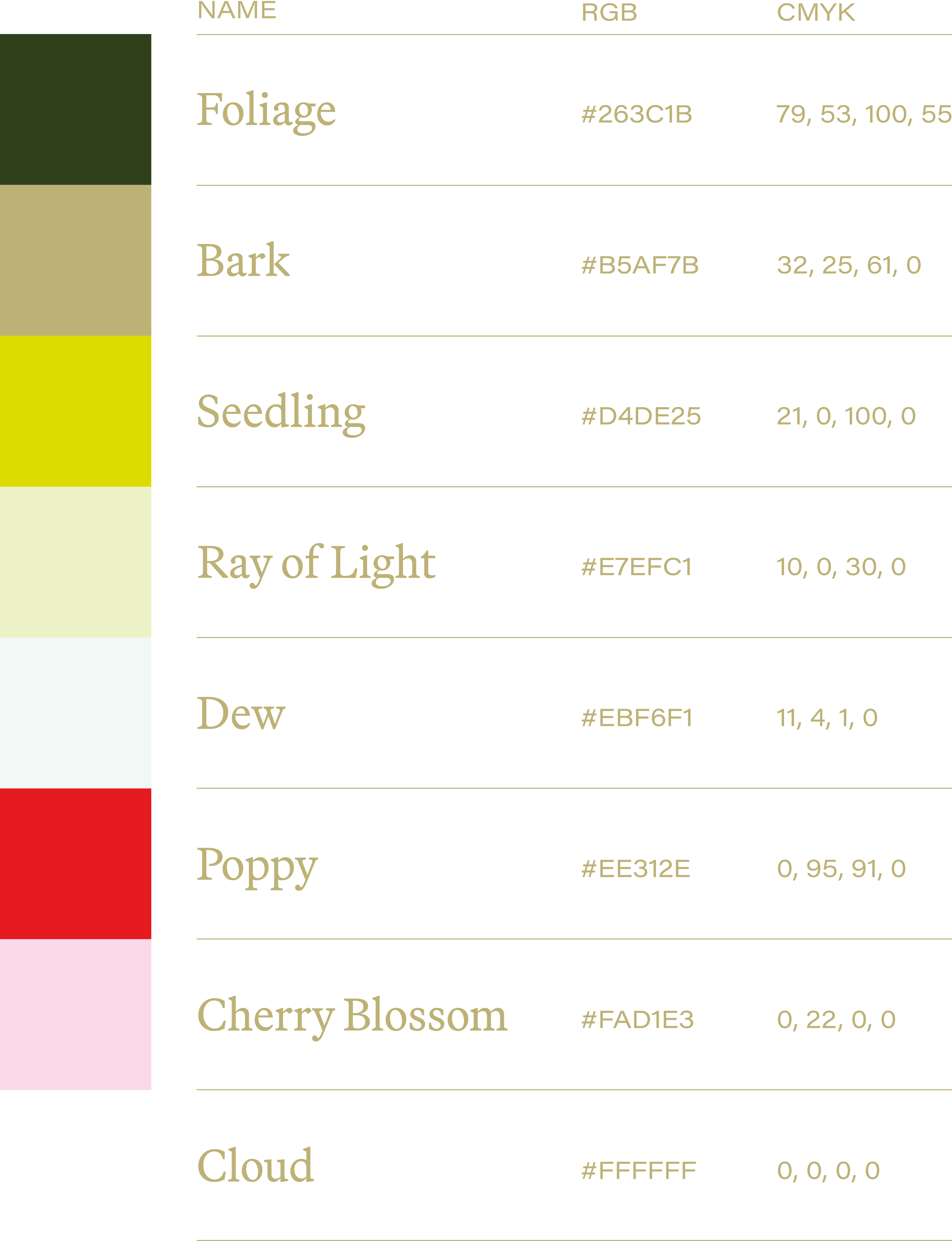
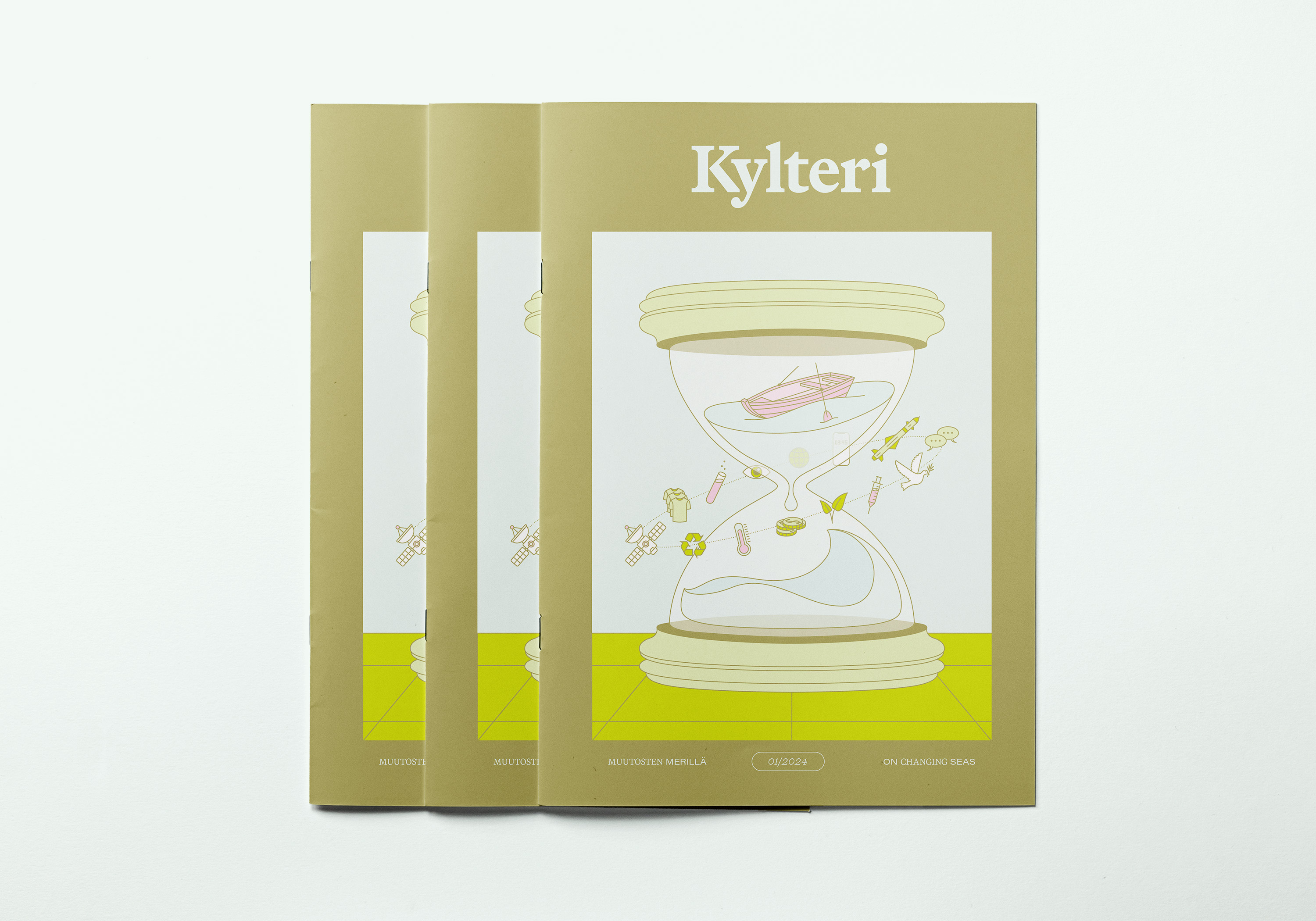
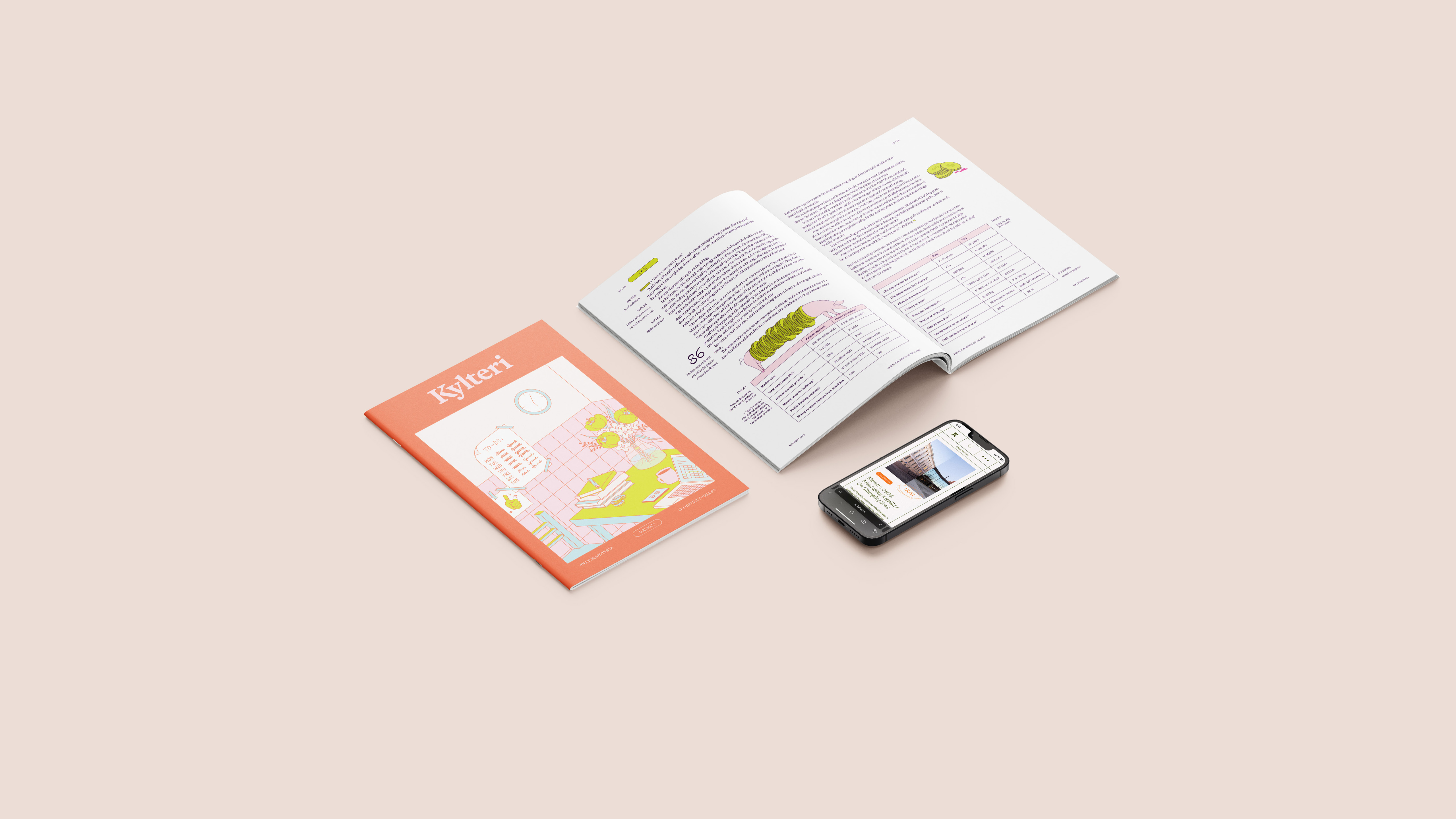
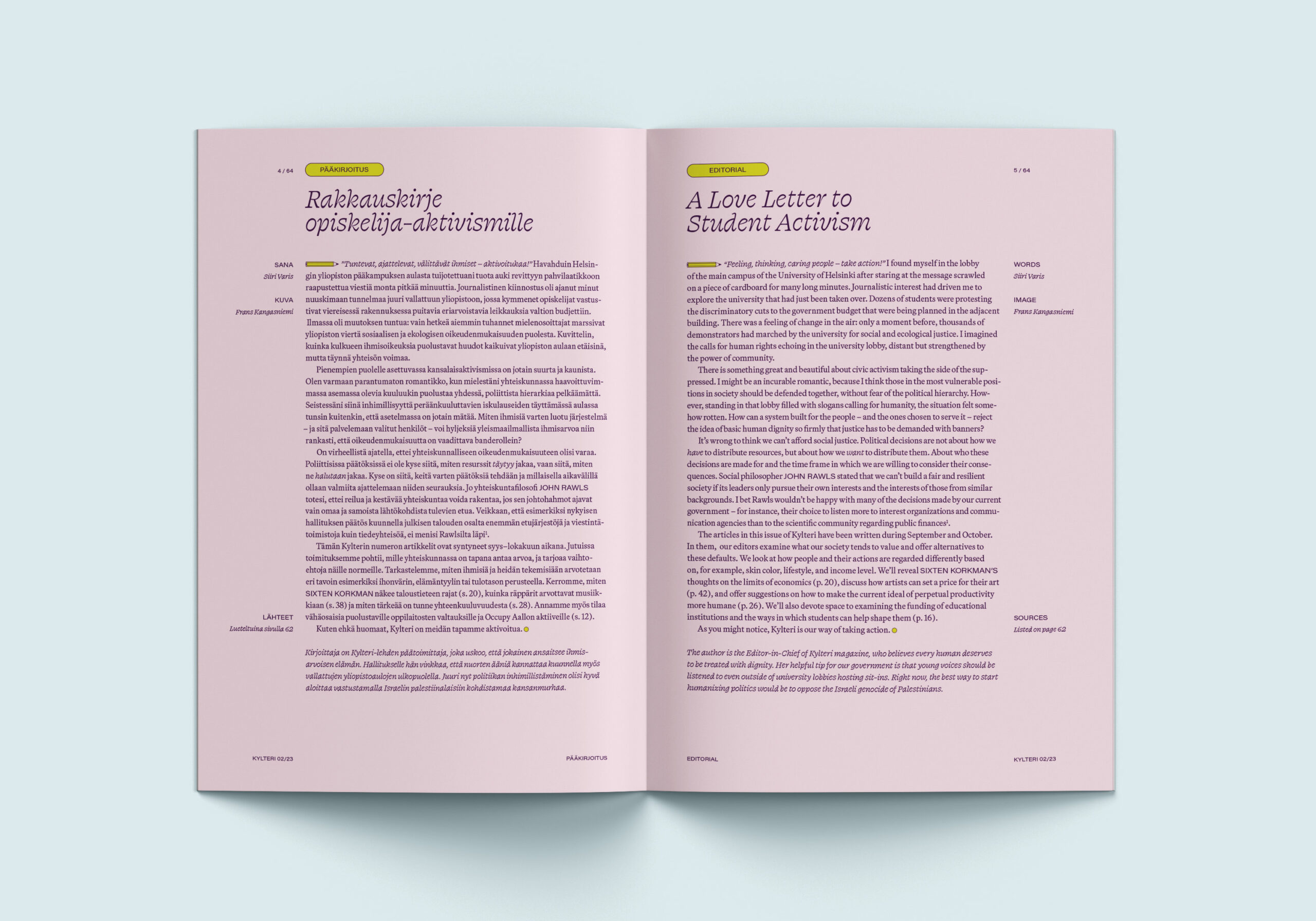
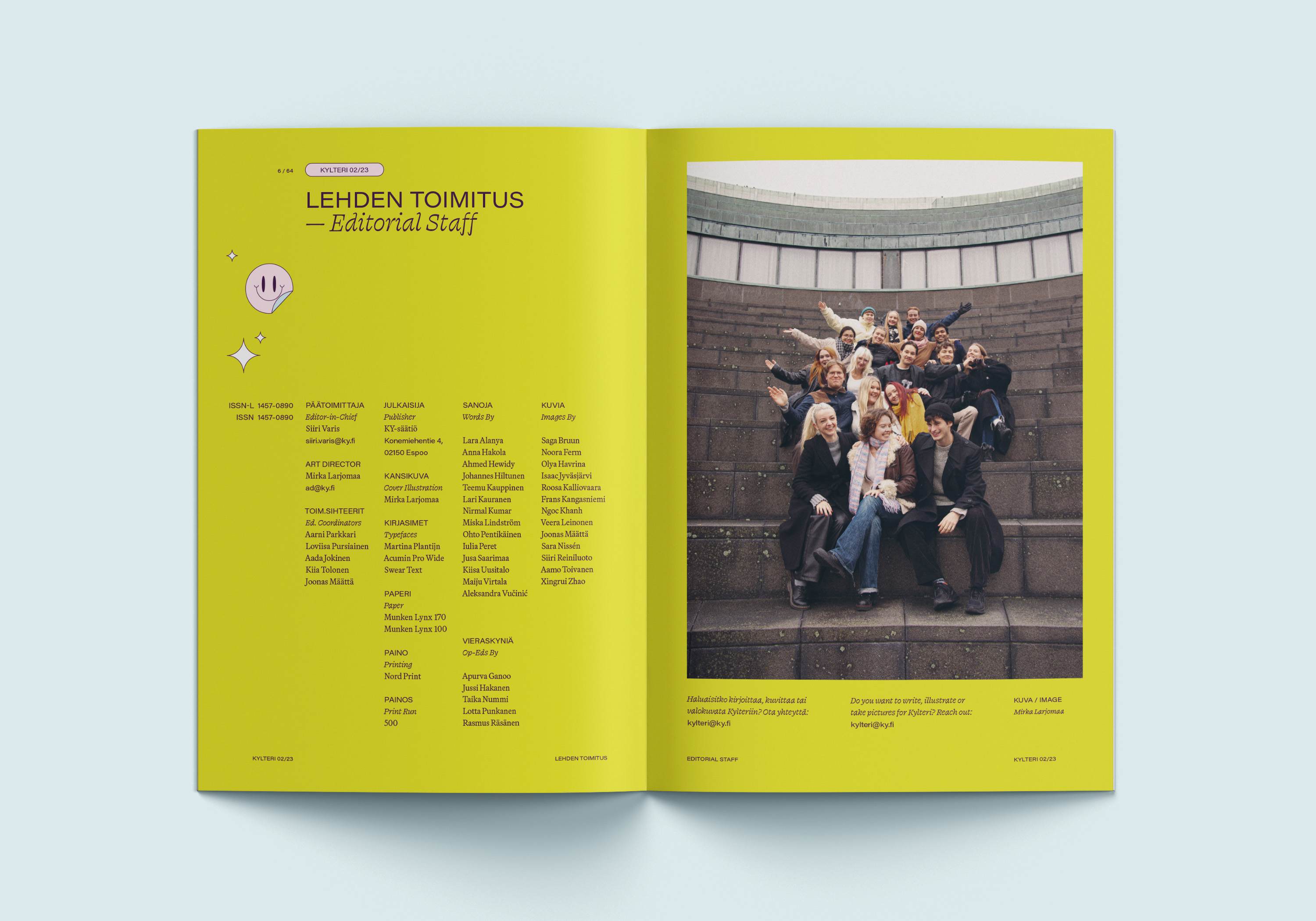
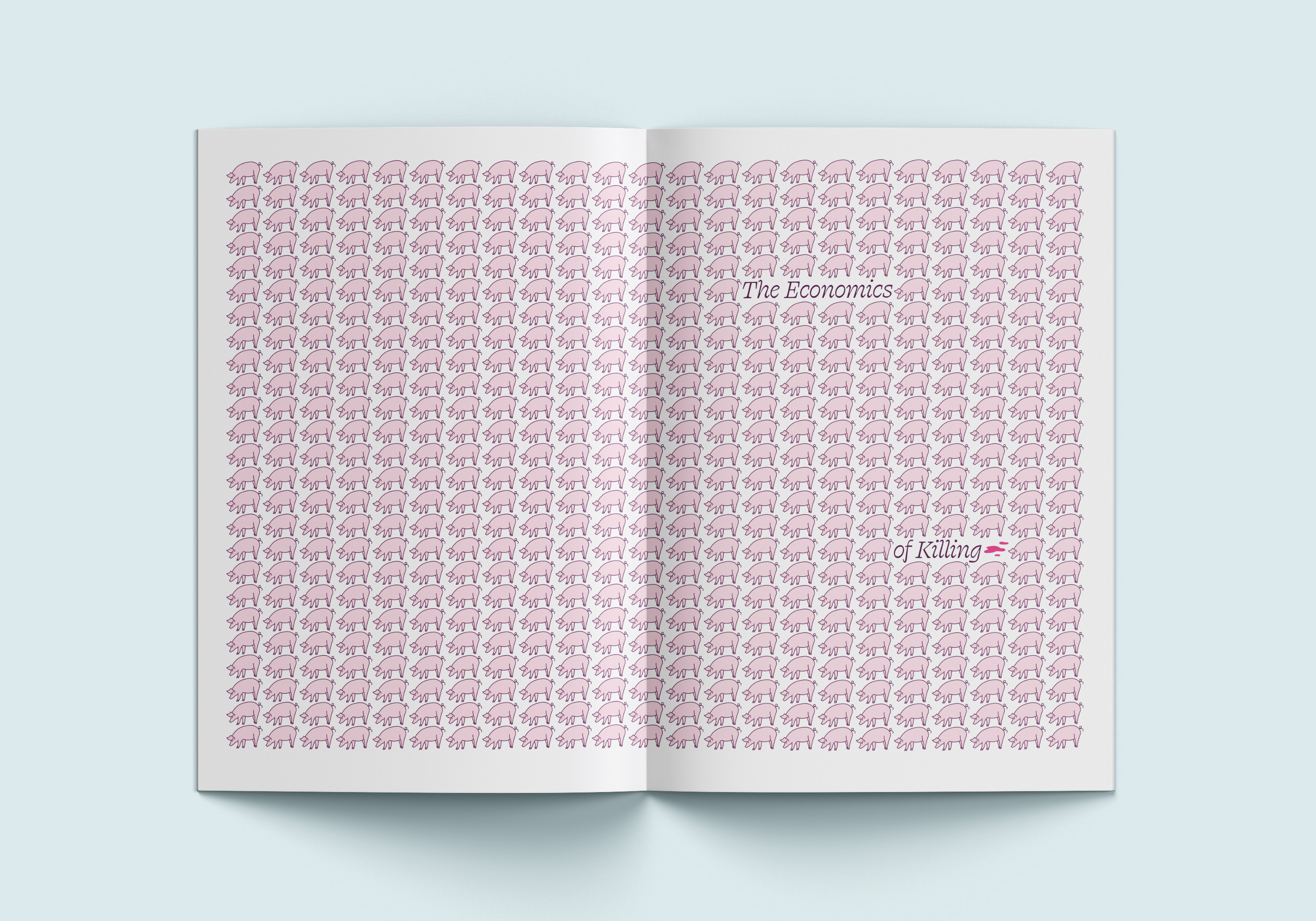
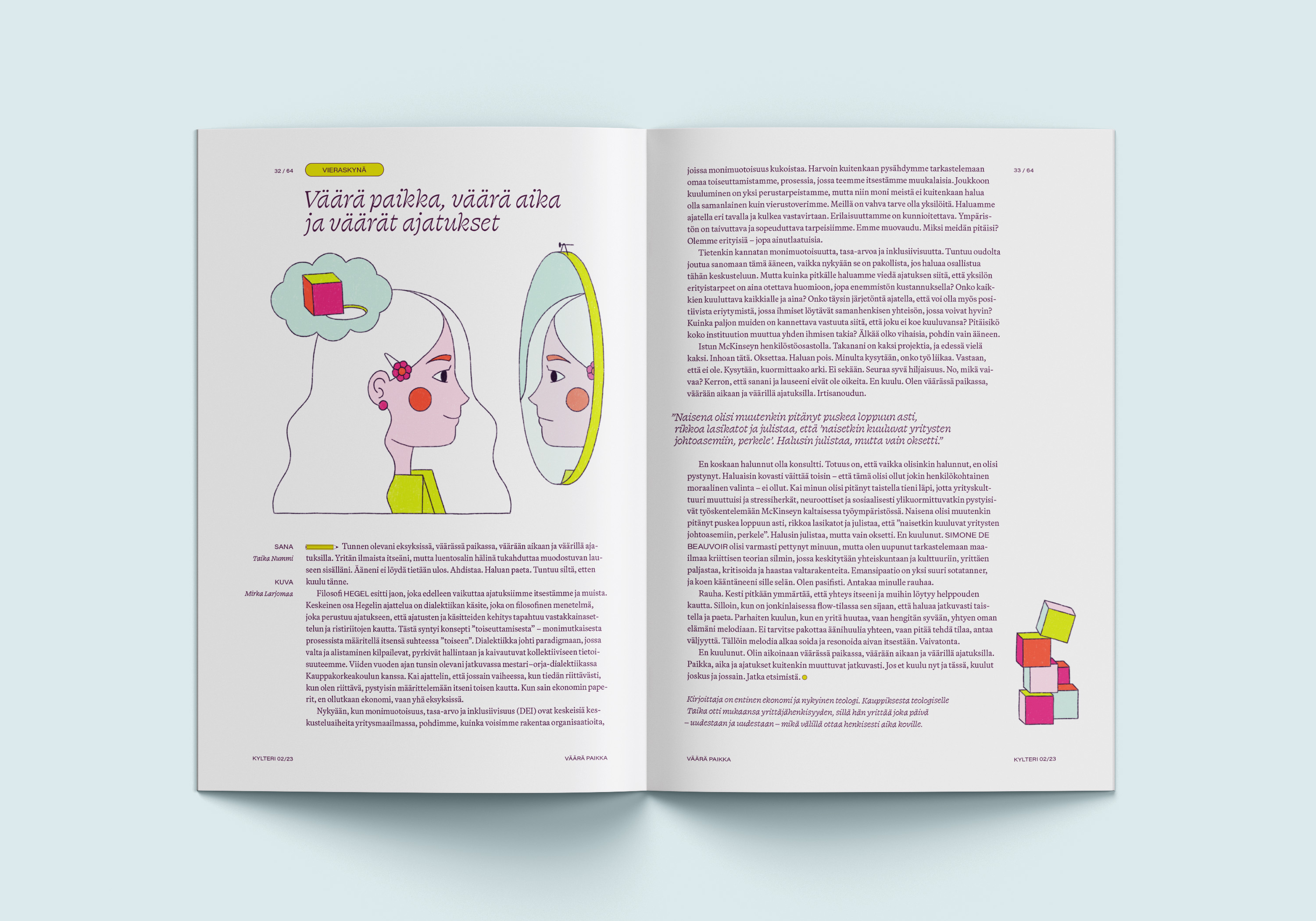
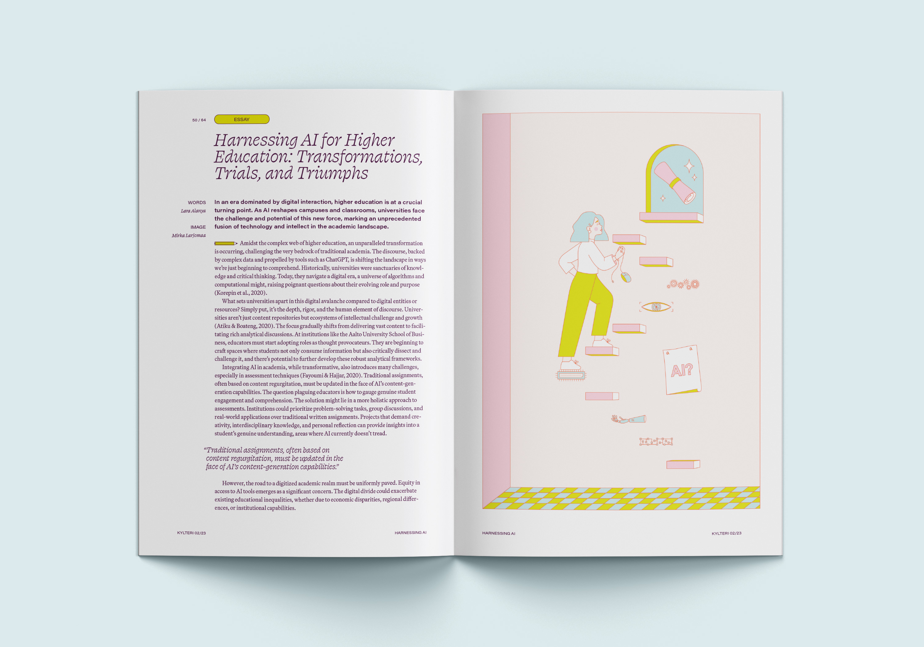
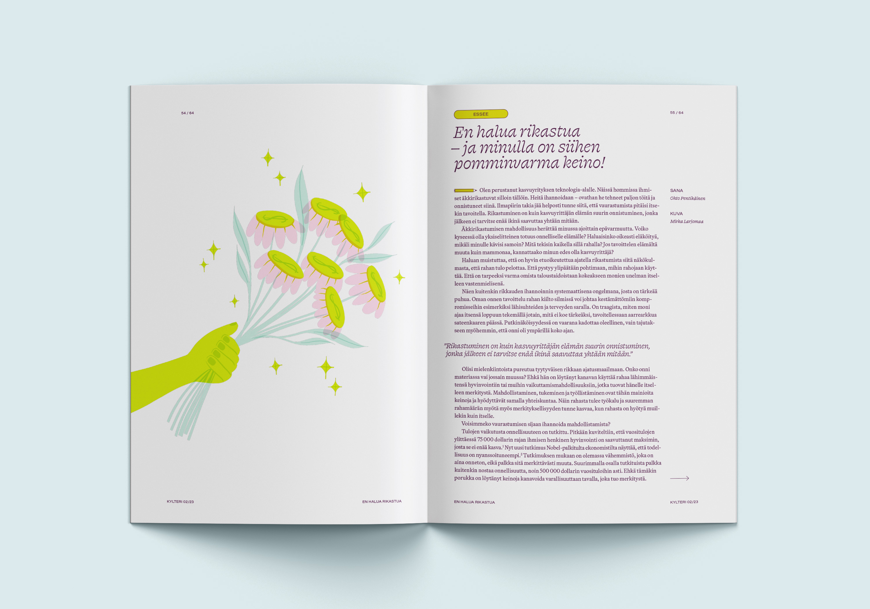
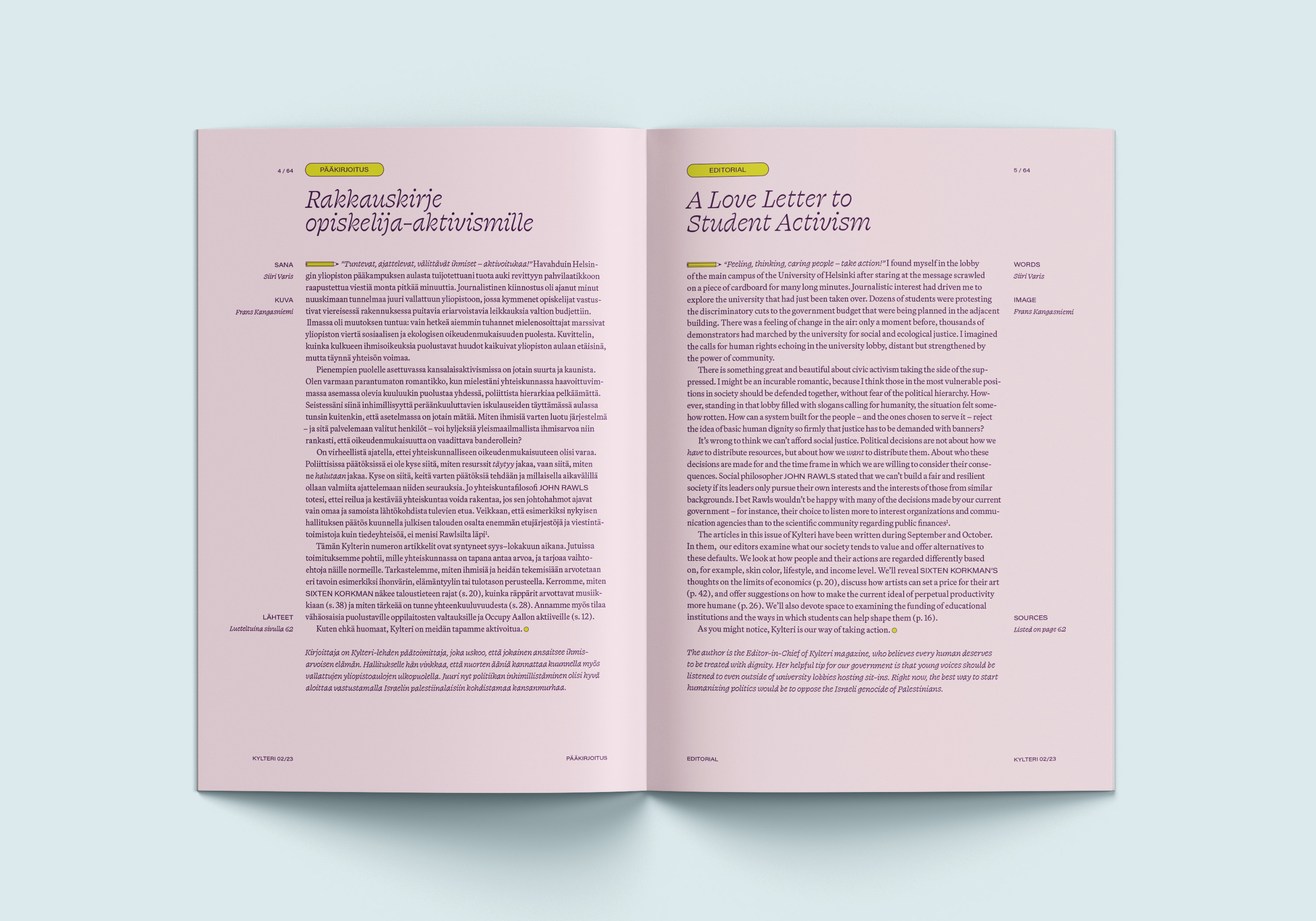
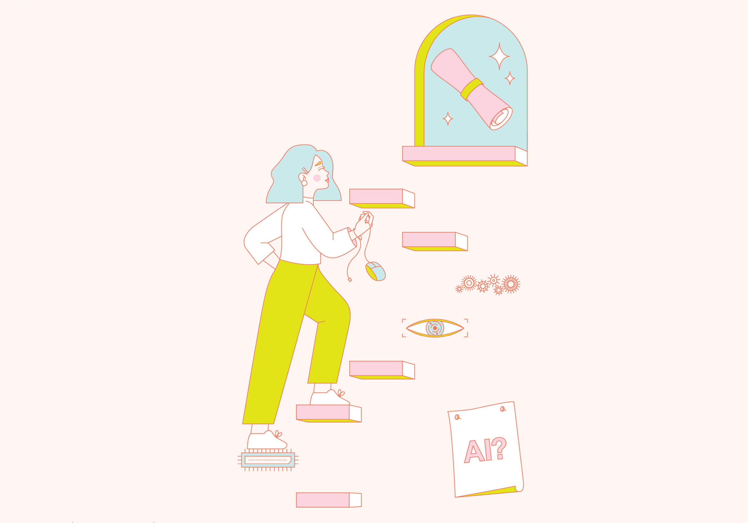
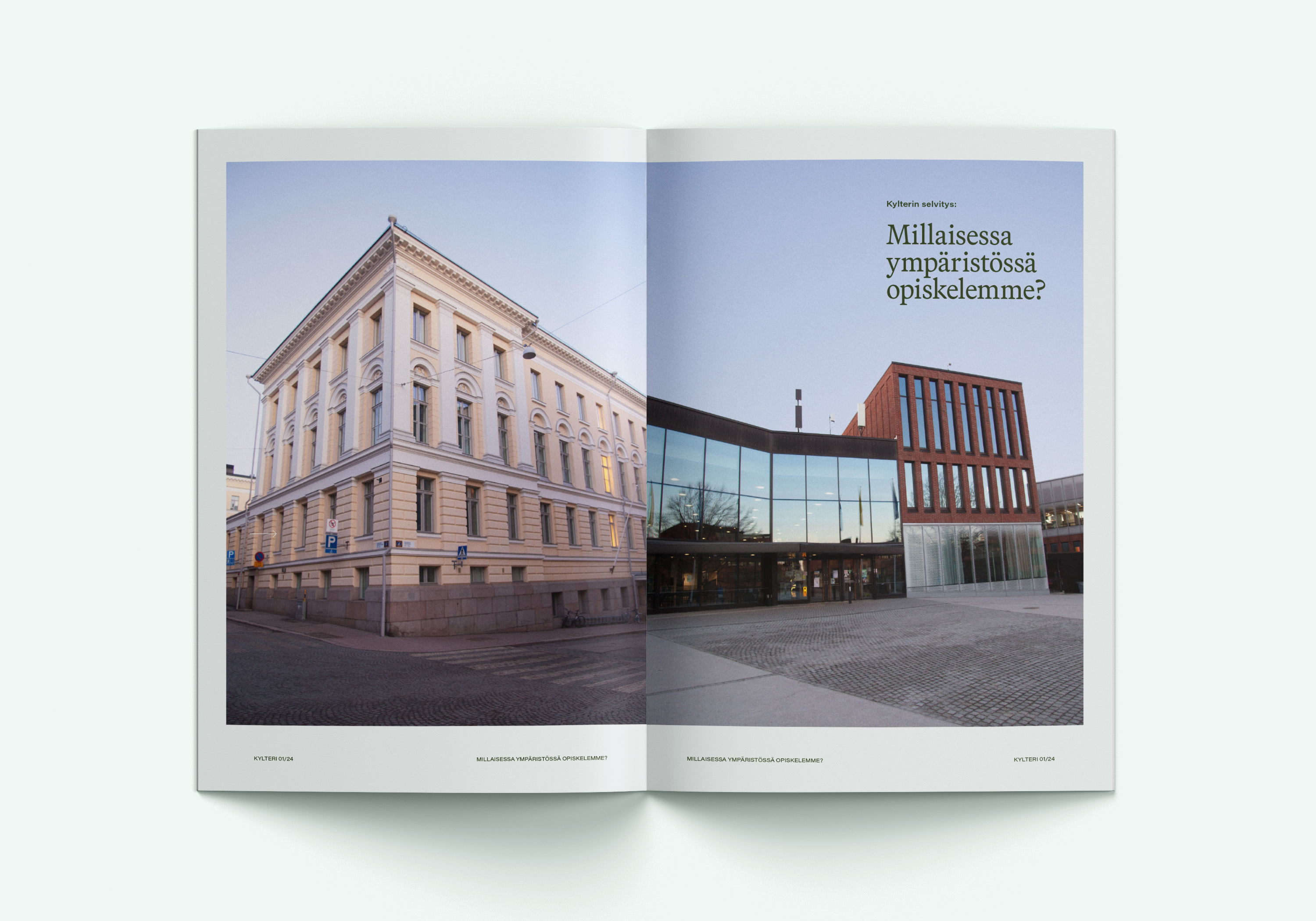
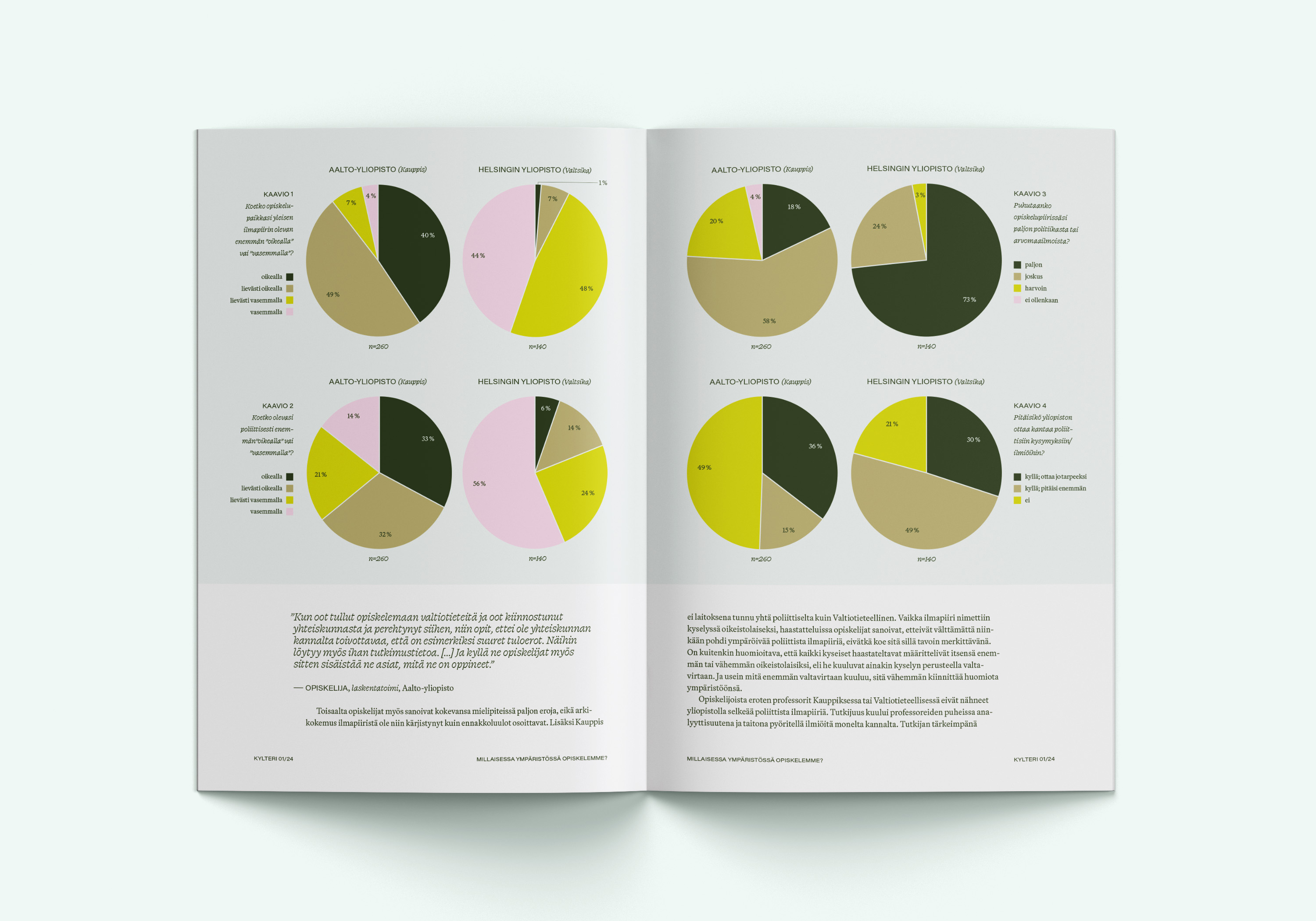
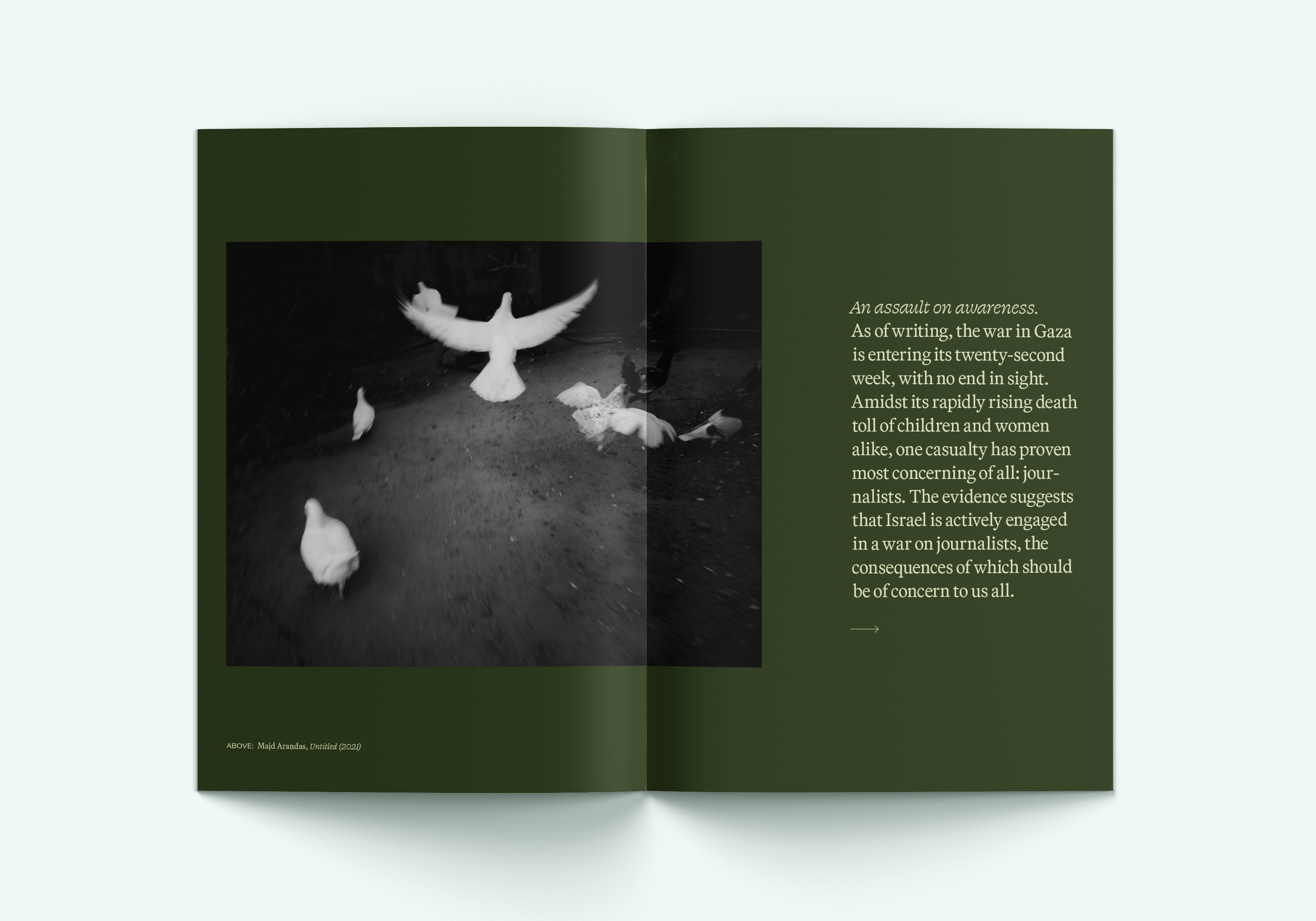
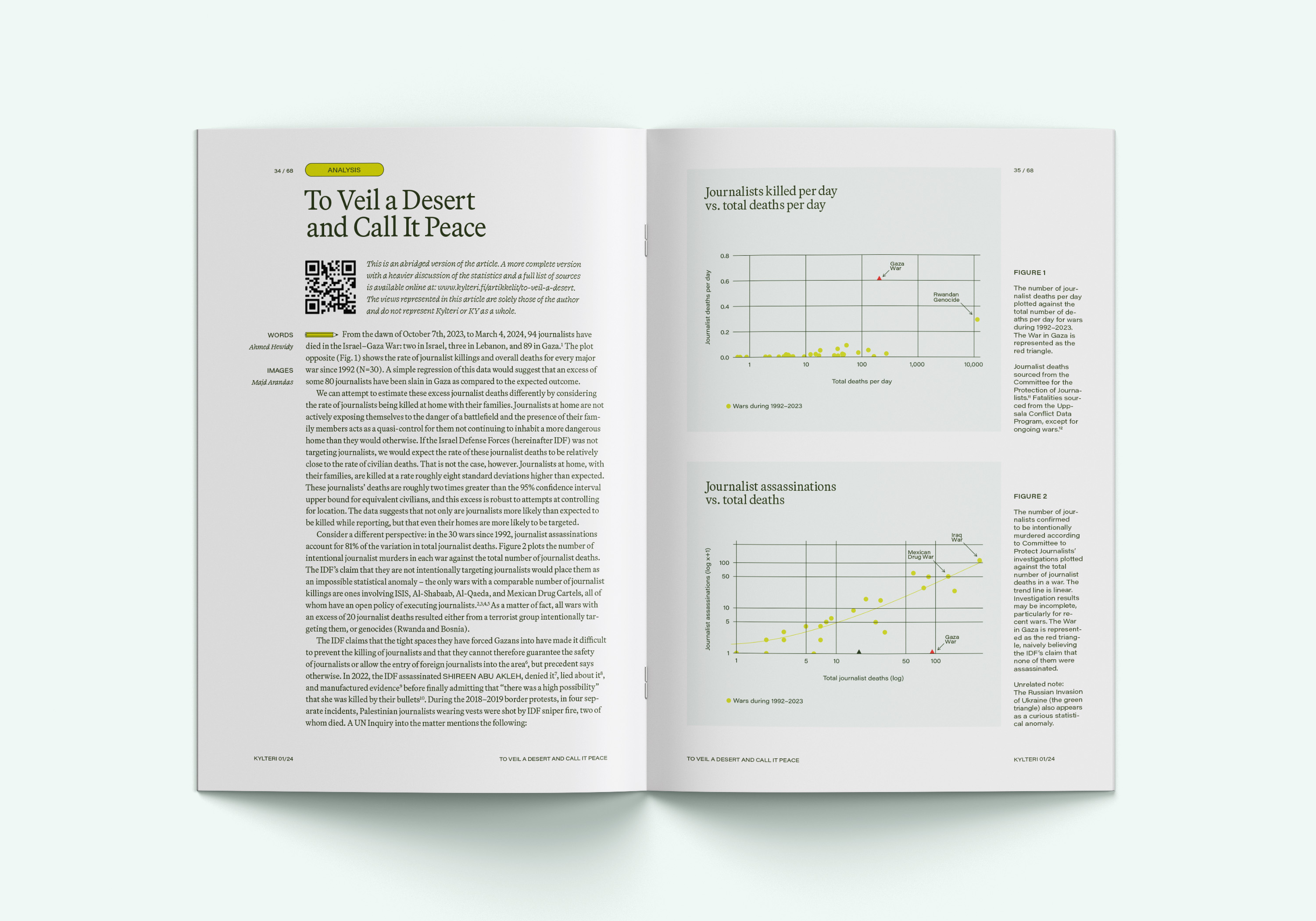
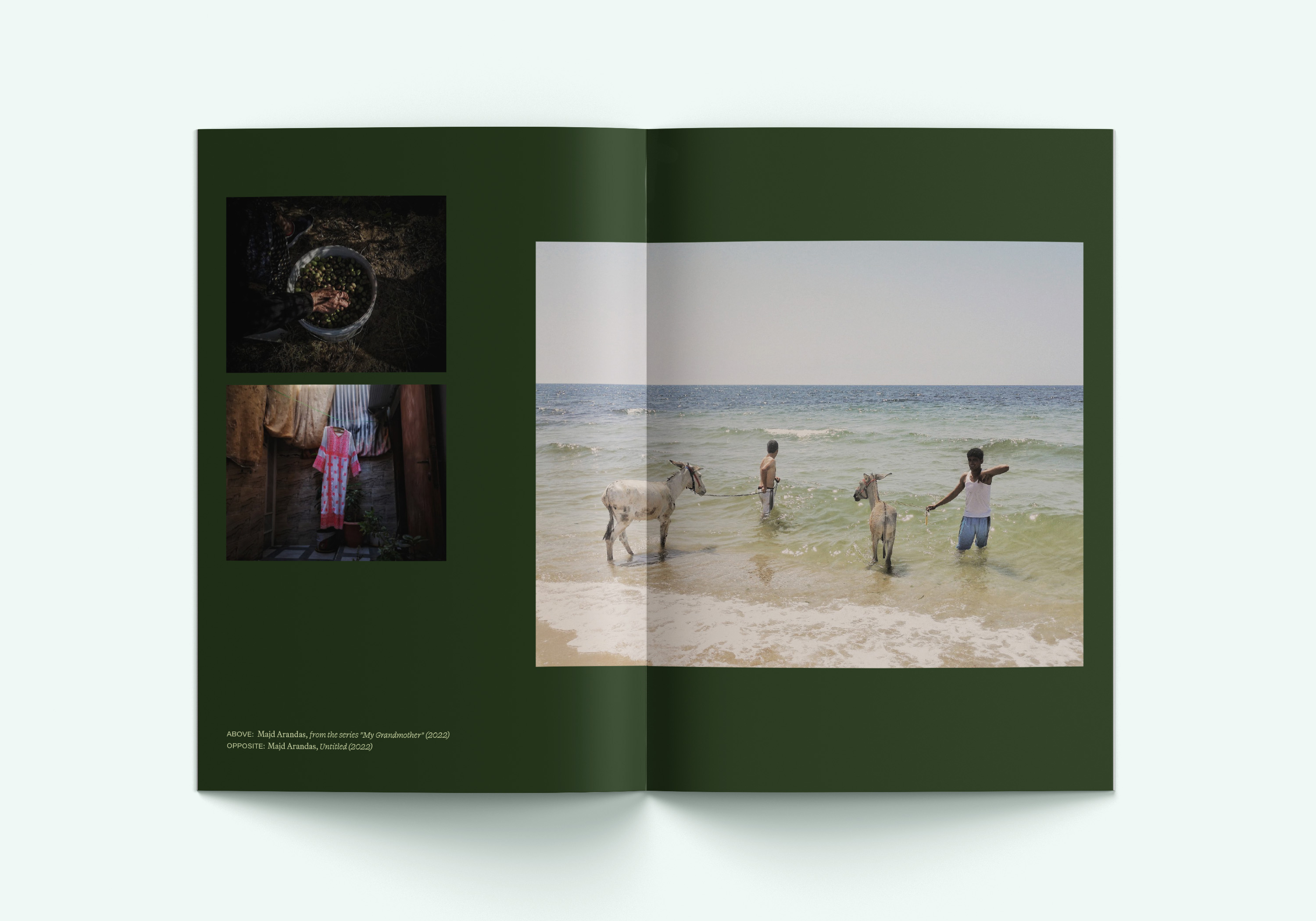
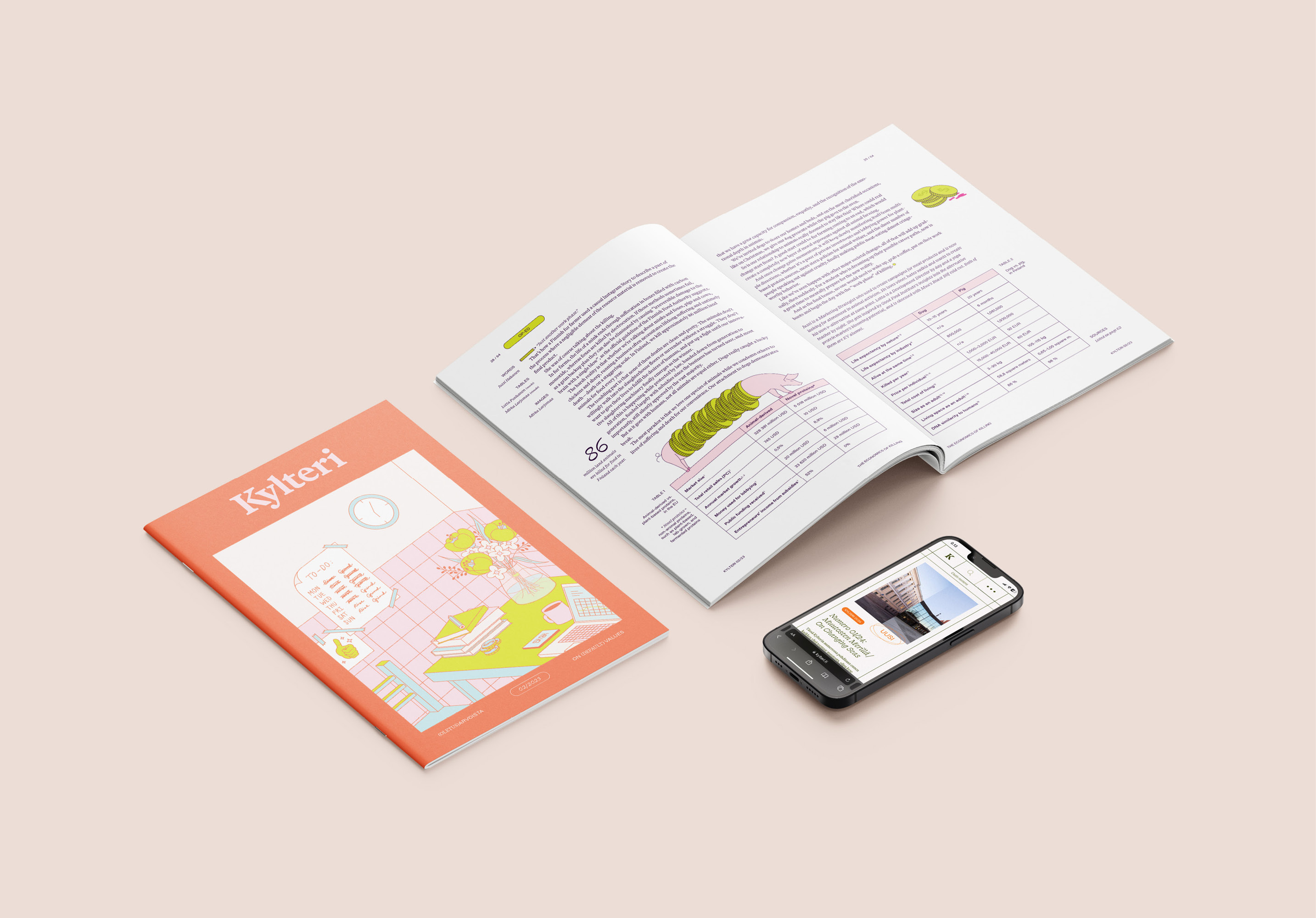
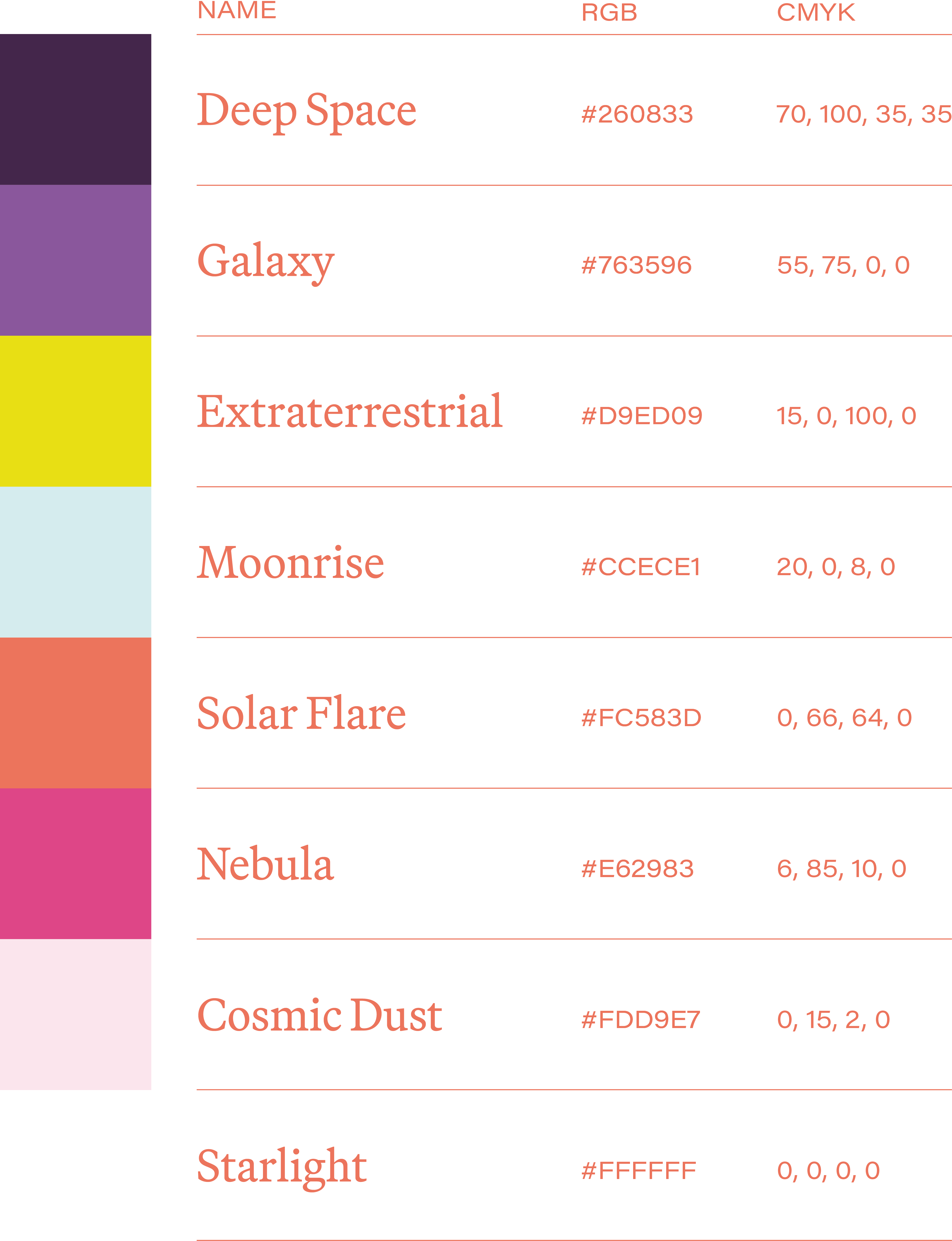
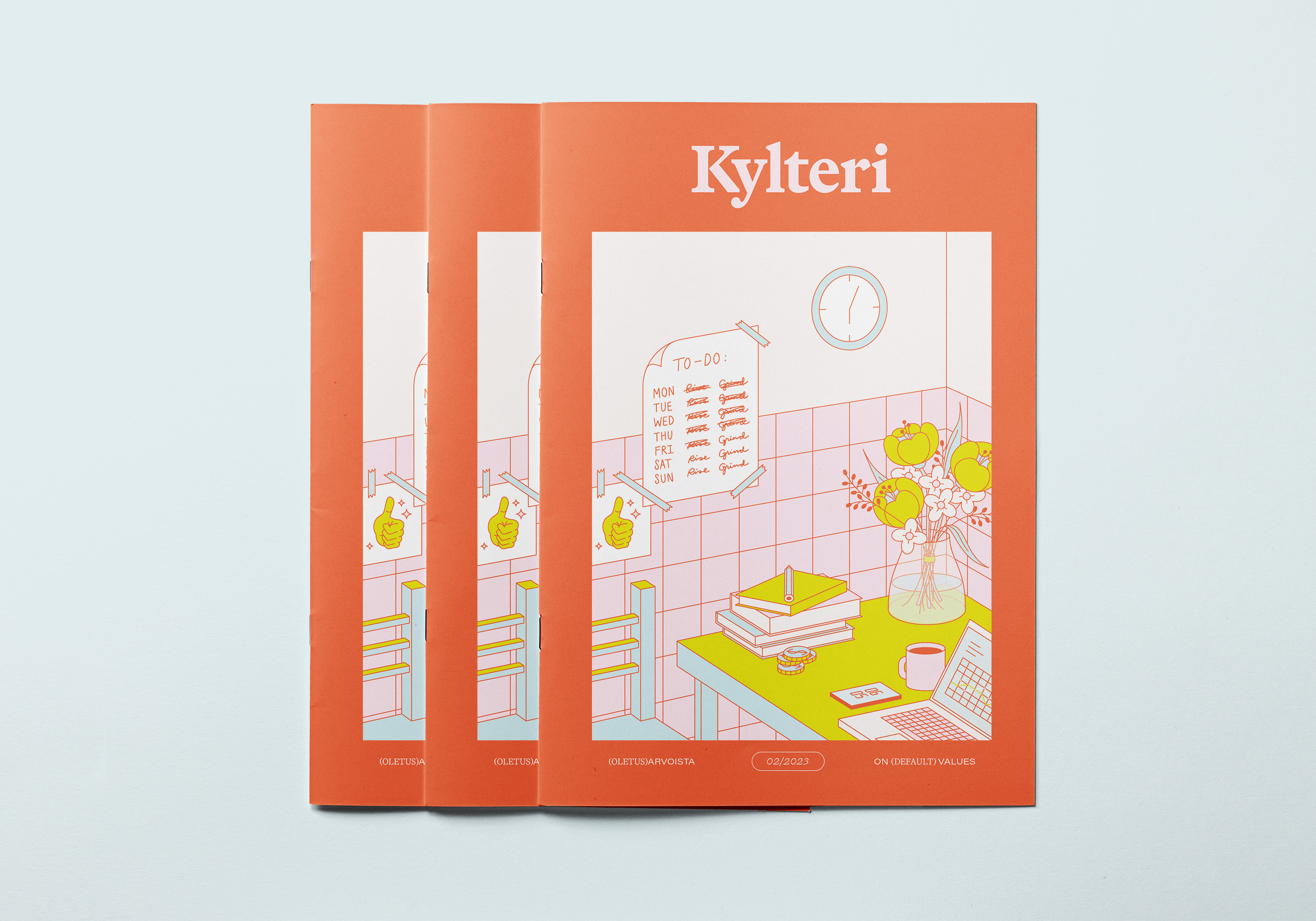
Kylteri is unique in that its visuals are reinvented by each of its Art Directors completely independently of KY’s brand guidelines, making it an interesting and challenging playground for aesthetic experimentation. The challenge from a design perspective is working with a multitude of illustrators and photographers, most of whom are students with little professional experience in visual arts, yet creating a cohesive and appealing end product. For the two issues I was in charge of, I solved this by choosing theme colors and asking all illustrators to adhere to them in their work. This, together with consistent typography, tied together the different visual styles. I also designed the covers for both issues and illustrated several articles.
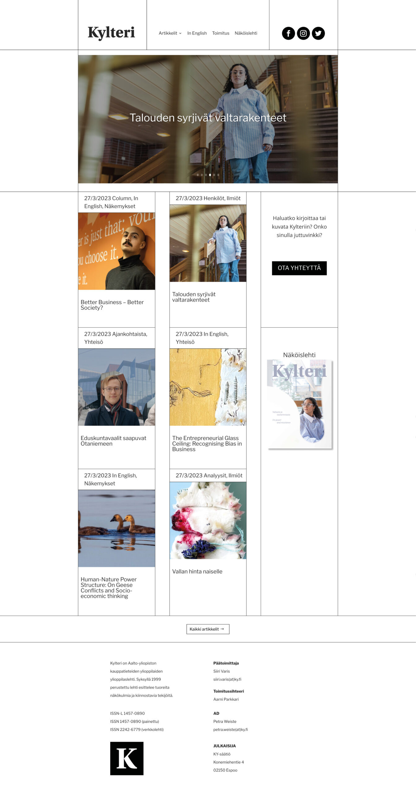
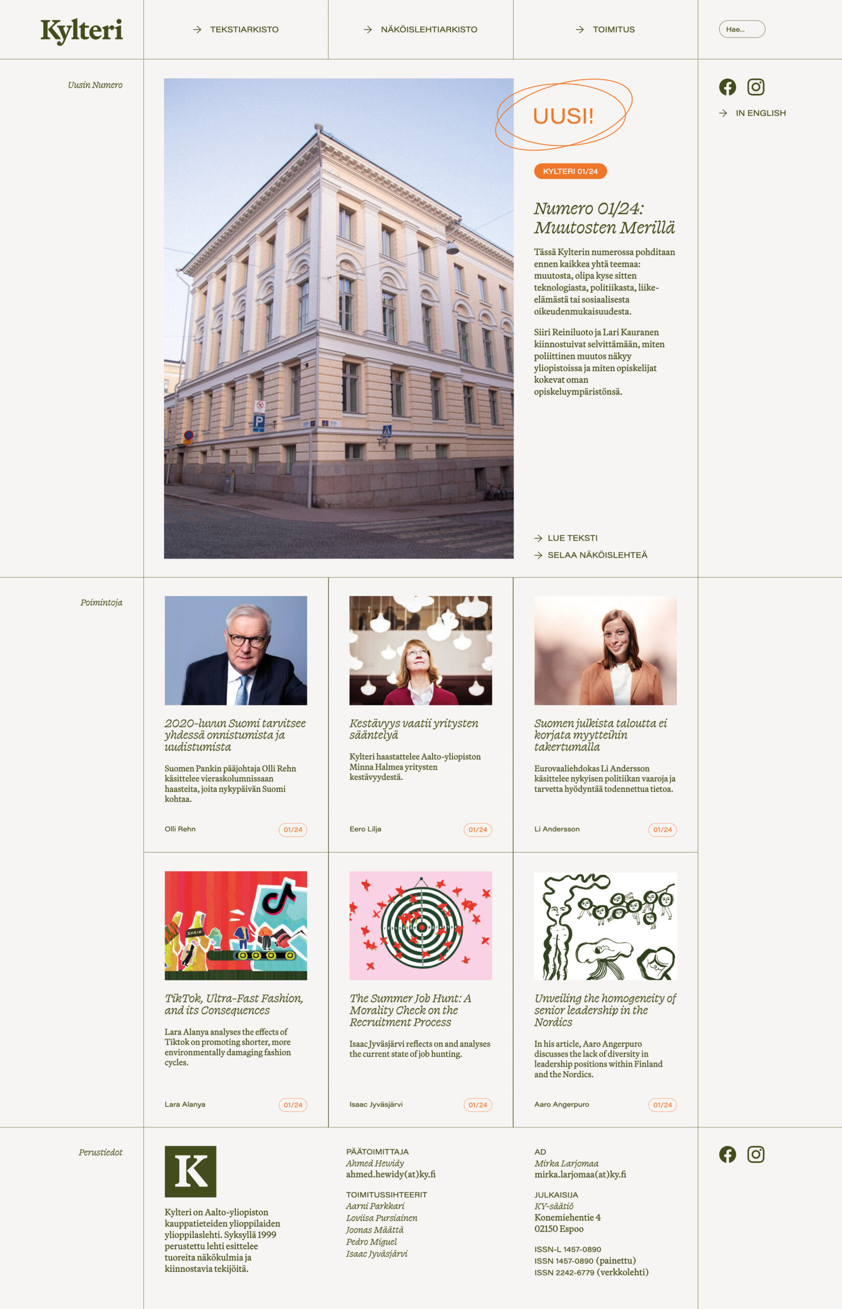
I joined the Kylteri team at an opportune time. In addition to designing the printed magazine, I got to revamp the Kylteri.fi website. (Note that I was only in charge of visualizing the site, not making it; Valtteri Häkkinen built it to my specifications.)
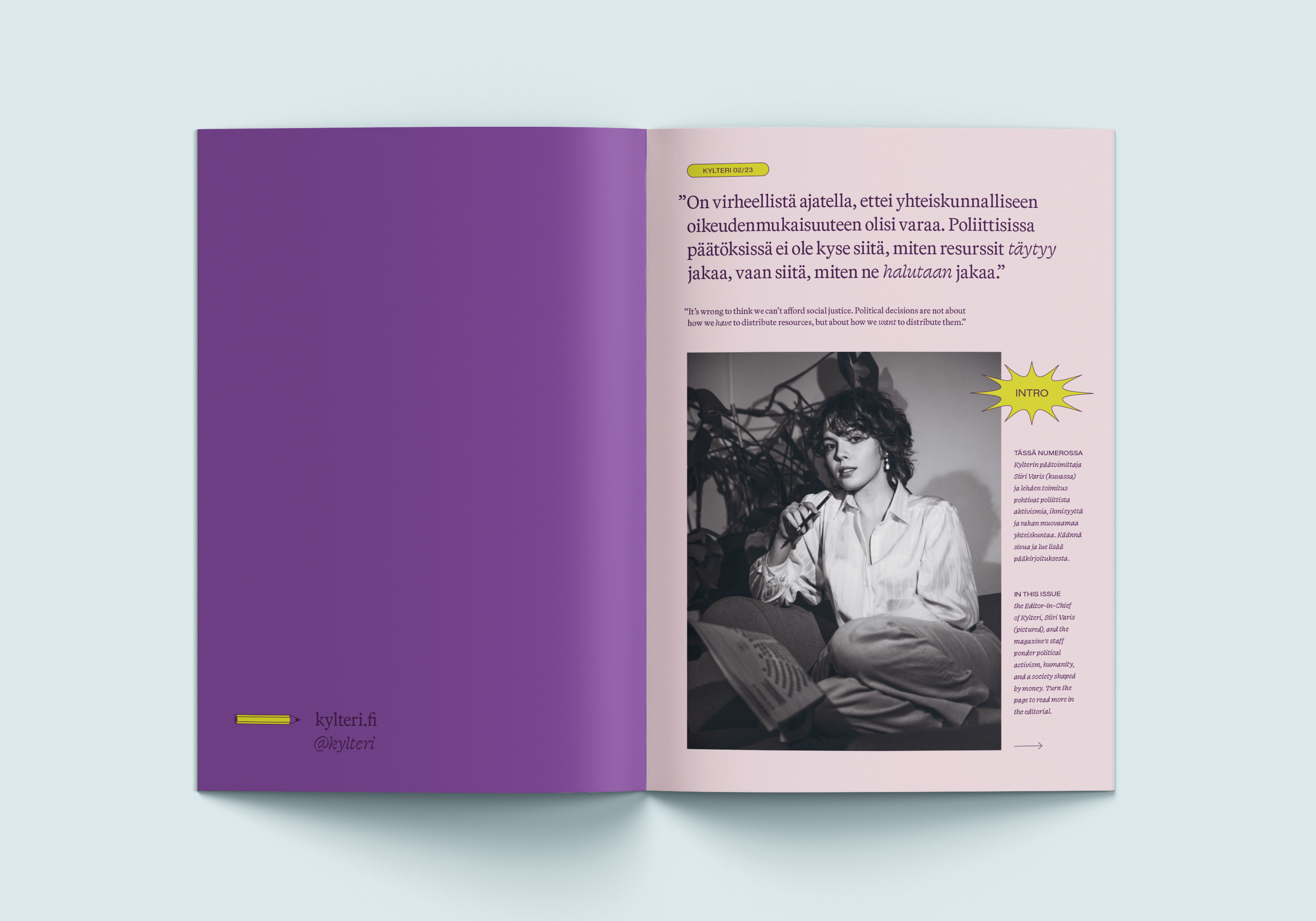
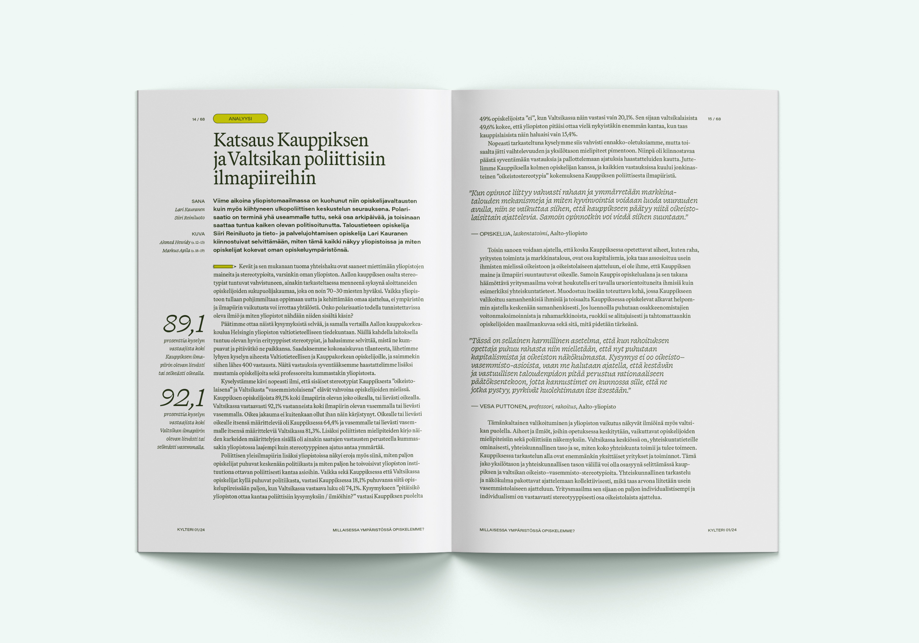
The typefaces used for both the printed magazine and the website are Martina Plantijn, Swear Text, and Acumin Pro Wide. In the body copy, Swear Text is used instead of italics, and Acumin instead of bold. These typefaces create a dignified yet playful look, appropriate for a student publication but equally appealing to a casual reader outside of this core audience.
Kylteri
Type Client Work
Client The KY Foundation
Tags Editorial Design, Illustration, Website Design
Year 2023–2024
As the Art Director for KY, the Business Students’ association at Aalto University, one of my main responsibilities was overseeing the visual language of Kylteri Magazine, a bi-yearly student-led publication with a rich history and a self-decribed target audience of ”all business-minded people”. The magazine is bilingual, publishing articles in both Finnish and English.
Kylteri is unique in that its visuals are reinvented by each of its Art Directors completely independently of KY’s brand guidelines, making it an interesting and challenging playground for aesthetic experimentation. The challenge from a design perspective is working with a multitude of illustrators and photographers, most of whom are students with little professional experience in visual arts, yet creating a cohesive and appealing end product. For the two issues I was in charge of, I solved this by choosing theme colors and asking all illustrators to adhere to them in their work. This, together with consistent typography, tied together the different visual styles. I also designed the covers for both issues and illustrated several articles.
I joined the Kylteri team at an opportune time. In addition to designing the printed magazine, I got to revamp the Kylteri.fi website. (Note that I was only in charge of visualizing the site, not making it; Valtteri Häkkinen built it to my specifications.)
The typefaces used for both the printed magazine and the website are Martina Plantijn, Swear Text, and Acumin Pro Wide. In the body copy, Swear Text is used instead of italics, and Acumin instead of bold. These typefaces create a dignified yet playful look, appropriate for a student publication but equally appealing to a casual reader outside of this core audience.
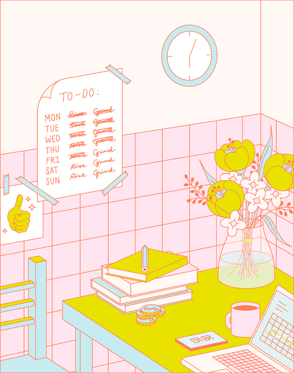
Kylteri 02/23
“On (Default) Values”
Kylteri 01/24
“On Changing Seas”
